This is my personal project, I will try to take pictures of rural and urban places and take pictures of what seems natural, I want to use the formal element from my abstraction work because I think it will help me take pictures. I have chosen the natural world also because I like everything natural and I would like to research other photographers and what they consider or how they define "natural".
my pinterest
https://uk.pinterest.com/mhausc/t-h-e-n-a-t-u-r-a-l-w-o-r-l-d/
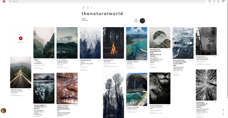
This is my natural world pinterest page where I look for inspiration and other photographers work.
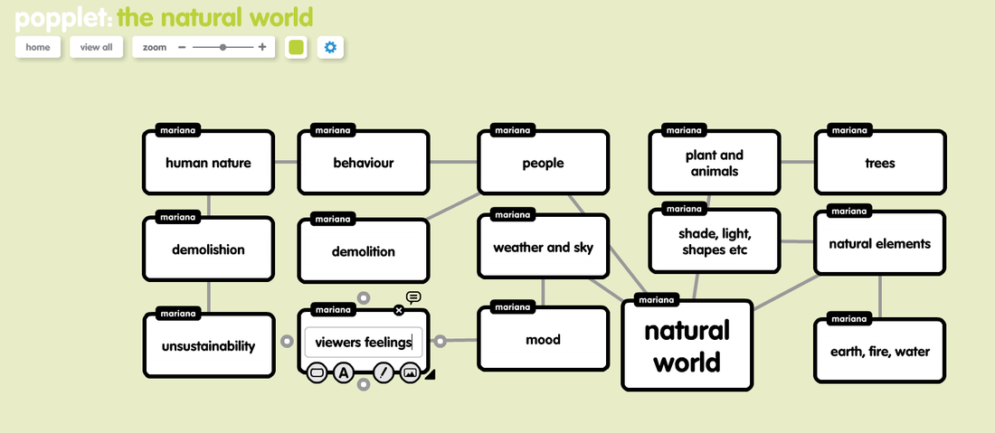
my popplet
http://popplet.com/app/#/3596551
first attempt
This was my first attempt of trying to take images while trying to connect it to 'The Natural World'.
In my first attempt, I see what I need to improve on, for example I need to think of composition and where to place the main subject in the picture. I also need to add more colour into my picture, at the moment I only have different shades and light but I need to add more colour since it's only green. I think it relates to 'the natural world' because rural areas are natural because they are full of plants and light, but I need to take more pictures of urban areas because that is natural too, I could take pictures of the city life and day to day things and weird things that are natural to us. I could also take pictures of what is natural but shouldn't be. I put the contrast down on some images so that the viewer can focus on the main objects instead of the background.
This is my second attempt. I think its more improved because I looked more at the different textures of plants instead of just taking a picture of anything that looked natural. I used various zooms to make the main object or subject stand out more. I have refined by adding more colour to my images and make it more natural, I have photographed more green which makes the pictures more natural and more pleasing to the eye and I have added more texture by adding wood. My focus was better in the second attempt because it was more clearer and you could see everything which made it more captivating. What went well was I improved my work and tried to make my photos more natural and virgin rather than just taking pictures of random things rather then taking pictures of anything. It would be even better if I could add more formal element into my pictures for example shapes and lines.
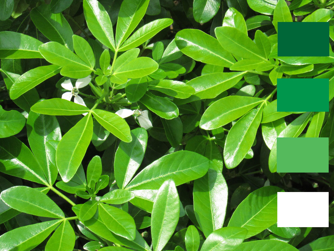
The picture below is a edited version of one of the pictures I took in my second attempt. I edited as a colour palette so the colours of the picture look more engaging. It also shows the different shades of colours. I put those colour to show the different types of green and to make them pop out. I chose to do it like this as I have looked on pinterest and got inspired by the idea of putting the colour next to it to make the colour more distinct.
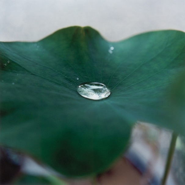
Rinko Kawauchi - Untitled, 2007
The Natural World
In this photograph I see a water droplet that’s focused I also see that it’s on a leaf which is unfocused. In the background which is completely faded it looks like a flower pot and there’s other stems coming out of it. The words I would use to describe this photograph are ‘focused’, ‘natural’ and ‘atmospheric’. To a person who cannot see this photograph. I would describe this as a leaf in a flower pot but imagine the camera was focused right on top of the leaf and the rest was faded out and there is a water droplet on the leaf, also imagine if there are no light colours in the photograph.
This photograph reminds me of my garden and nature. It also reminds me of rain. It is more of a naturalistic image because it looks as if nothing was edited and it’s a picture of nature, however, its also abstract because it has some of the formal elements for example, focus and shape. The lines in this photograph are in the leaf and in the background stand out but there are more curves in the image. There are different shapes in this image for example the leaf is a round kind of shape and the droplet is a circle and the flower pot in the background is more of a square. There are mostly dark colours in this image , the only light image is the background which helps magnify the colours and the main subjects. There are a range of tones of green in the leaf. As the image is focused on the leaf it look more rough but where its blurry its more soft. The photographer captures the play of light by showing a water droplet that’s reflecting the source of light. The lead also looks darker and lighter in some parts. Space is represented as a minimum in this photograph because the photographer zoomed in onto the photograph but the background looks distant but close. The droplet is in focus but the rest of the lead and image is out of focus. The subject has been framed/cropped by having the leaf as most of the image but the droplet in the centre of the photograph. However some of the leaf is out of the image because it’s zoomed in so much.
The droplet strikes me the most because I like the way it is focused and is in the centre of the image. I also like how you can see the reflections of the surroundings in the image. The background is the most mysterious because you cannot really see what’s in the background. I would ask the artist, why this certain leaf? Why did you zoom in so much? What time of day was this taken and what was the surroundings?
The title I would give this photograph is ‘surfaced’ because the photograph is too interesting to give it a basic name so I thought of surfaced because the water droplet is surfaced and the camera is based on top of the leaf and you cannot see the surfaces beneath the leaf. I think this image could be about cycles and nature. To analyse it I would say it could be about cycles and things that slow you down from moving onto the next cycle. But you’re helping that thing by stopping it.
The effective thing about this photograph is that it’s mainly dark colours which creates an atmospheric mood when looking at it also its cold colours which make you feel more sad than happy. The water droplet also helps this idea because it reminds the viewer of rain and rain can be thought as depressing or sad when linking to moods. I also think the compositing and focus of the image is effective because I like how image is basically just the leaf and the only thing that you can that you can focus on is the lead and water droplet is focused is worth remembering and can help me on future or work.
chemigrams
|
|
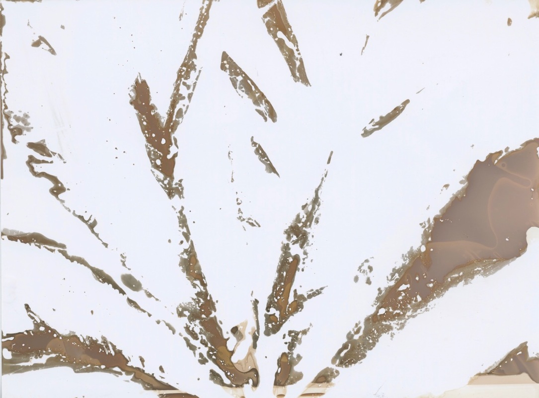
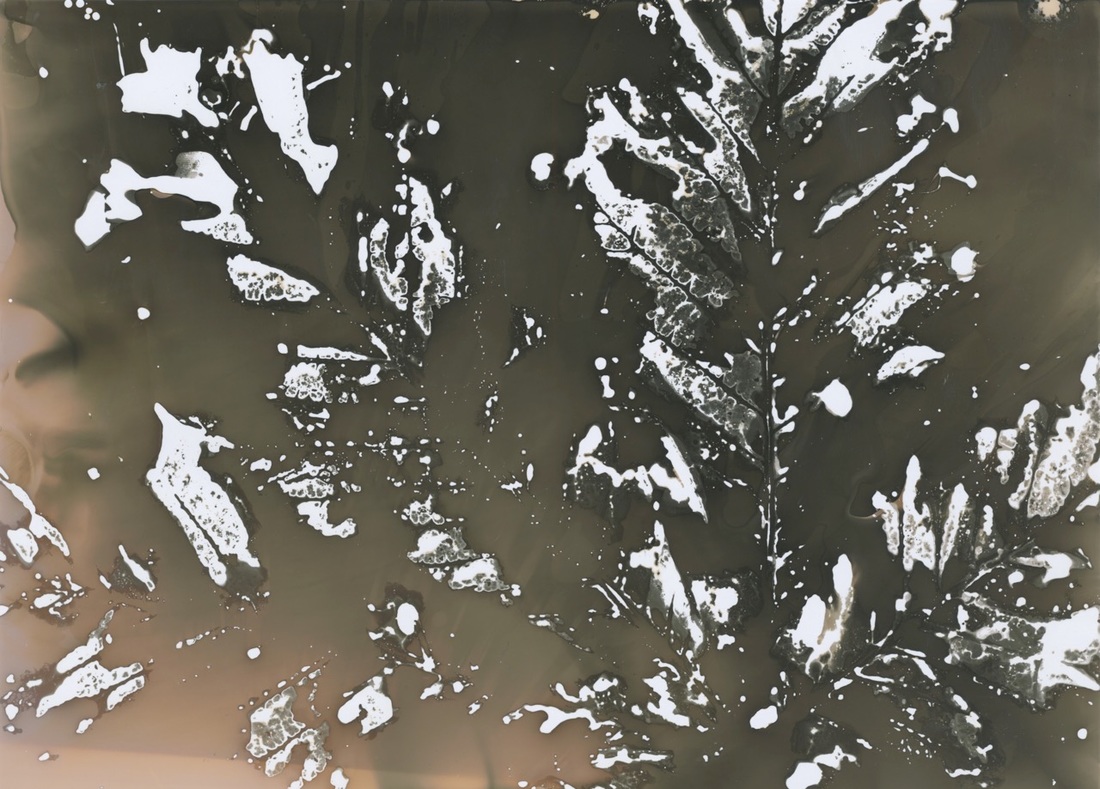
I decided to do some chemigrams, first I collected some large leaves, and then I got photographic paper and layer it on the table, and then i dipped the leaf into some chemicals for a few seconds and then pressed the leaf against the paper for a second and pressed the parts that I wanted to show on the paper and then removed the leaf and then left the paper in sunlight to dry and then watched it turn. I could've done it better by making sure the chemical didn't just go all over the paper because the colour went everywhere which is shown in the second photo and in the first photo I should not have pressed it on too much. I chose to do this so that I wasn't only taking pictures with a camera and so I could explore chemigrams.
Holiday
These are some pictures i took on holiday which I think linked to 'The Natural World'.
karl blossfeldt
|
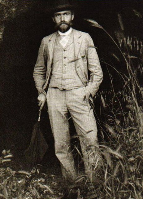
Karl Blossfeldt was born on June 13 1865 and died on December 9 1932. He was a photographer, sculptor,teacher and artist. He was famous for close-up photographs of plants and living things. He said "the plant must be valued as a totally artistic and architectural structure".
|
|
These are some example of his work, he photographs up close pictures of plants to document how plants grow, I think they contain many of the elements for example he uses shade and light to make it interesting but he doesn't use colour, this could be because he could be trying to focus it onto the subject, as a viewer, the leafs vein interests me, because by looking at it you can just imagine the texture.
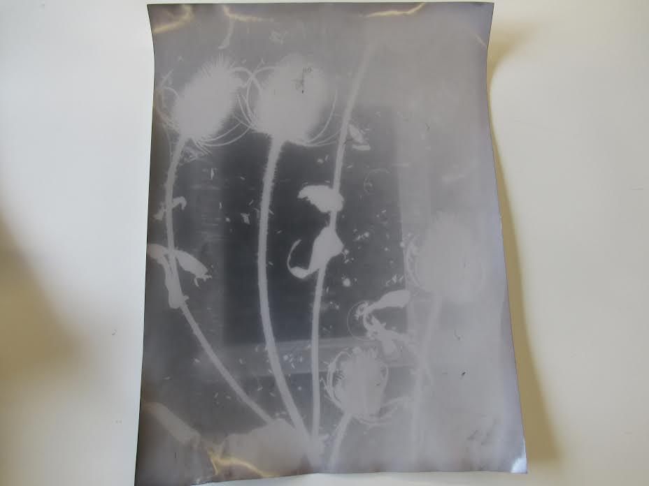
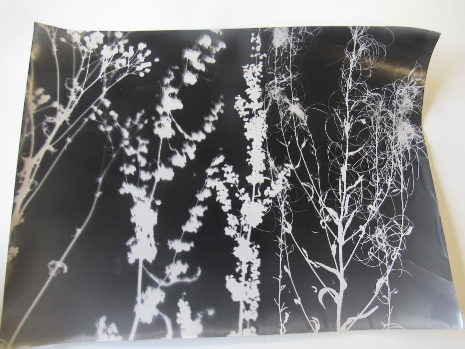
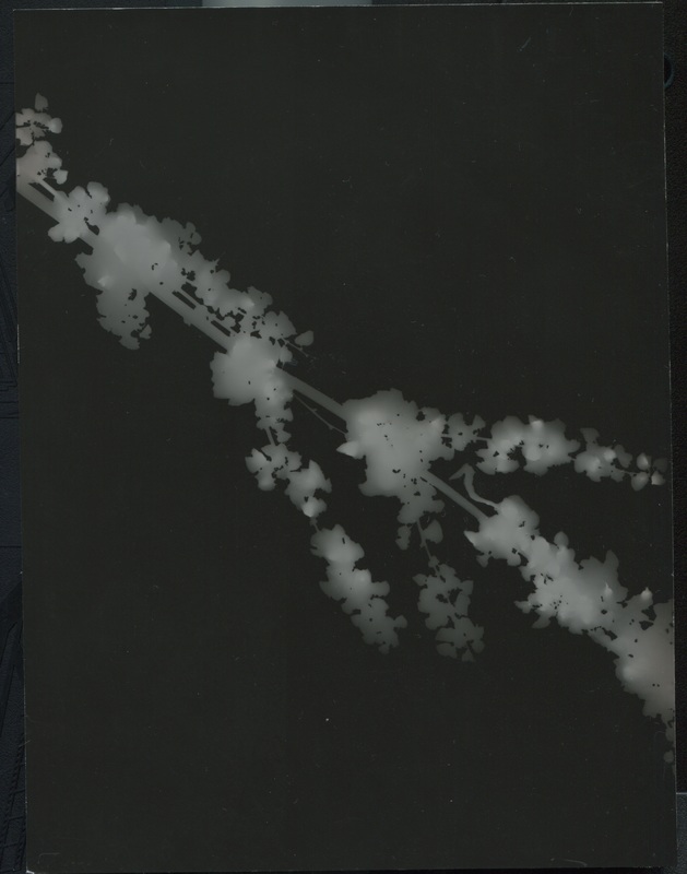
These are some of my photograms that I made in class, the first photo is a mistake but turned out more interesting, the shades didn't really work, it wasn't exposed enough, so then it turned out more white and blurry but this makes it more interesting because it doesn't look normal. I chose to do this so I could explore using photograms with plants. In the second photo it looks as if it's real life because it look like a field and the plants are moving. I attempted to use photograms instead of using a camera because it make the photo look more dull and invisible as if the photo isn't there meanwhile the plant/main object is striking and catches the viewers eyes. My third picture was an example of this attempt. However the two first pictures didn't work as pl`anned. This is because a mistake happened which then grabbed the attention off of the main object. However this made the photo even better because every picture is planned to catch the viewers attention on the main object but I grabbed the attention on the mistake, This helped me learn a lesson that the best pictures are not planned.
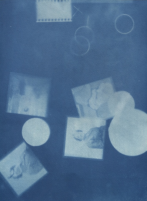
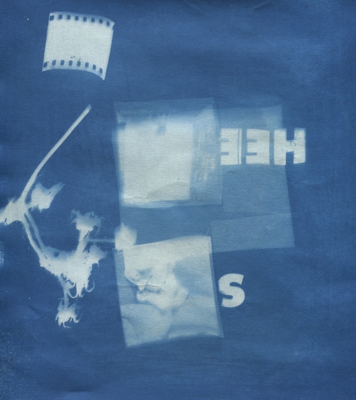
These are cyanotypes I took with see-through paper with letters and plants and some other pictures and objects. I think it went successful because it is interesting to look at. I used film of people and placed it on to the cyanotypes so that the sunlight penetrates through it so that it creates a nice image onto the cyanotype. This relates to the theme because sunlights are natural. I also used a plant in the second to make it more natural and show the life and the picture. However the messed up pictures of people could show that someones life isn't in order and it's messy. The circles in the first one could show someone is absorbing the photo. I have analysed my photos after taking them and realised they were more than expected.
dafna talmor

This is some of Dafna Talmor's work. She is inspiring as she introduced this method of using unused pictures or making them more interesting and leave people wondering. She came to visit my class and she showed her website and some of her pictures. Her pictures are interesting and make ordinary but beautiful pictures into more weird and abnormal pictures. Her pictures have formal element for example contrast. The contrast of light and nature between the two photographs or more when she puts them together makes the photo more interesting and makes different feelings when looking at it. She also put a object or shape blocking her work which makes you think, what was underneath or originally there. This makes the photo natural but not at the same time because she changes it to make it look interesting but she also combines different atmospheres together. She also uses light/shade to make the photo more distinctive to the viewer and pleasing to the eye rather than photos that are all one light shade which makes it look ordinary. She also uses different techniques to make her work different. For example she used nail polish to smudge the photo up and used ink to change the colour of the image.
http://www.dafnatalmor.co.uk/
These are the photos that I made. Originally Dafna had taken these pictures but she let my class and I do what we wanted to them to make it look even more interesting. In the first picture I put two different pictures together, the top picture I made and put nail polish so the colour would go more blurry and then put it next to the bottom picture which was a spare cut up I found. I burned it a little bit with a lighter and then the picture melted on the sides and on the girl hand. However normally when you look at a photo you see patterns and colour but when you look more deeper you see the details you didn't realise at first. This photo was my favourite. The second photo I made was originally two photos, one of mountains and one of a waterfall. I decided to colour the mountain green and the waterfall pink. I wanted to see if colour would change anything and it makes it harder to realise what it is. I also cut the middle of the photo because I wanted to see the separation of the two worlds. I like this photo but I believe it could have been better. The third photo turned out more contrasted because of the nail polish which changed the colour completely. The top picture was of two young woman sitting near mountains and the bottom picture was originally the bottom of mountains. In the middle is tracing paper which is coloured with pink ink and was stamped with holes with a pin. I like this photo but I think the contrast and the middle could have gone better. The fourth picture was two different pictures of nature, on the bottom photo i pinched in holes with a pin and drew a triangle and then added a little strip of a image to the space between the two images, to finish I added pink see-through paper on top. I can continue to experiment by making my pictures more interesting and experimenting. I will use the techniques for later in my work to make it more distinct.
Philip J Brittan
http://philipjbrittan.com/
Philip is a photographer that's based in Bristol and London, England. His work is protected from copyright which is why I cannot show it. His work is very unique to the eye, he uses different techniques and processes for his work. He takes pictures of natural things and then alters it to look more interesting and weird. His work contains many formal elements for example, light and texture which makes his work most interesting.
Patrick Zephyr
Patrick is a natural photographer, he grew up in Massachusetts, USA. I like his work because they're as natural as you can get. His work is well defined and use many formal elements for example, focus. The focus in his pictures make you want to look at it for a long time because when you keep looking you see new things and it's as if you were there. He has also not only done work on landscapes but animals too. Below is some of his pictures. In the sunset picture is contrast because it shows both cold and warming colours which changes the tone. It also looks saturated.
Mark Hamblin
|
Mark is also a natural photographer. He grew up in Warwickshire. His work interests me because of the focus again which makes you focus on the main subject and makes it stand out. Also the colours of his photos set a mood when you look at it.
|
The photo of the sunset intrigues me because of the colour which set a calm mood. The reflection of the sky on the water also makes it more calming. The composition of the photo is straight which makes it more pleasing.
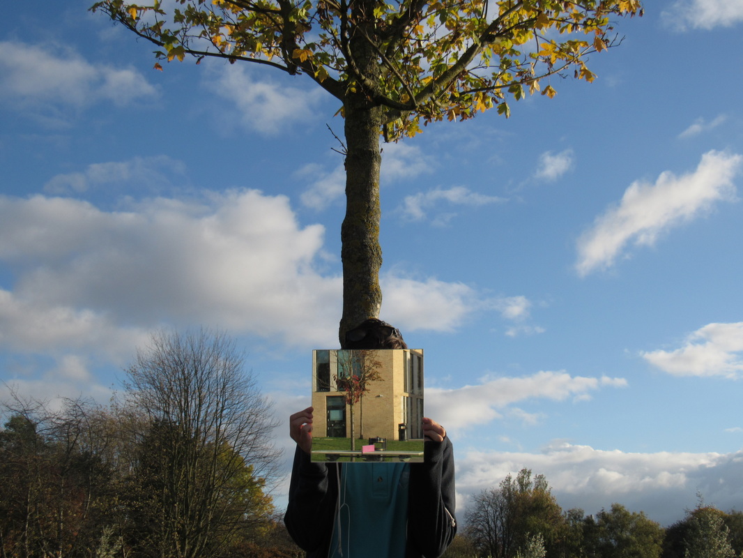
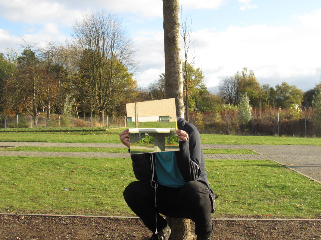
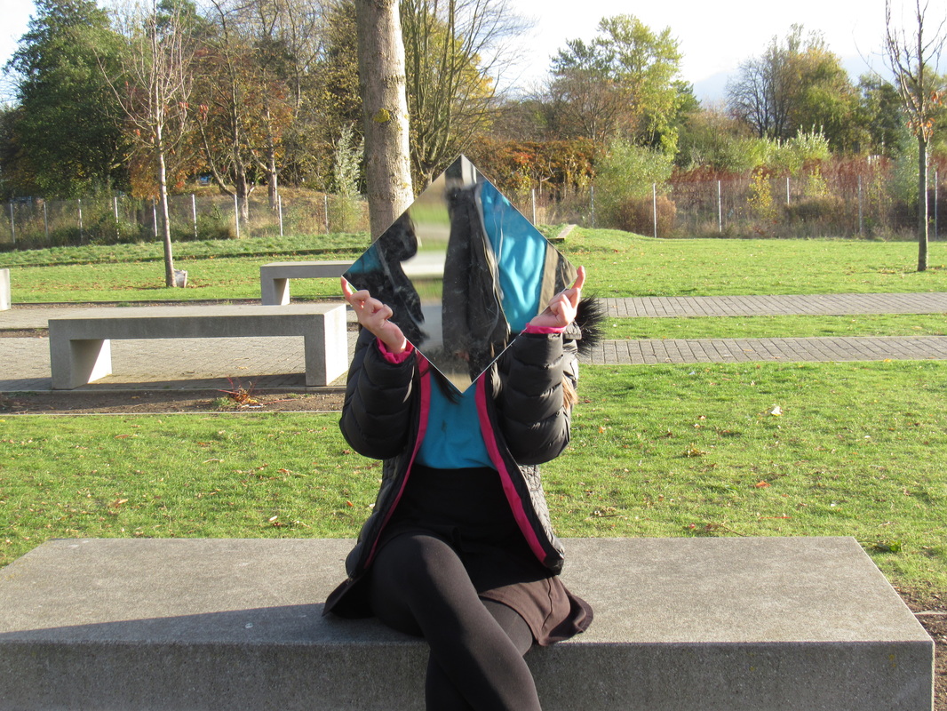
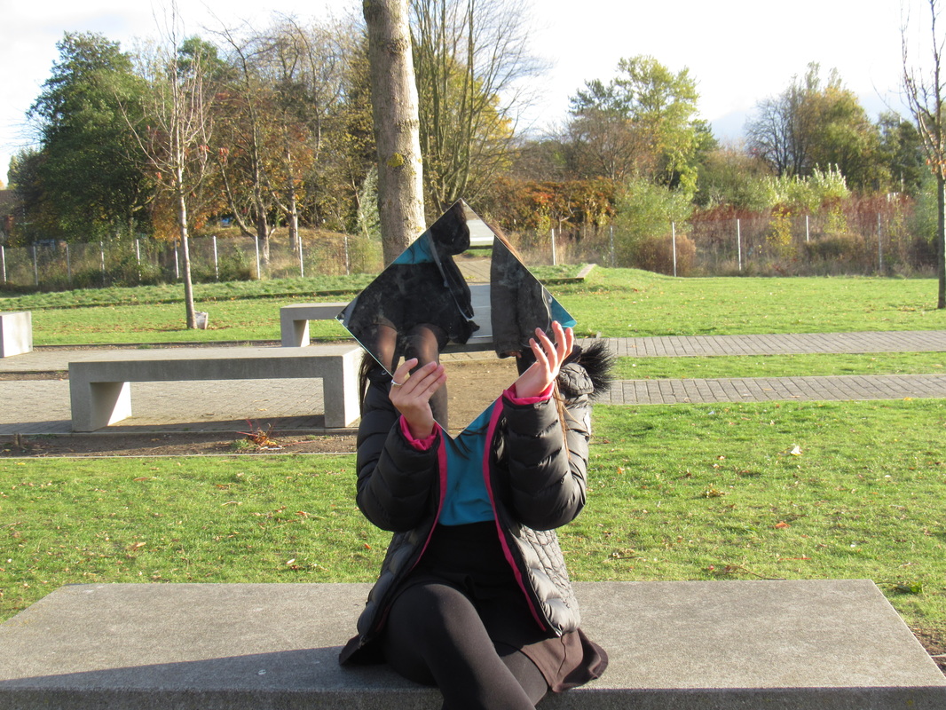
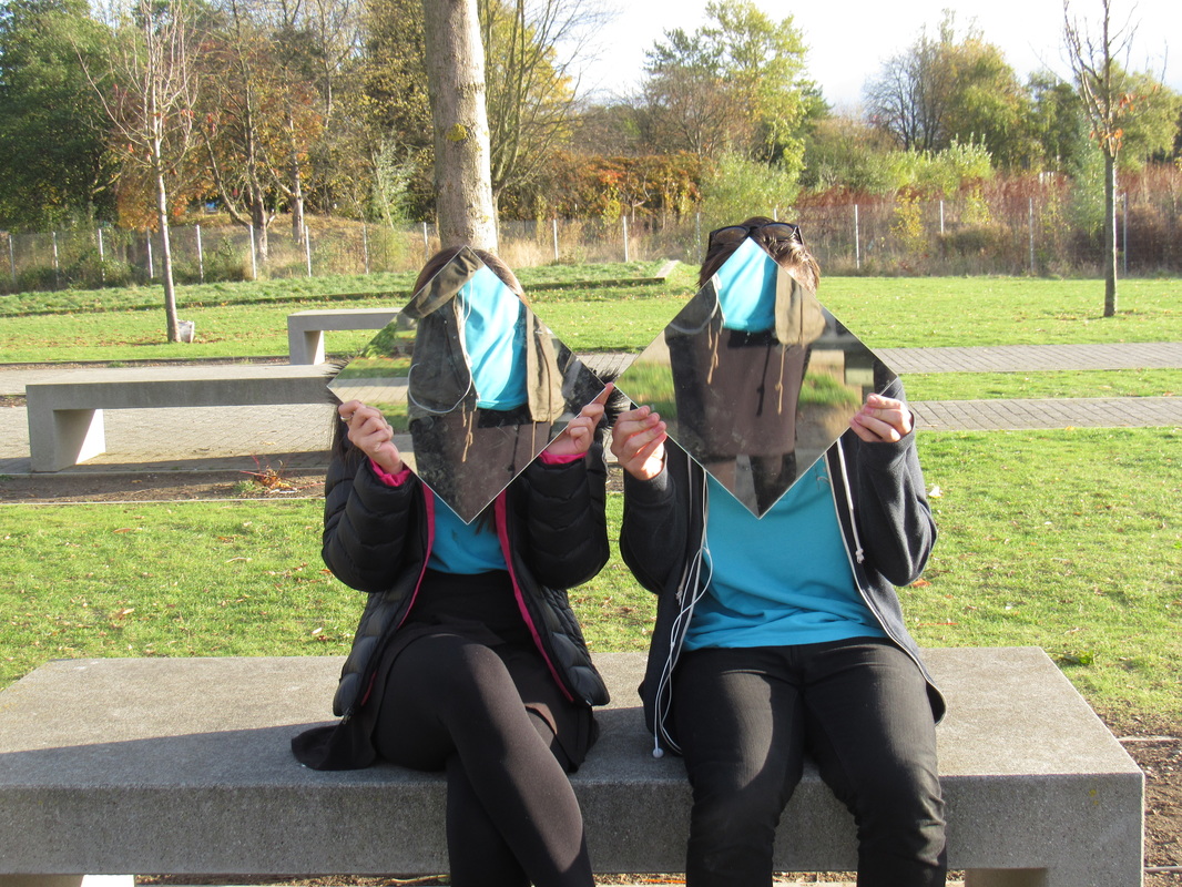
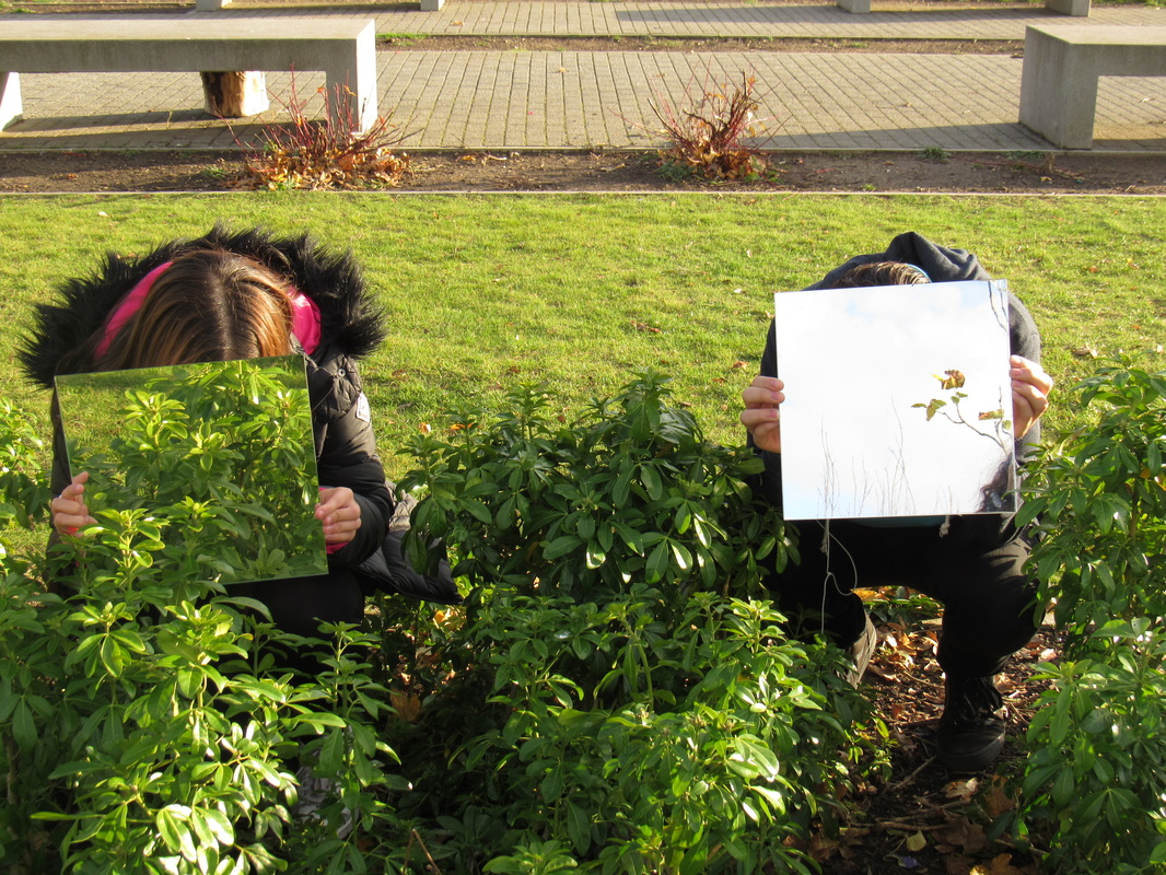
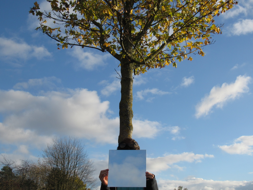
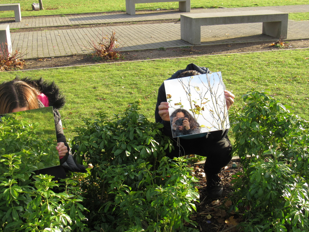
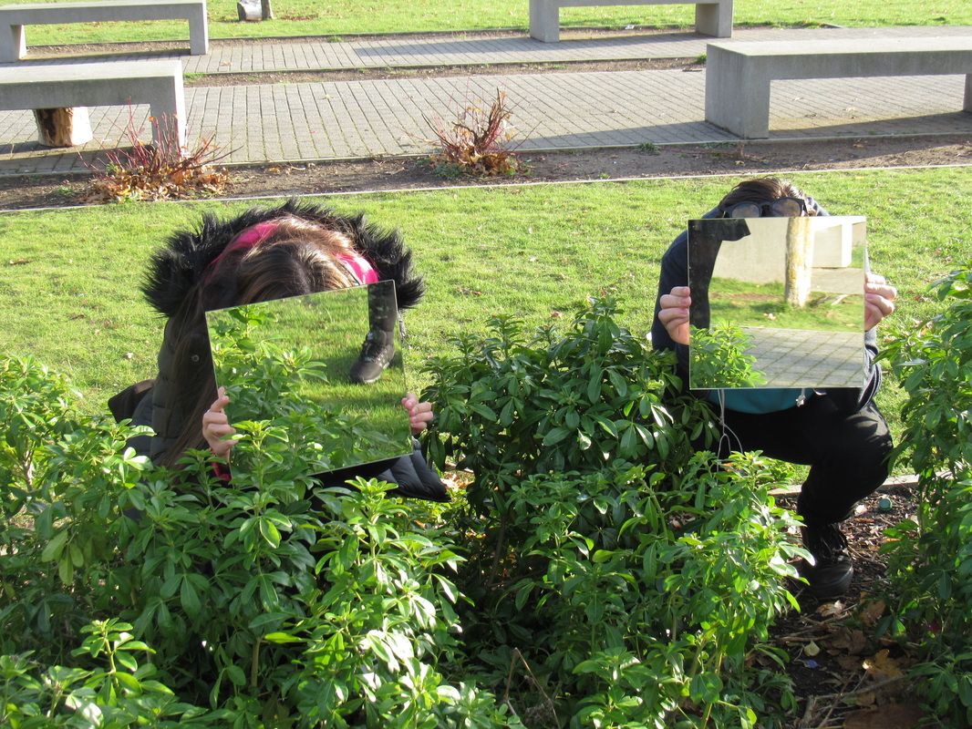
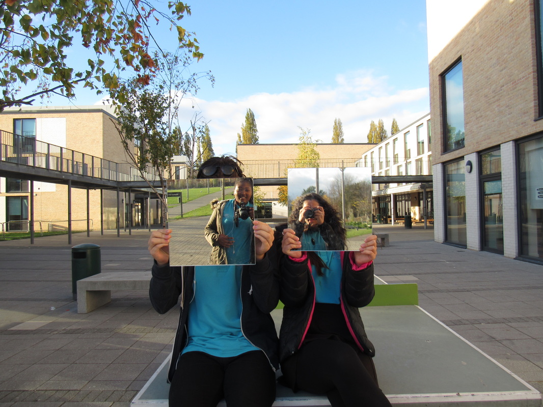
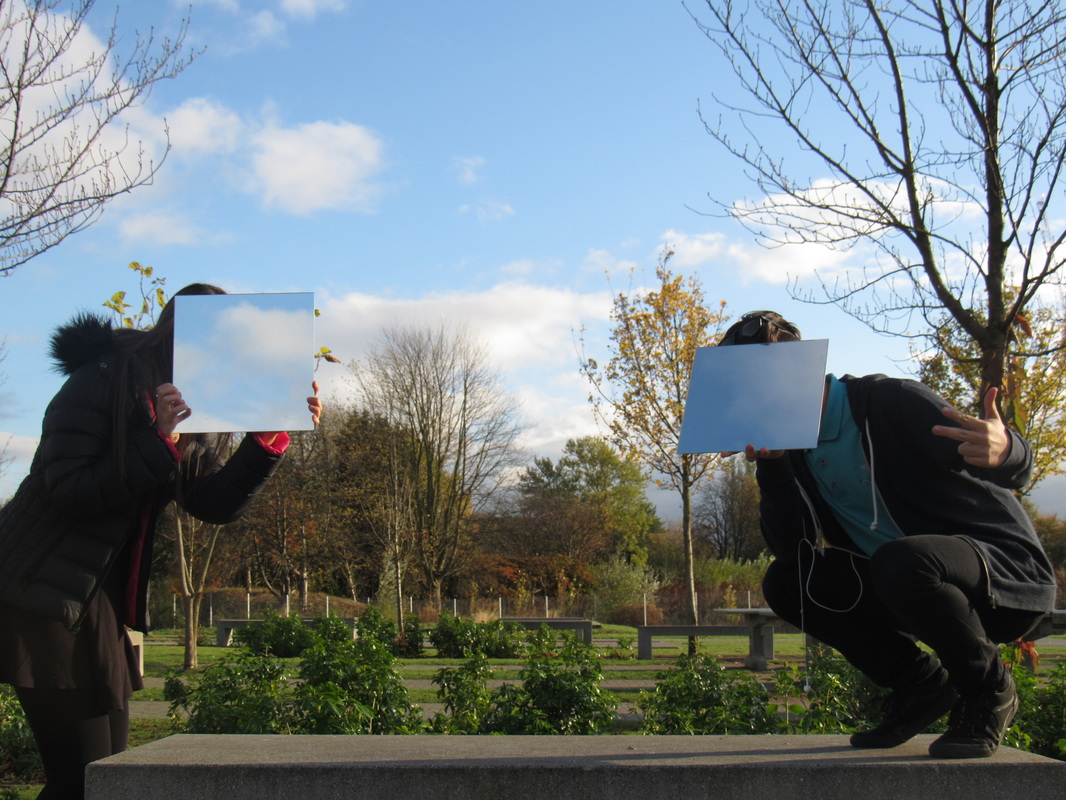
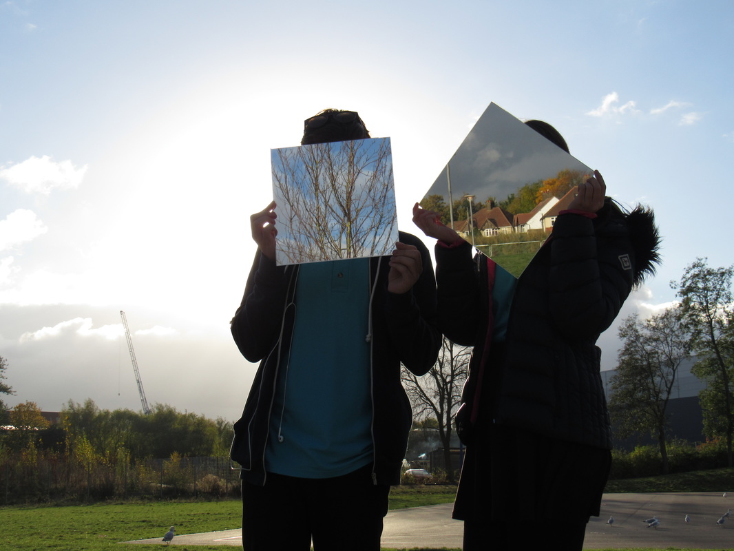
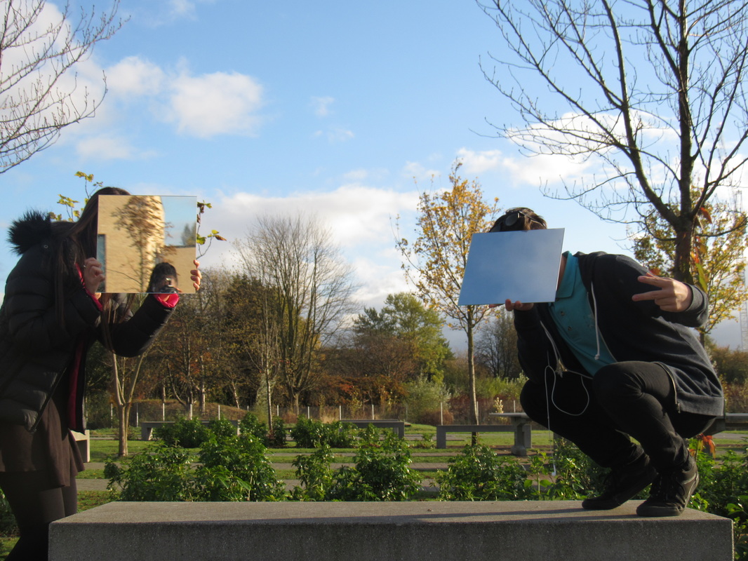
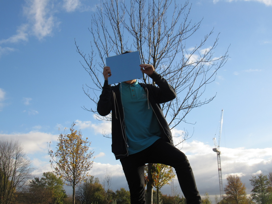
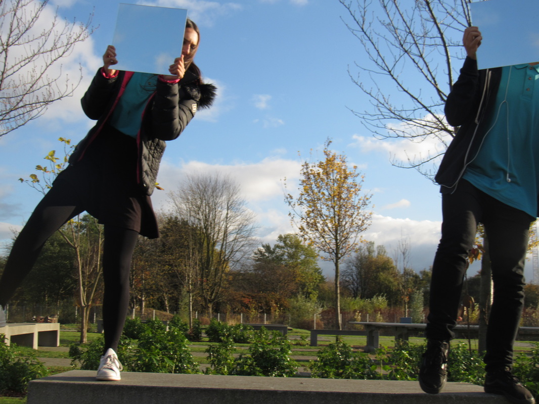
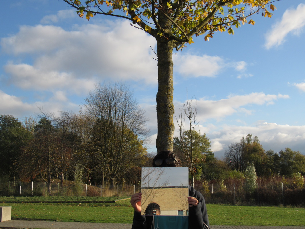
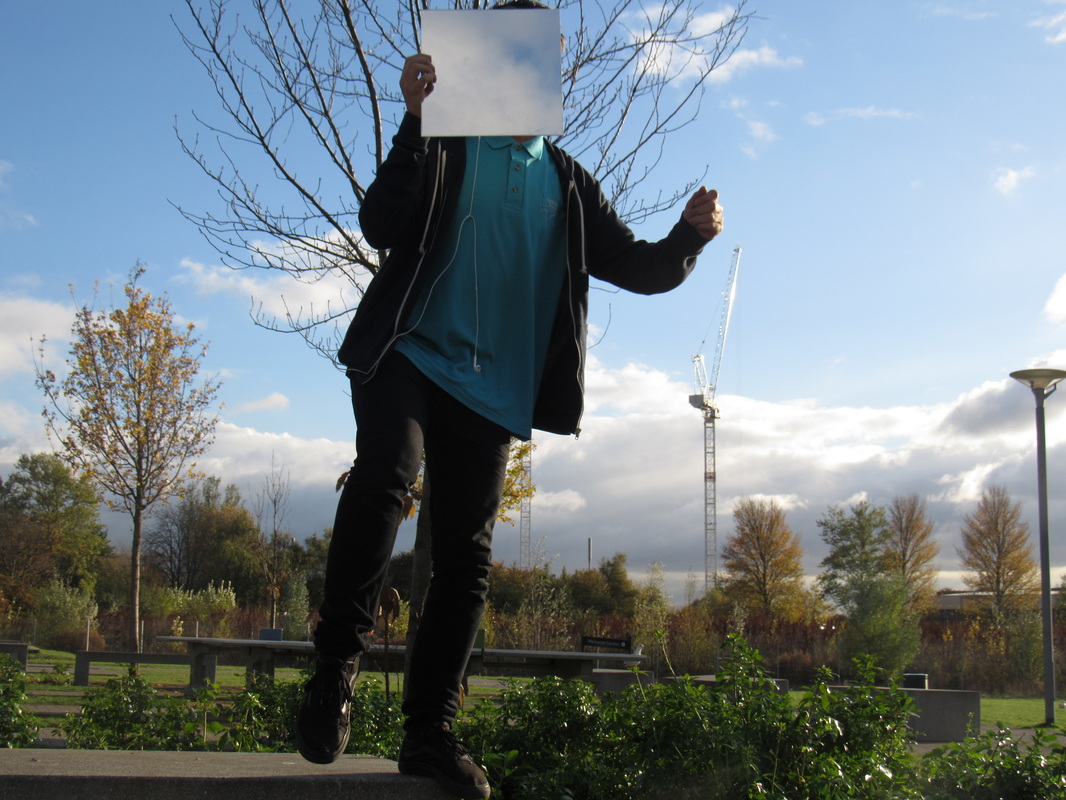
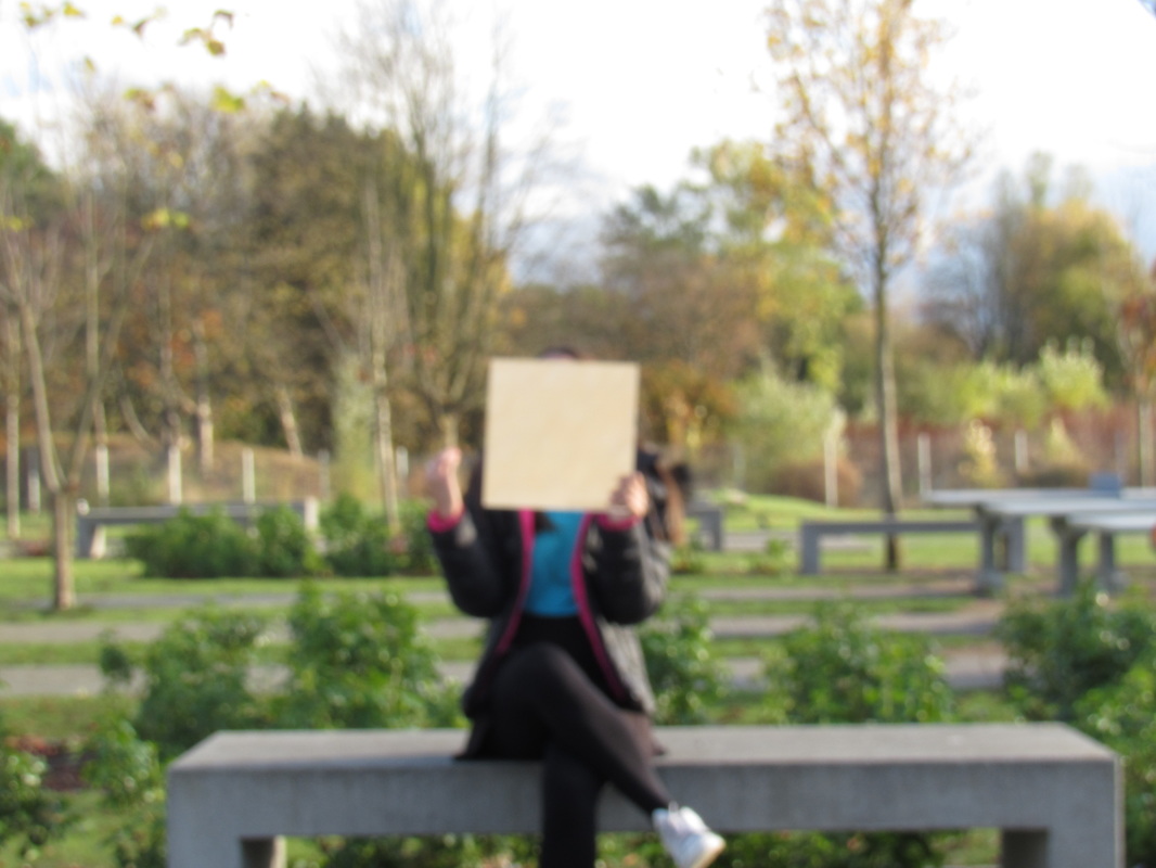
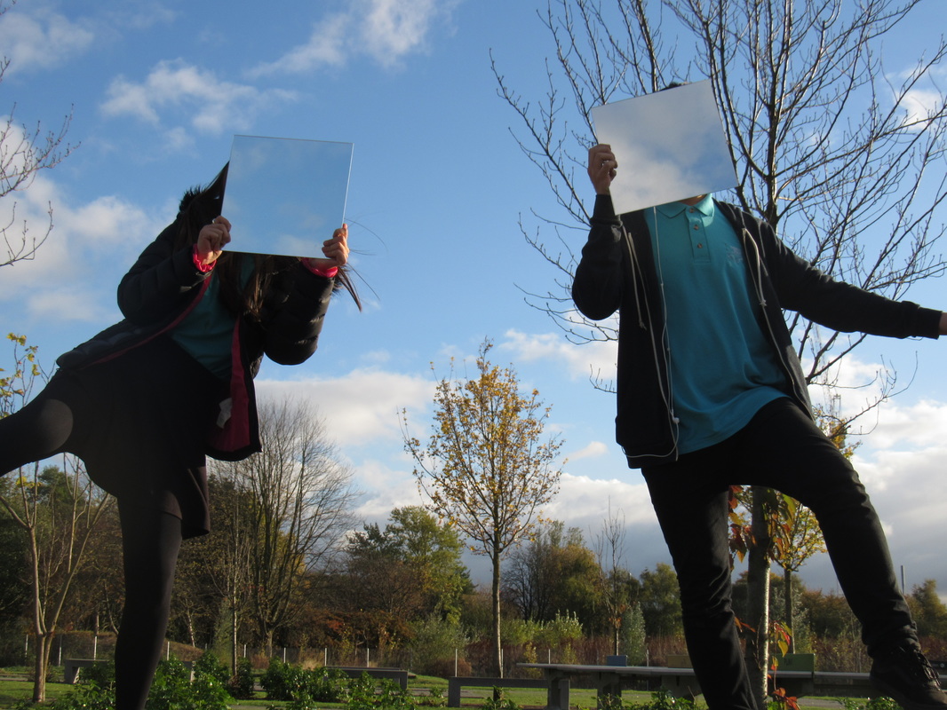
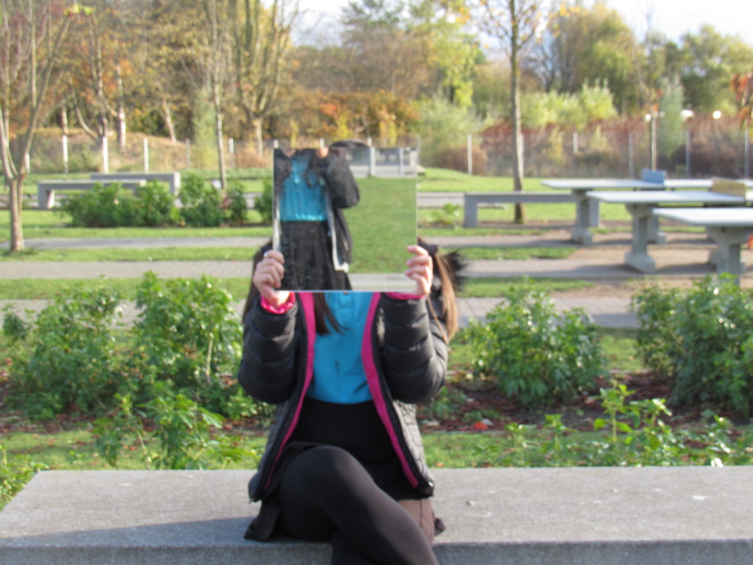
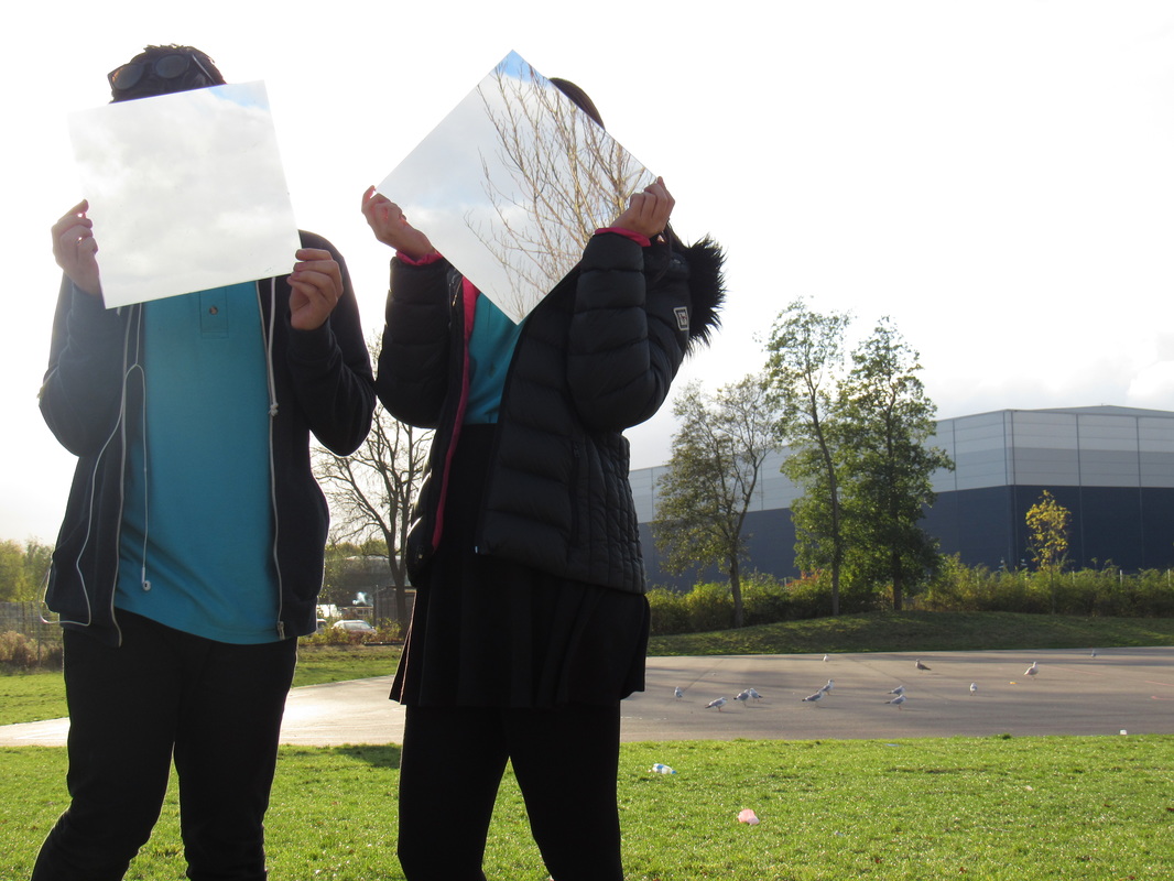
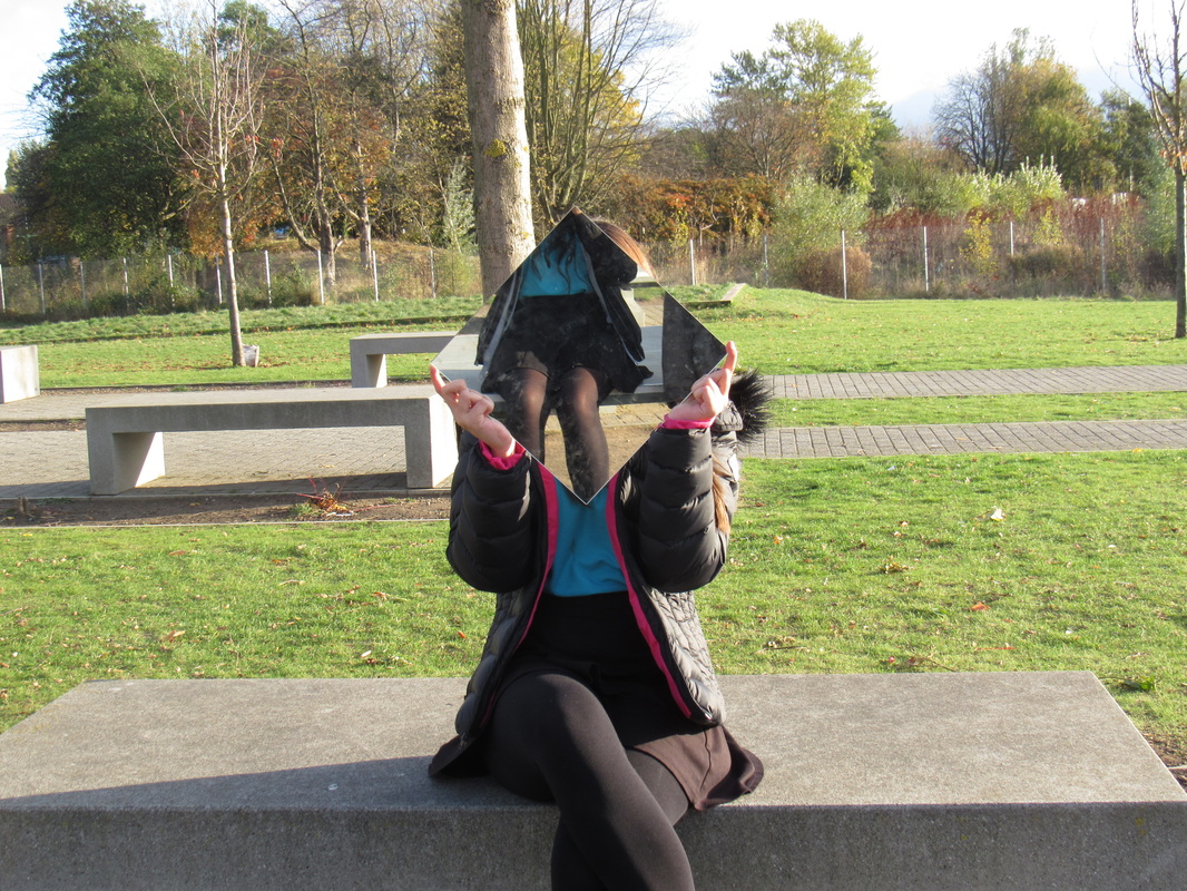
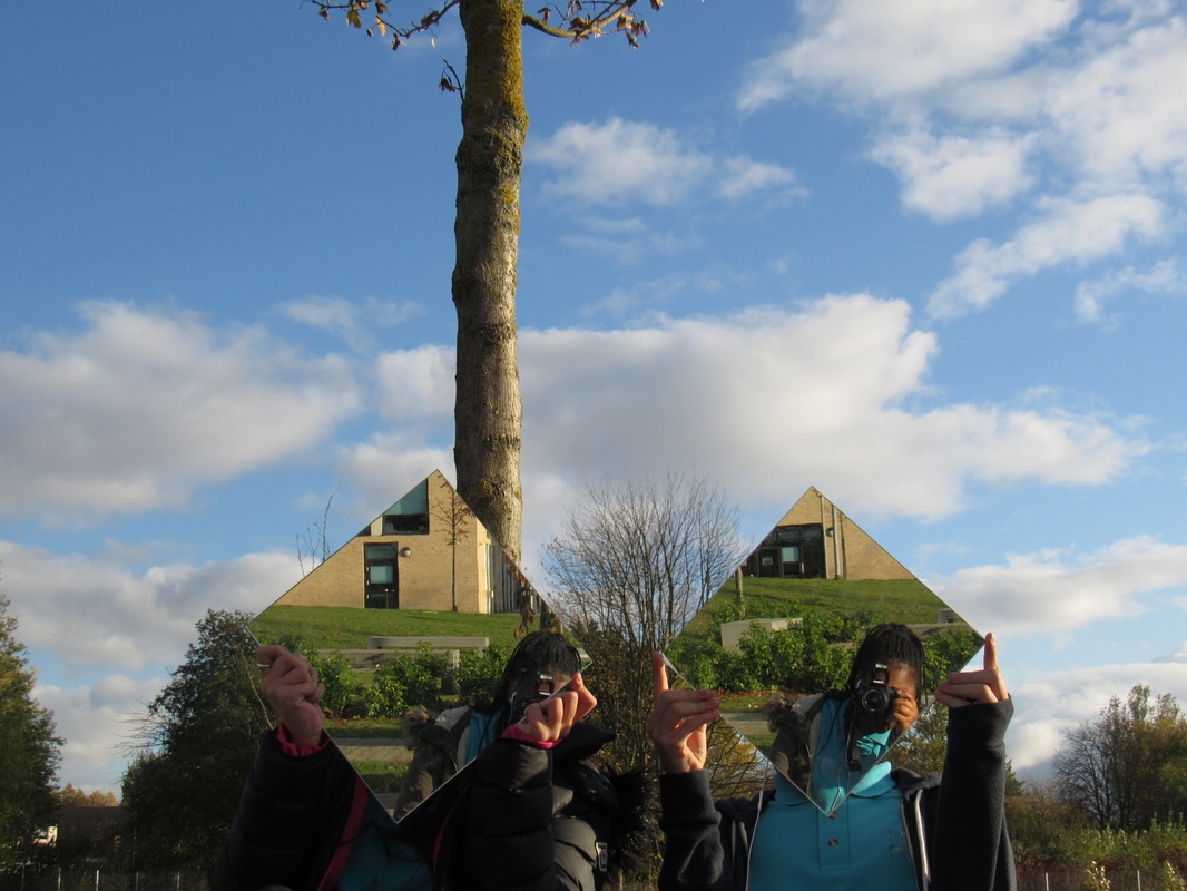
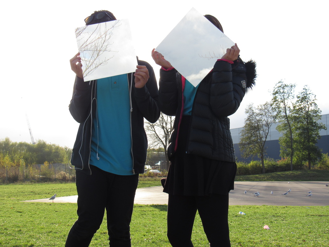
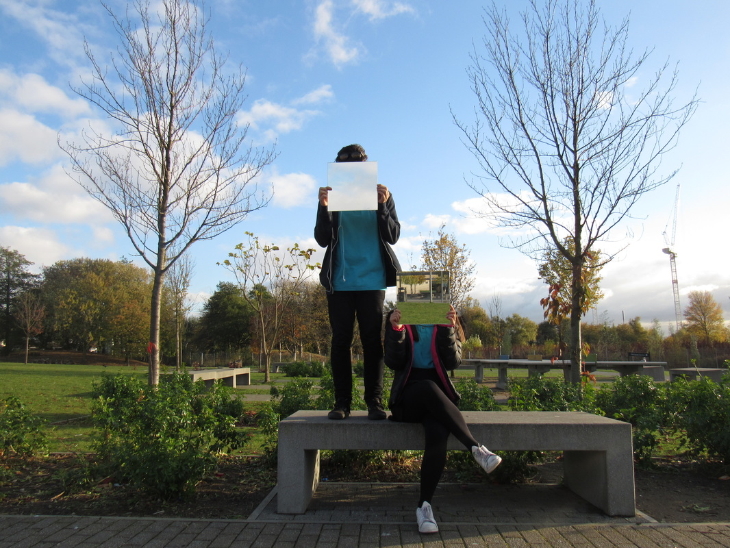
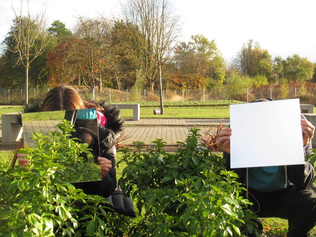
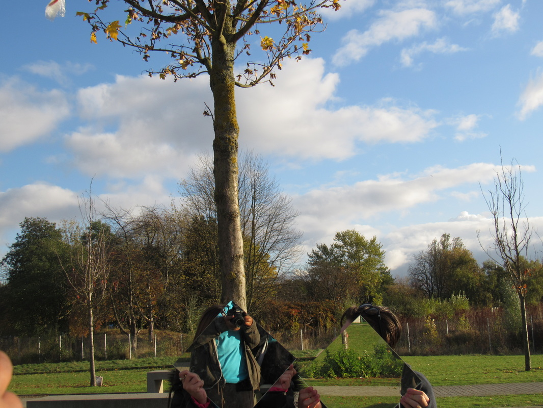
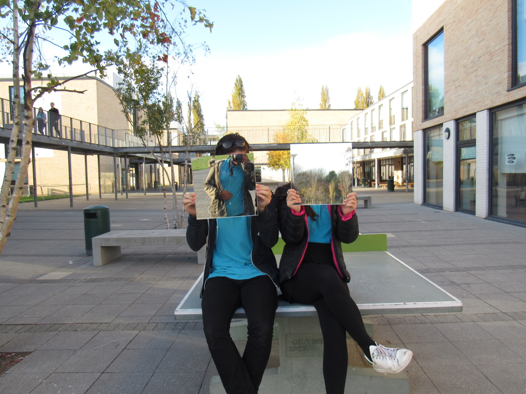
another attempt

This was my other attempt on the natural world. I used mirrors to cover up the main object to switch it so the background it the main subject. I think I could improve by changing composition and colour to make the pictures more interesting. I could also edit it to make it more different. What went well was I resulted with what I aimed for. What I have learnt from photographers is that you can make photos more interesting by taking the focus off of the main subject and making the natural background stand out more. I used mirrors to instead of looking at their faces so the mirror shows the background.
|
|
|


The slideshow about shows photograms I have made and how I used them and added water and ink to them. This makes the photo more salient towards the viewer. I did this to make them more interesting and add colour to make confusion in feeling or make a positive feeling for the bright colours and how the colours are mixed together.
Second Outcome
For my outcome I used Adobe Photoshop to combine pictures from rural and urban areas.
I chose to combine two images into one image using photoshop. But I used a image from a more rural area and the other from urban/city area, I chose to do this because it shows the contrast between the Natural World and artifial life
