The Formal Elements
Abstraction makes you look at a picture but doesn't completely show the main object of the picture, it makes you look at the lines and shades of a picture and makes you use your imagination to find out what it is. The main elements are:
Focus: Which areas appear clearest or sharpest in the photograph? Which do not?
Light: Which areas of the photograph are the brightest? Are there any shadows? Does the photograph allow you to guess the time of the day? Is the light natural or artificial? Harsh or soft? Reflected or direct?
Line: Are there objects in the photograph that act as lines? Are they straight, curvy, thin, thick? Do the lines create direction in the photograph? Do they outline? Do the lines show movement or energy?
Repetition: Are there similarly looking objects in the picture? Do you see many of the same looking object? Is an object repeating itself? Are objects straight, curvy, thin, thick? Do the lines/objects create direction in the photograph? Do they outline? Do the lines/objects show movement or energy?
Shape: Do you see geometric (straight edged) or organic (curvy) shapes? Which are they?
Space: Is there depth to the photograph or does it seem shallow? What creates this appearance? Are there important negative (empty) spaces in addition to positive (filled) spaces? Is there depth created by spatial illusions i.e. perspective?
Texture: If you could touch the surface of the photograph how would it feel? How do the objects in the picture look like? How would they feel?
Value/Tone: Is there a range of tones from dark to light? Where is the darkest value? Where is the lightest?
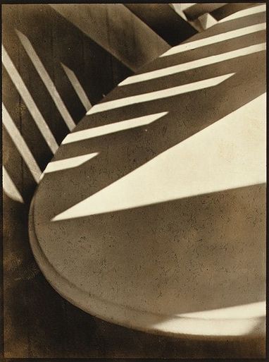
Paul Strand
|
This photo was made by Paul Strand.
Focus: The image is focused and visible but you can't completely tell what it is when you first look at it. Light: The light shines on the object(s) and makes them not easy to see. This photo is a picture of a table but you can't originally spot what it is by first look. Line&Shape: There are multiple lines in this picture, especially strong straight ones created by light and shadow. The table is revealed by a huge curve going around, and that shows it could be a table. Lines are geometrically made by man made objects and it looks like there is a staircase and the table is right under it. Repetition: The lines are repeating across the table, they're in parallel with each other, more than across each other. Space: The photo looks like it was taken quite close to the main object. Texture: The object(s) in the image look(s) pretty smooth, so if you touched it, it would be smooth. The shadow being straight and not lumpy or not ridged creates the smooth feeling. Value/Tone: In the photograph there are different tones, shades, shadows and bursts of light created. The photo looks brownish because it might have been taken quite some time ago, or it could've been because of the quality of paper the photographer used for the photo, or he deliberately made it like that as he wanted it to look old. |
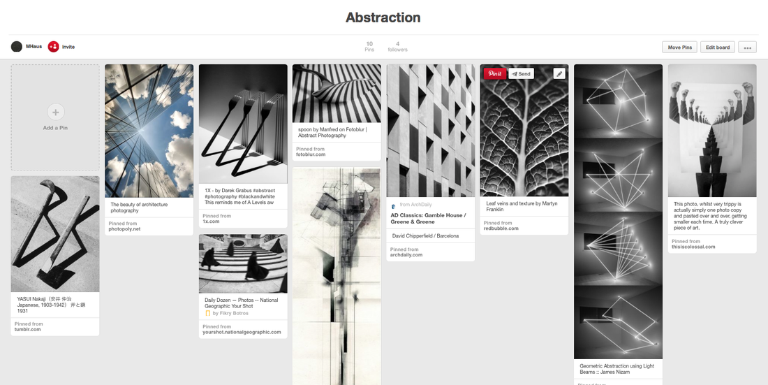
This is my pinterest page, I store abstract pictures here that I found from other photographers.
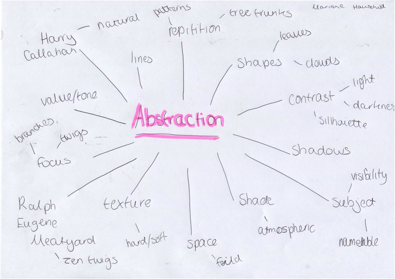
This is a mind map I made of what I thought abstraction included:
|
|
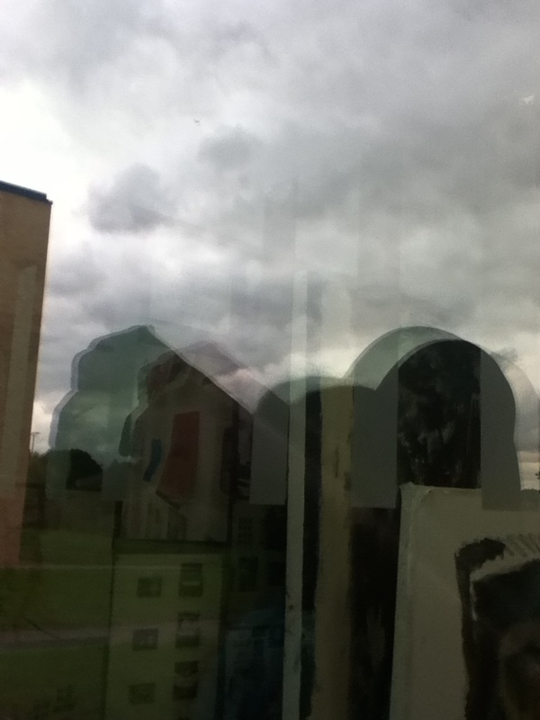
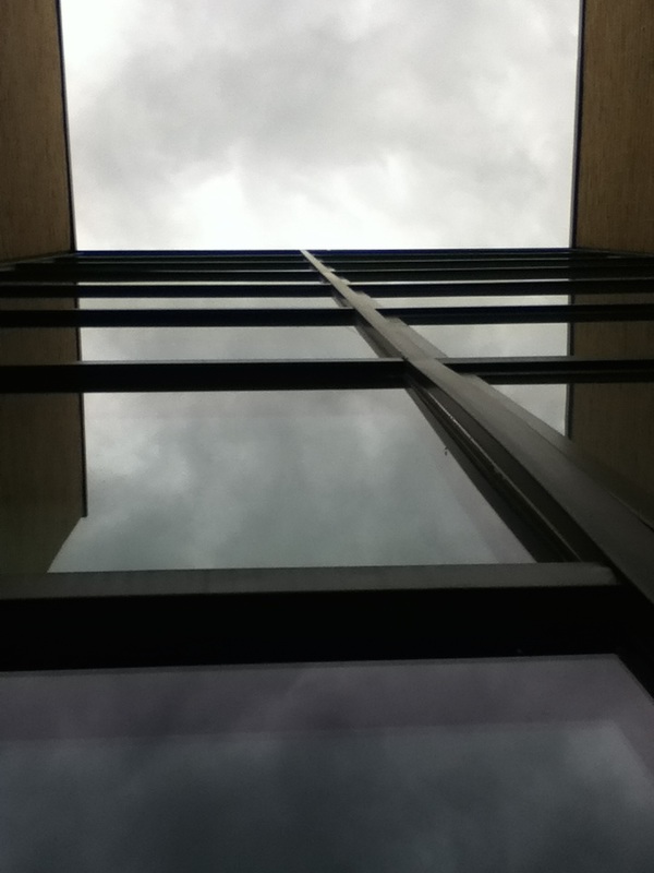
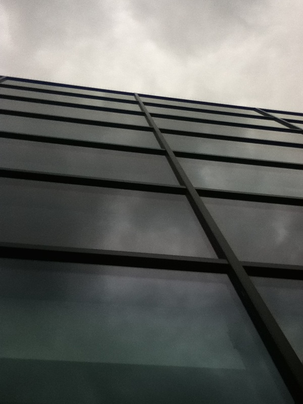
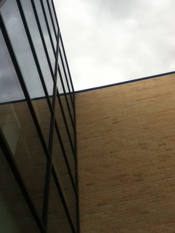
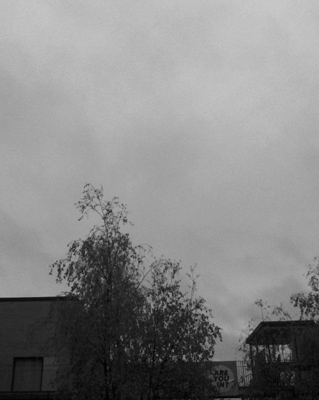
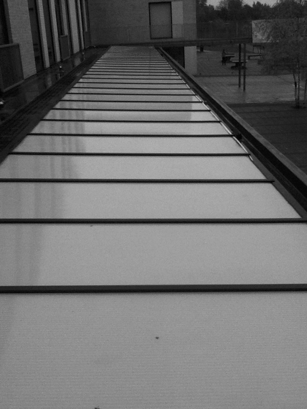
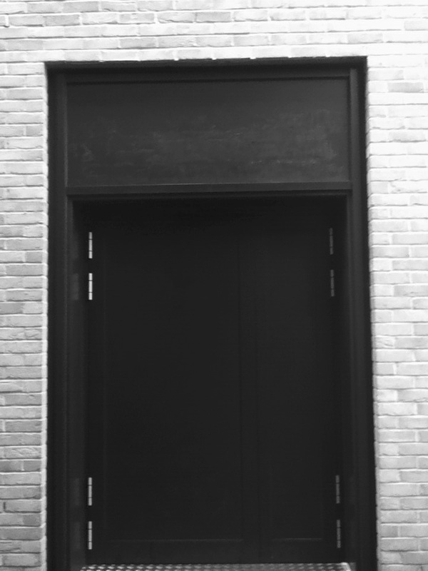
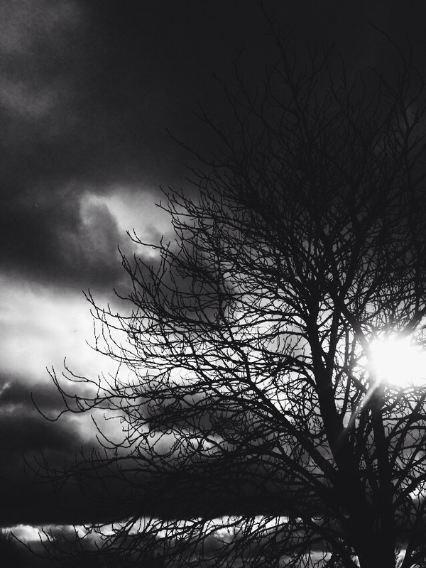
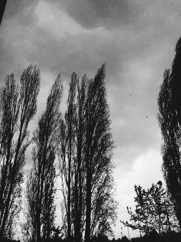
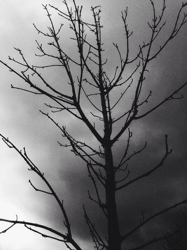
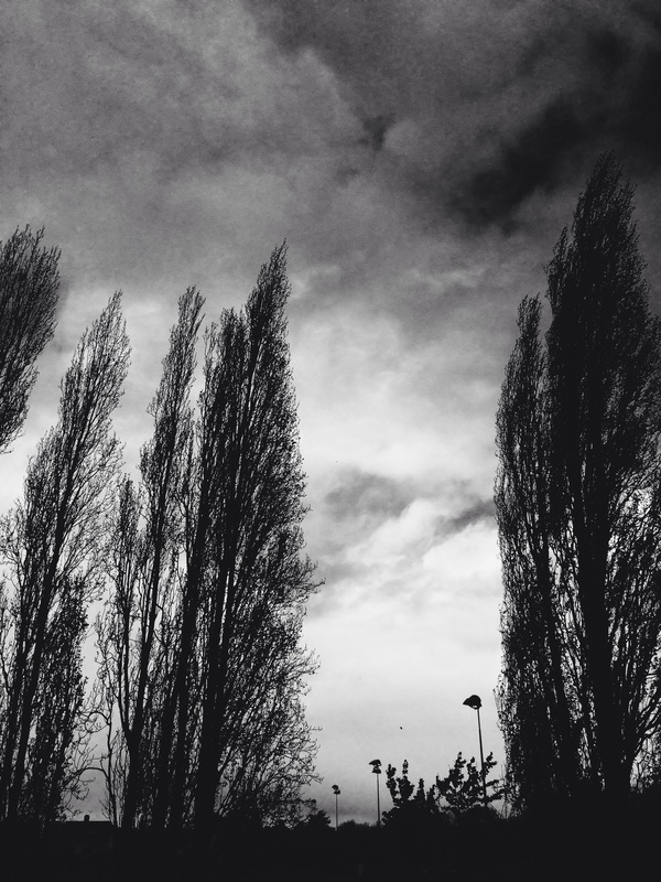
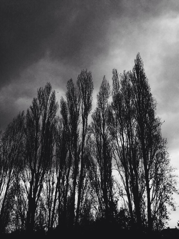
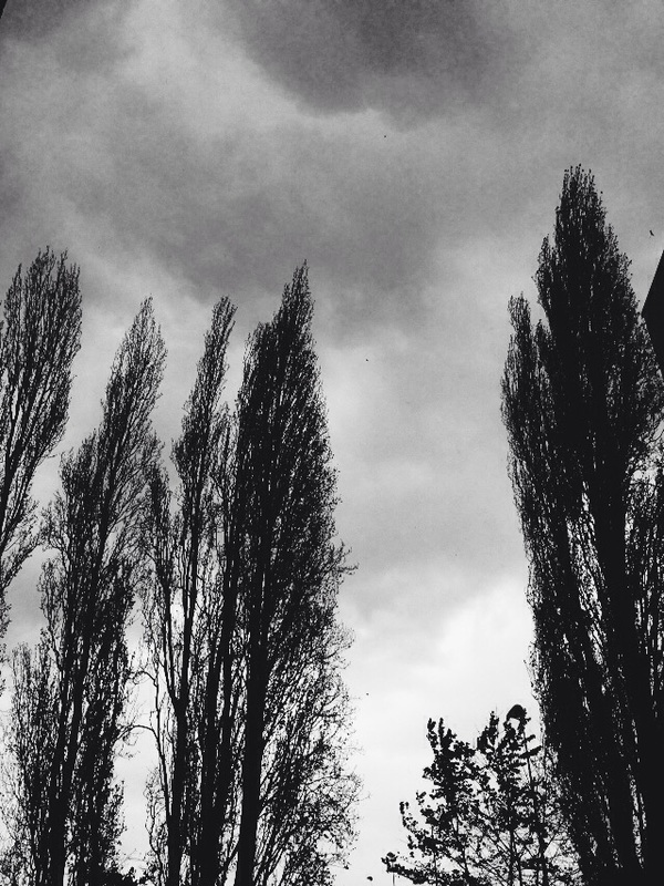
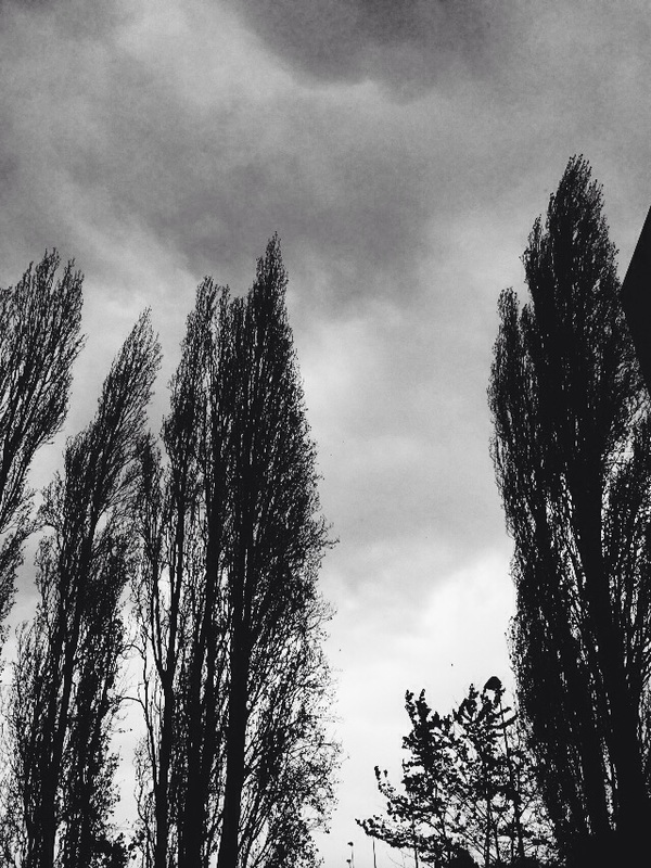
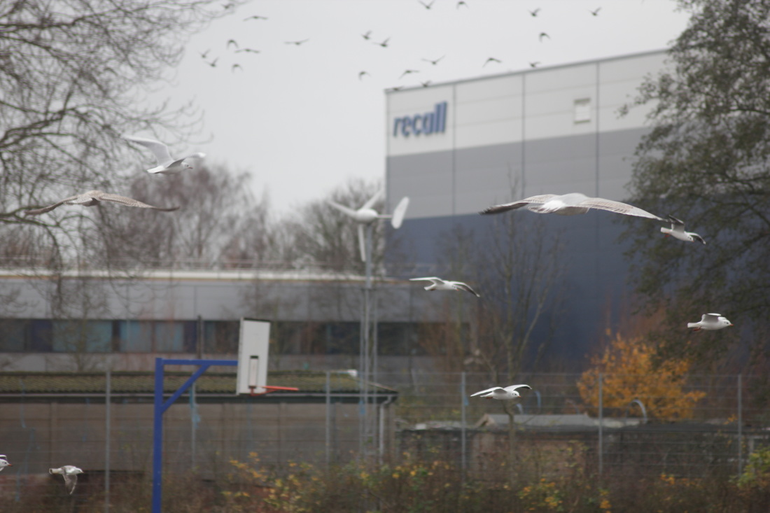
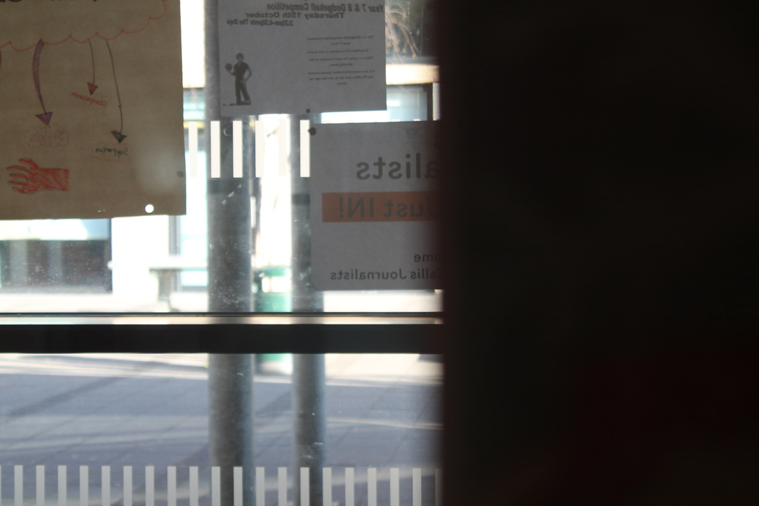
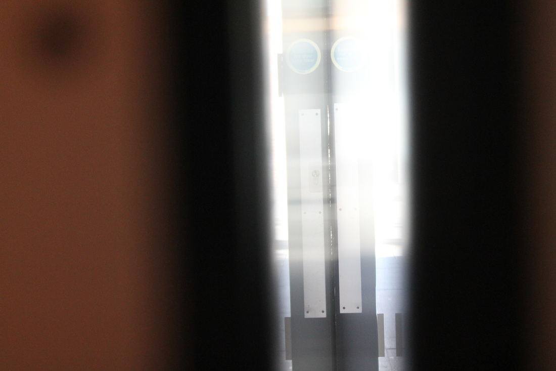
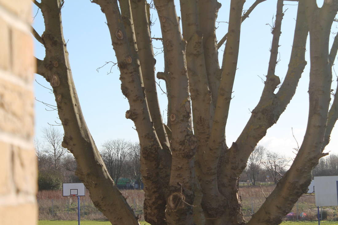
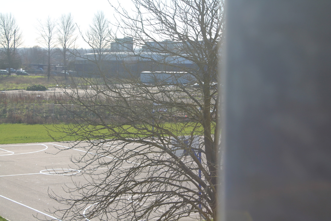
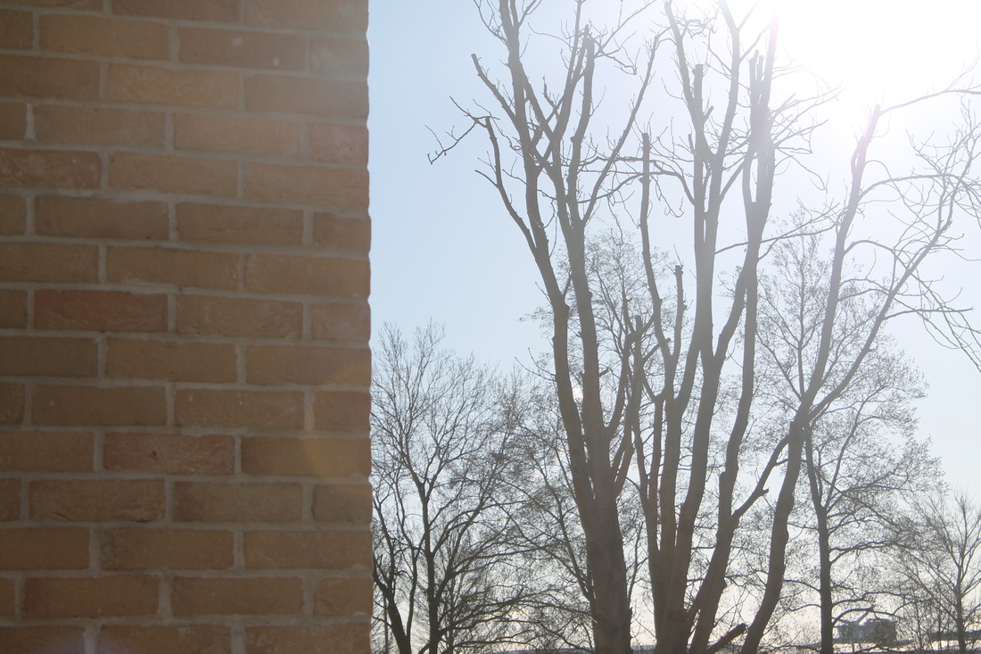
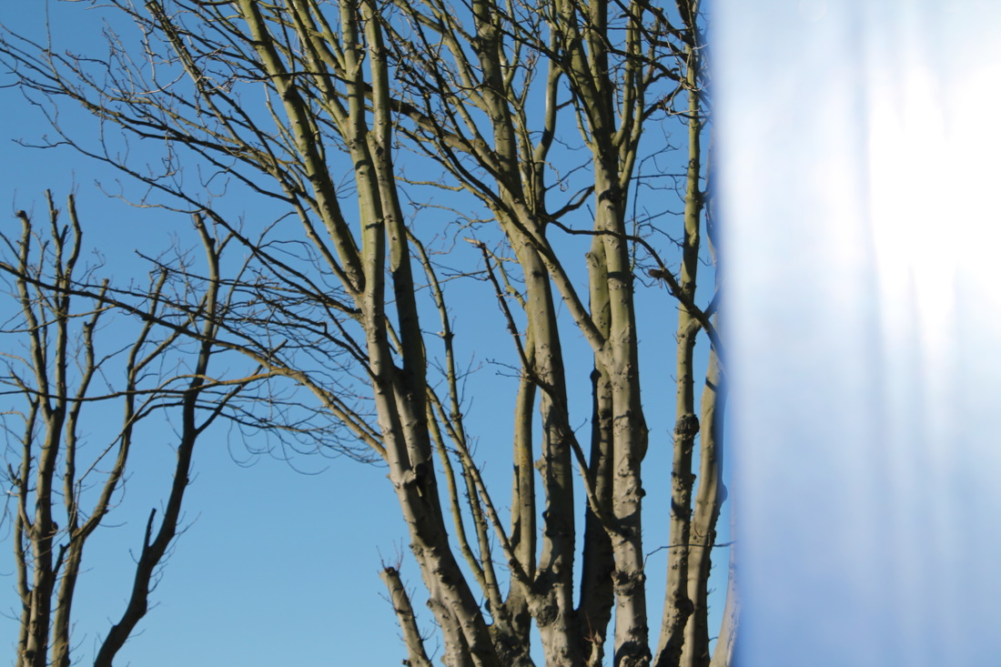
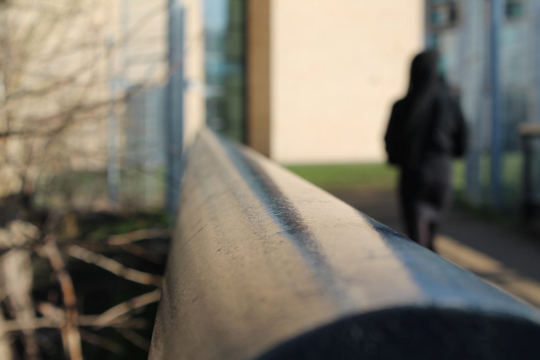
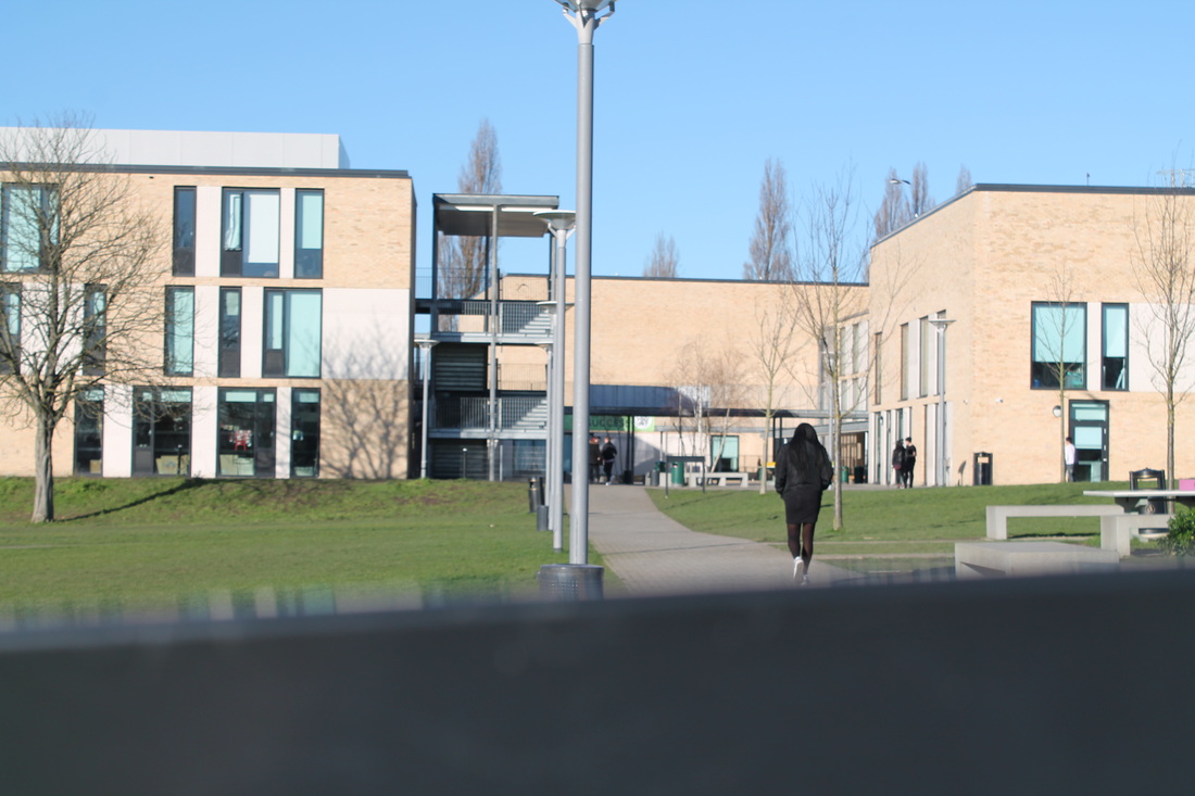
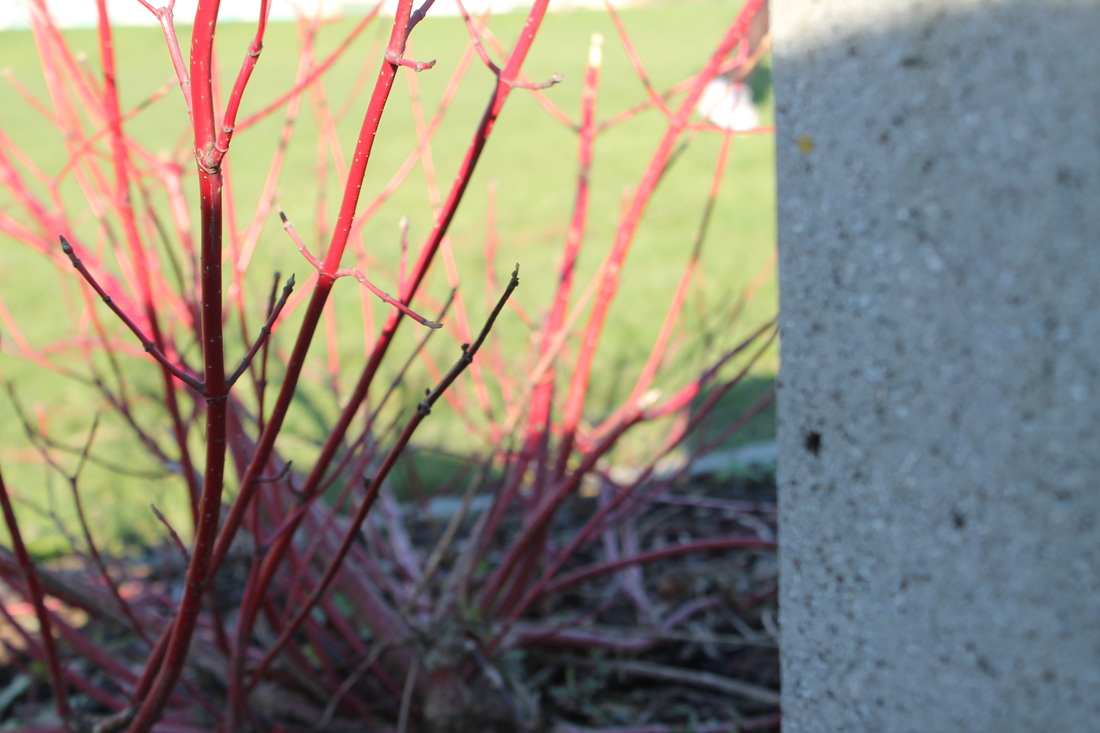
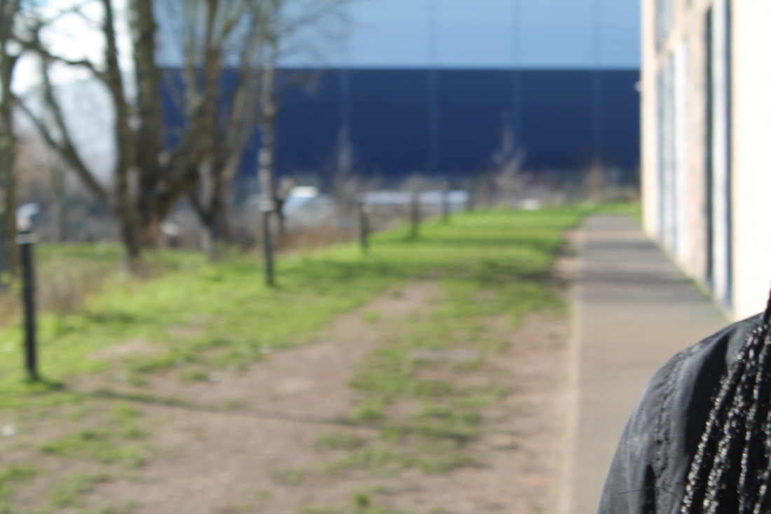
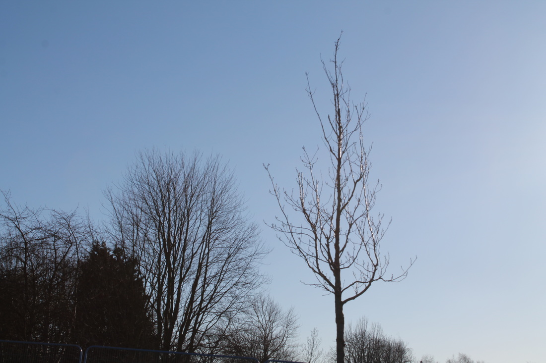
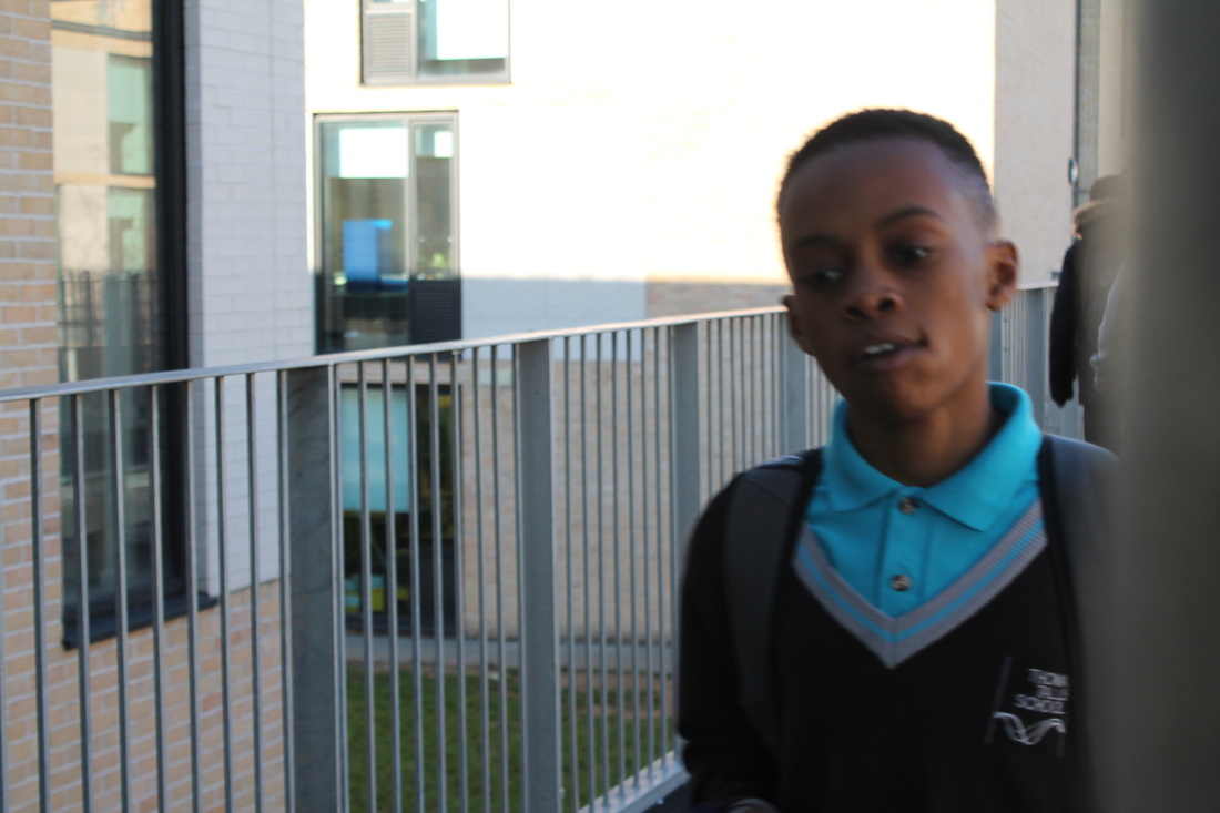
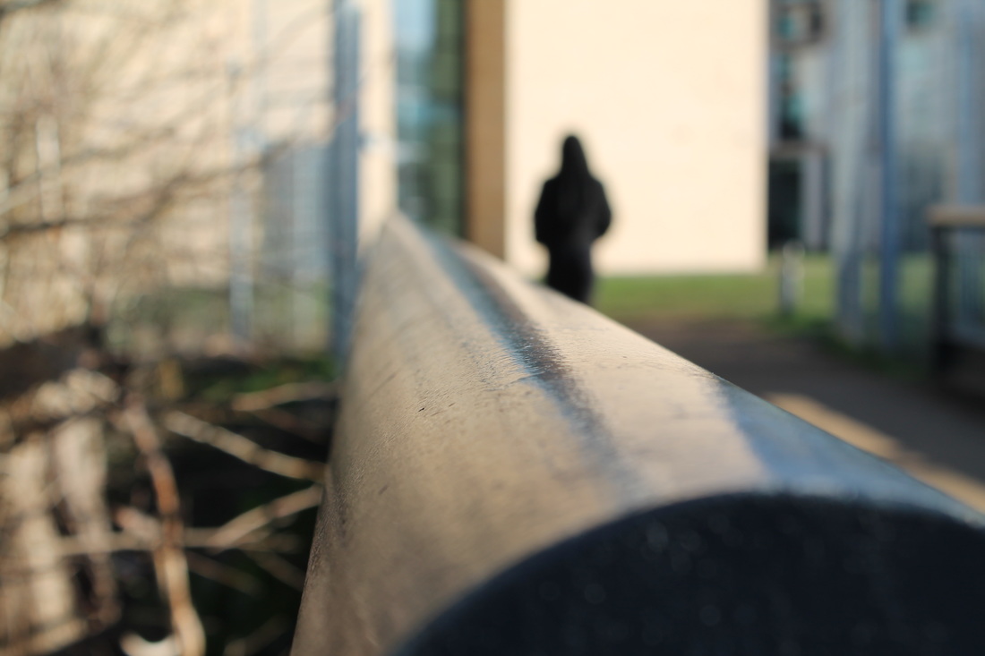
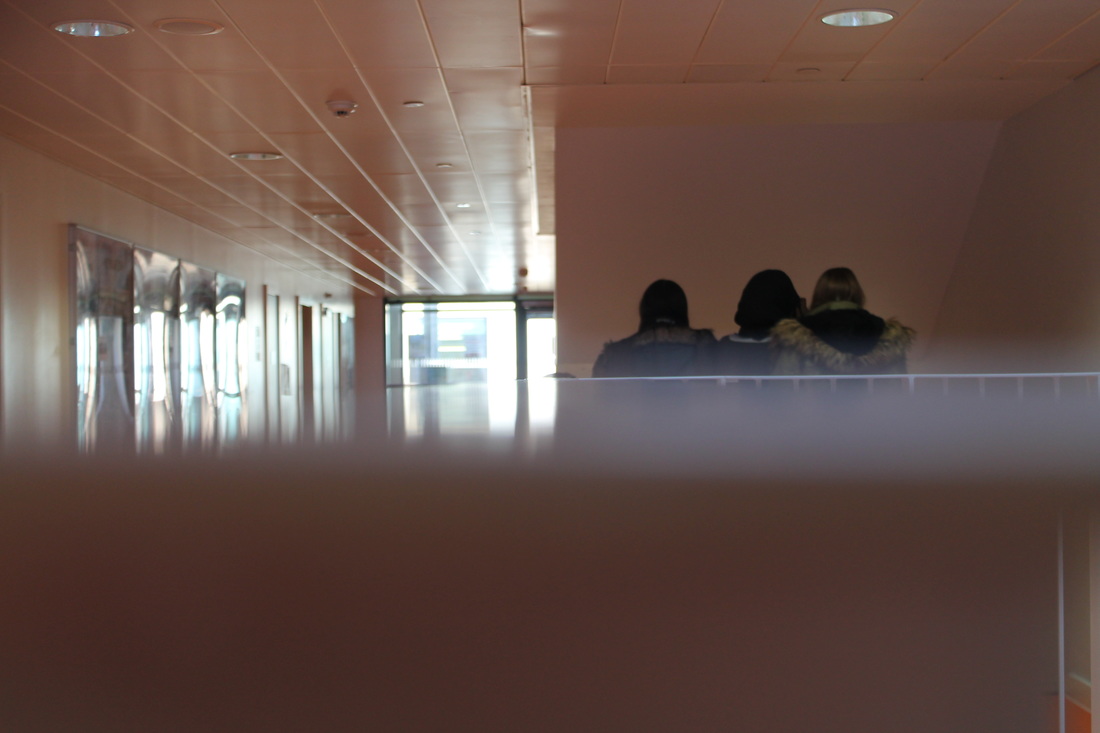
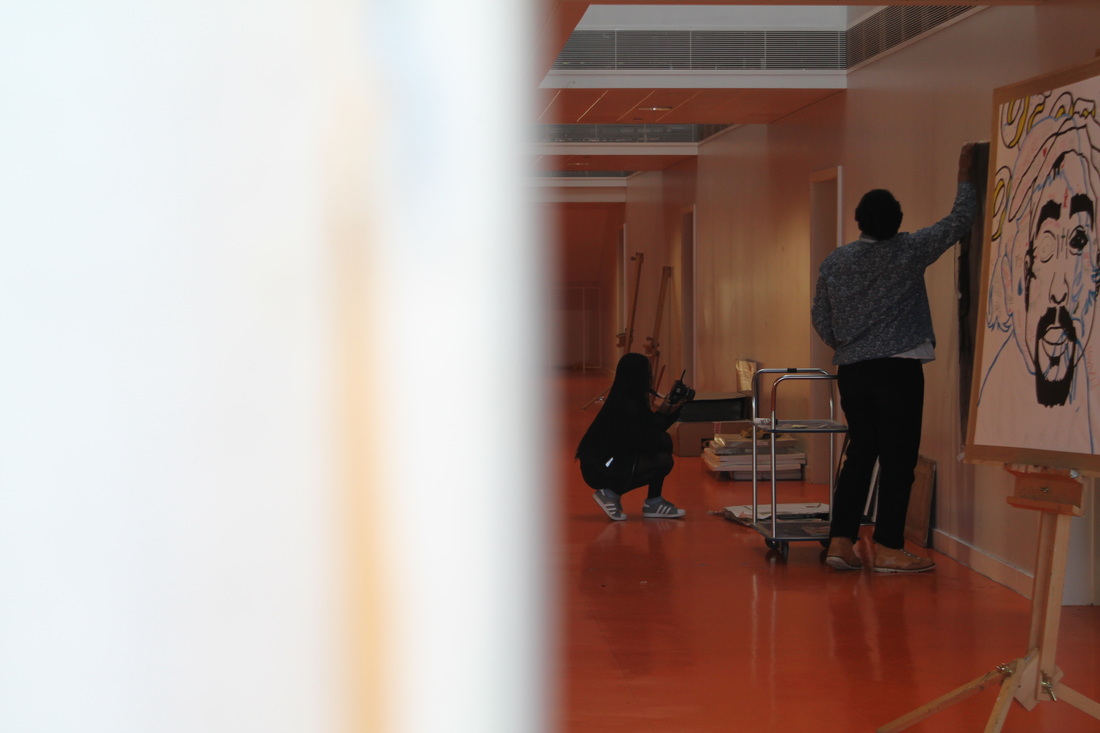
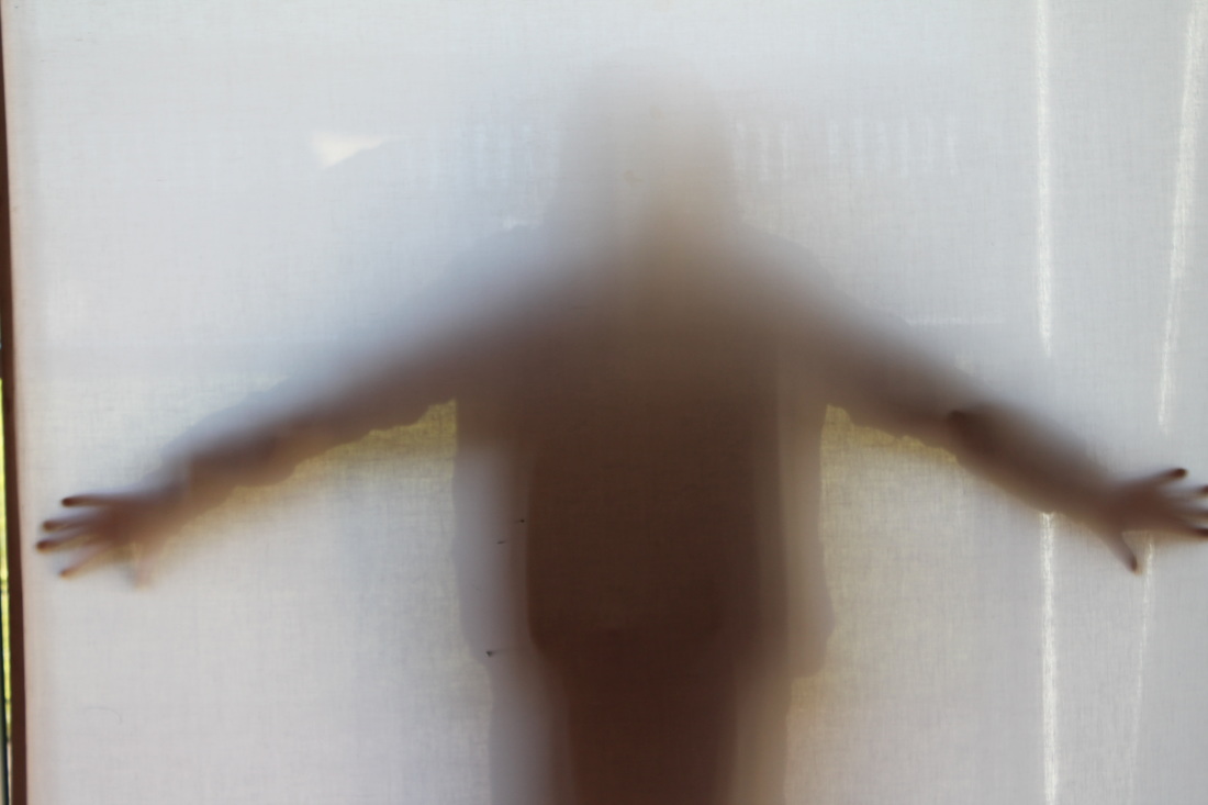
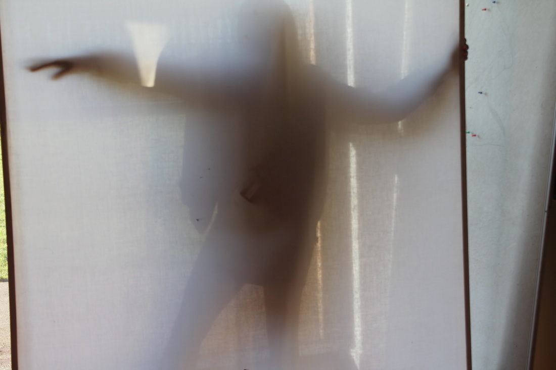
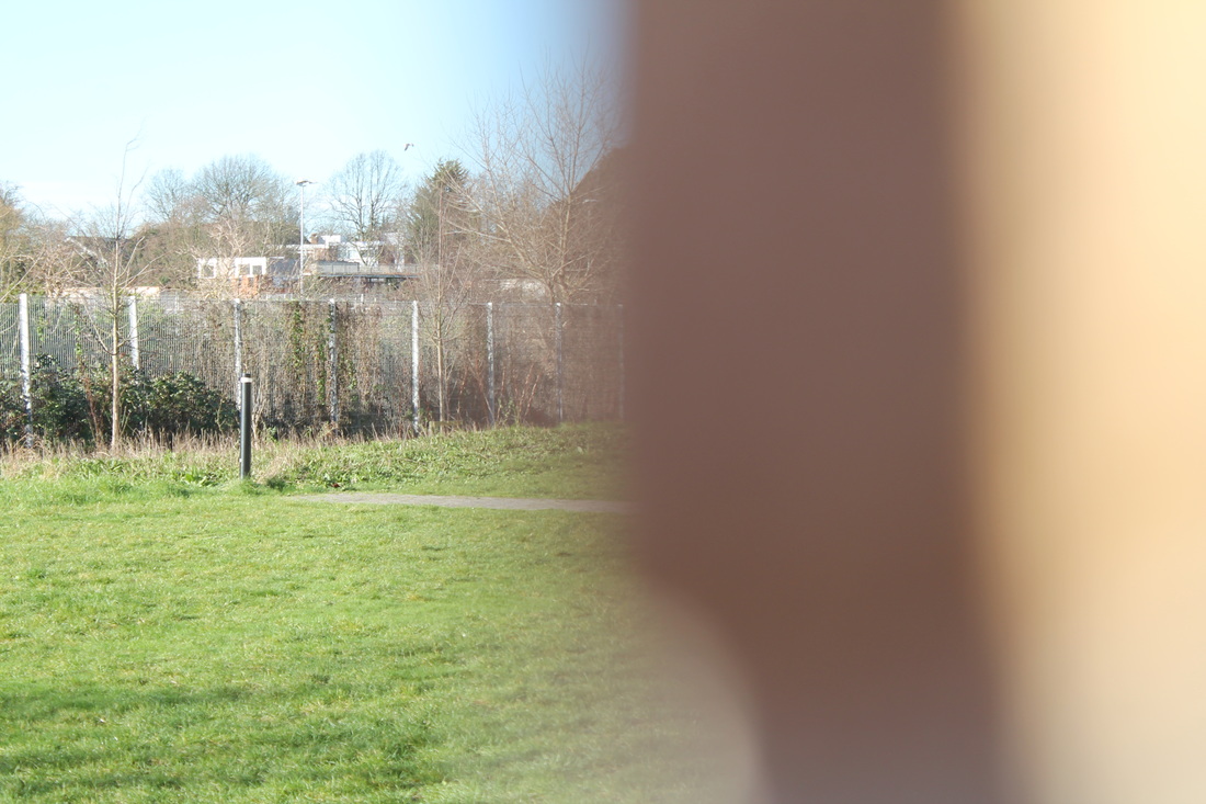
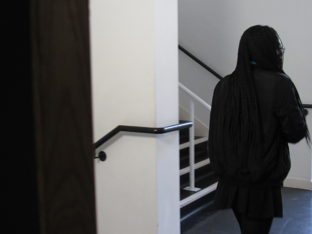
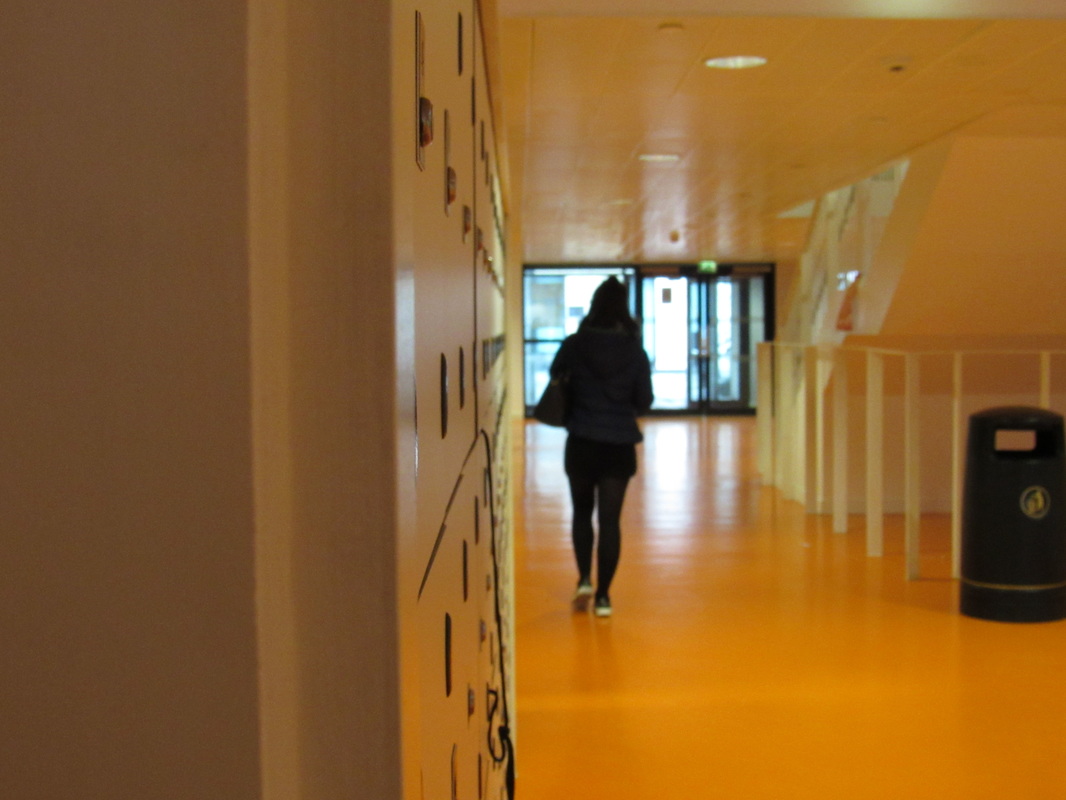
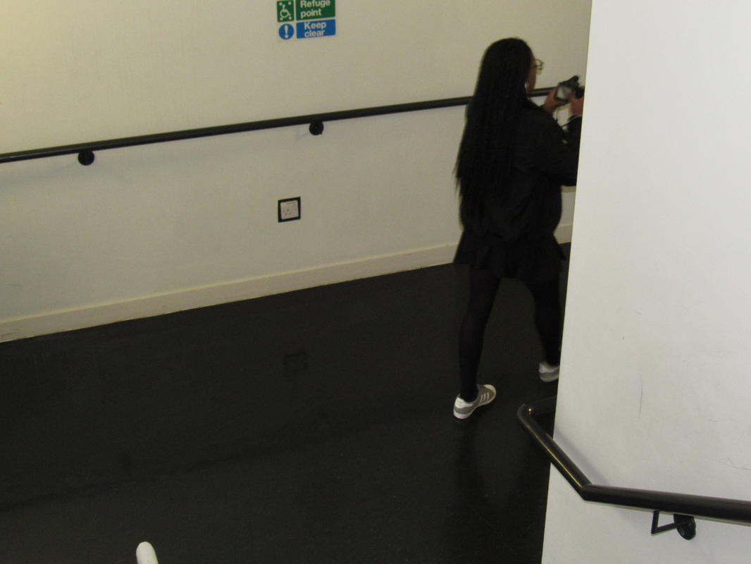
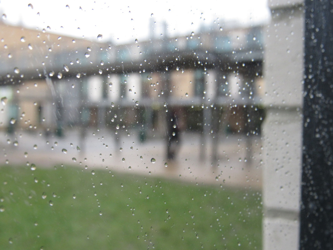
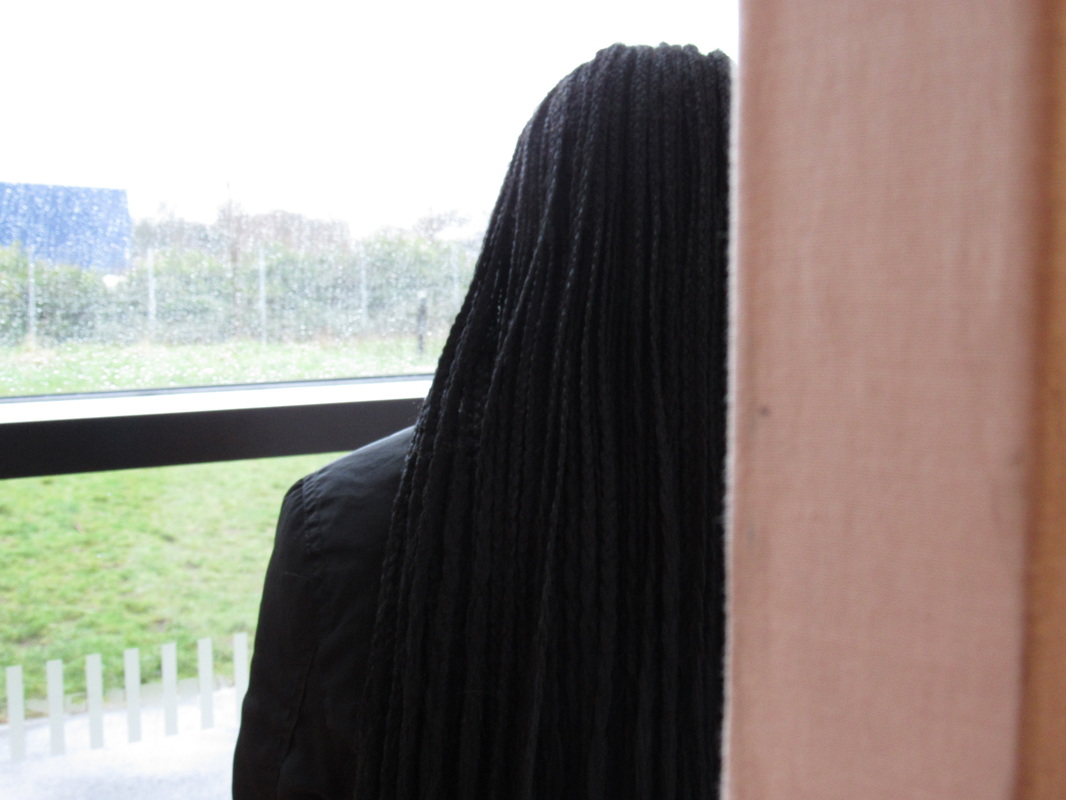
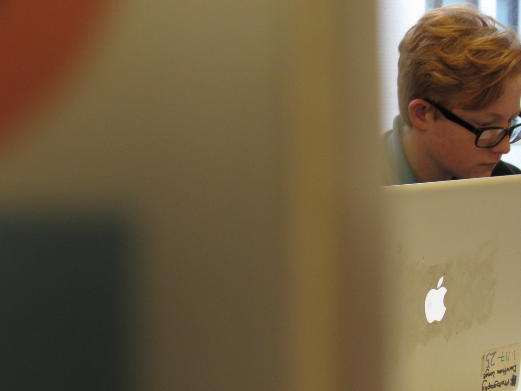
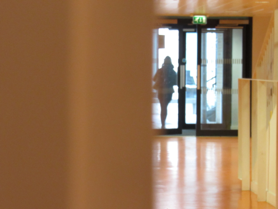
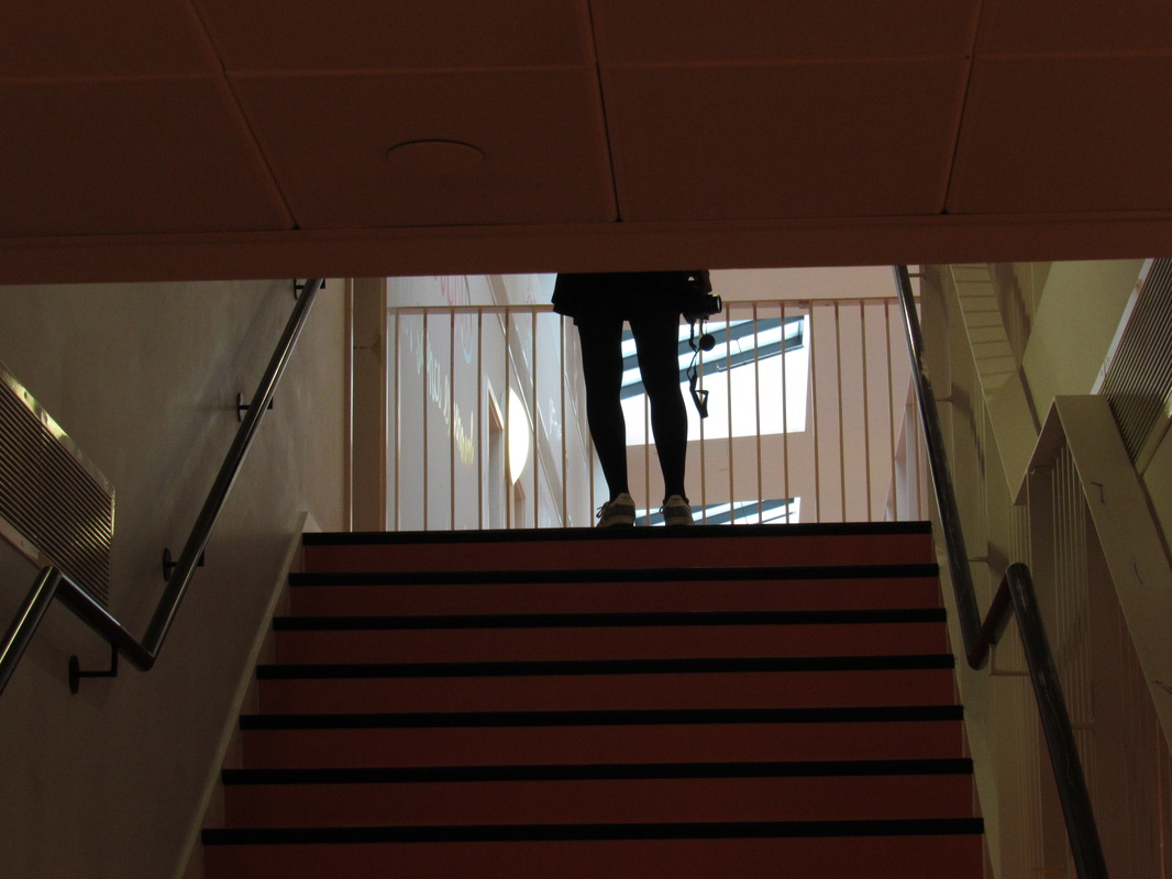
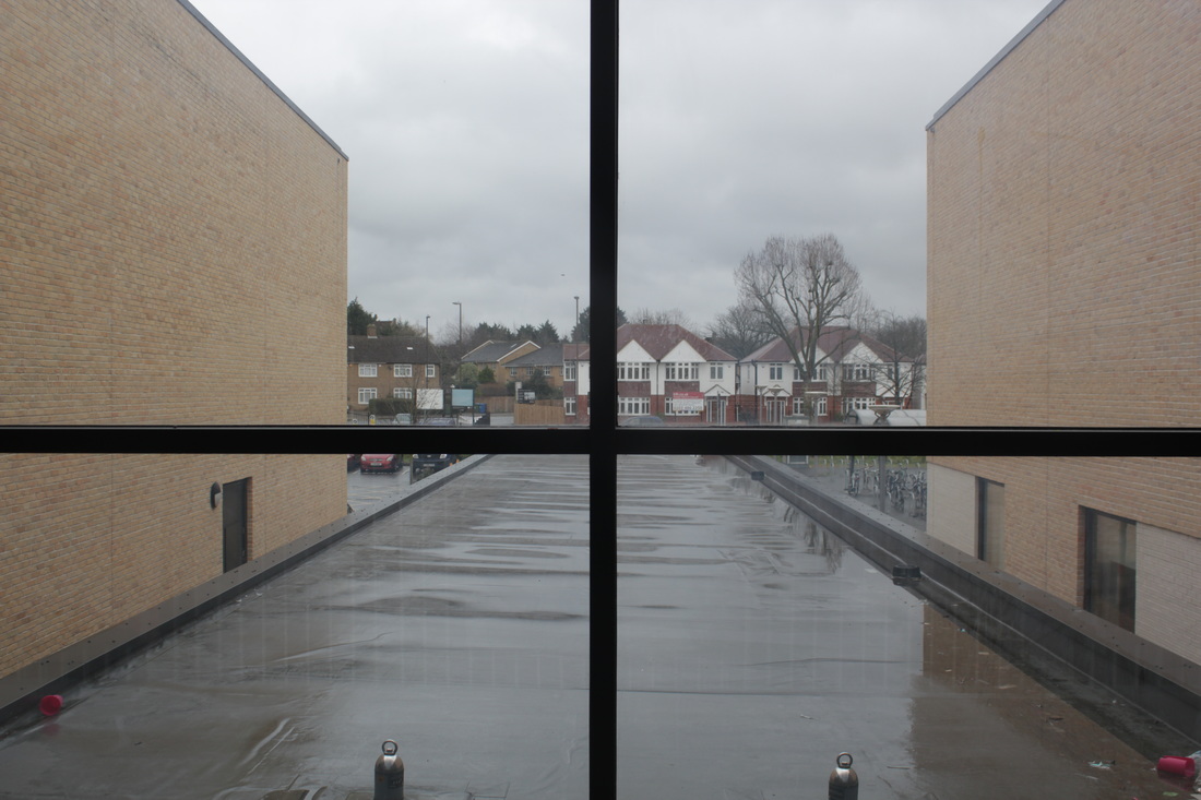
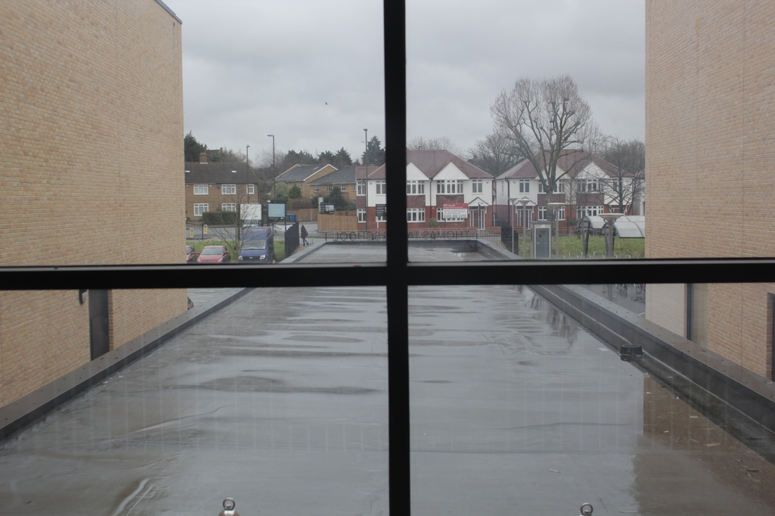
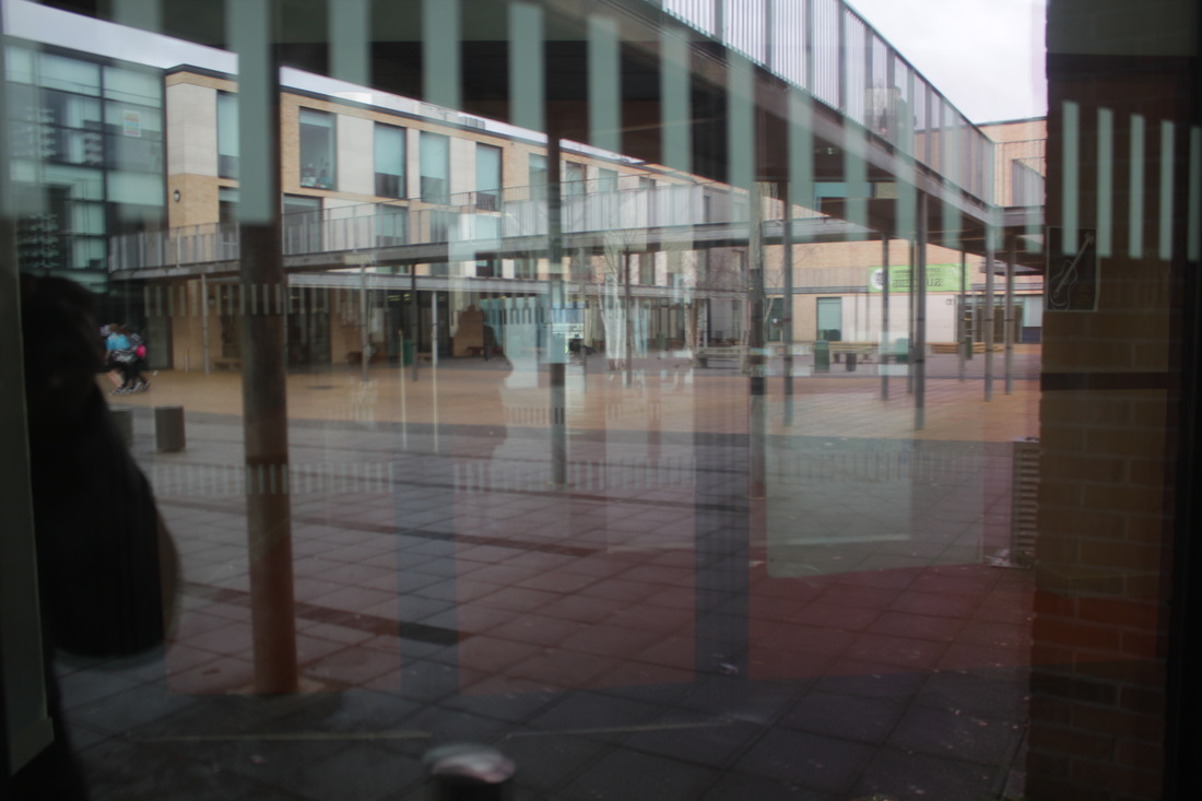
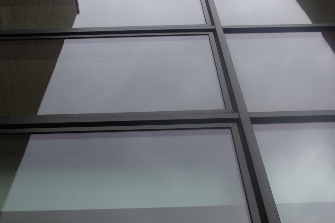
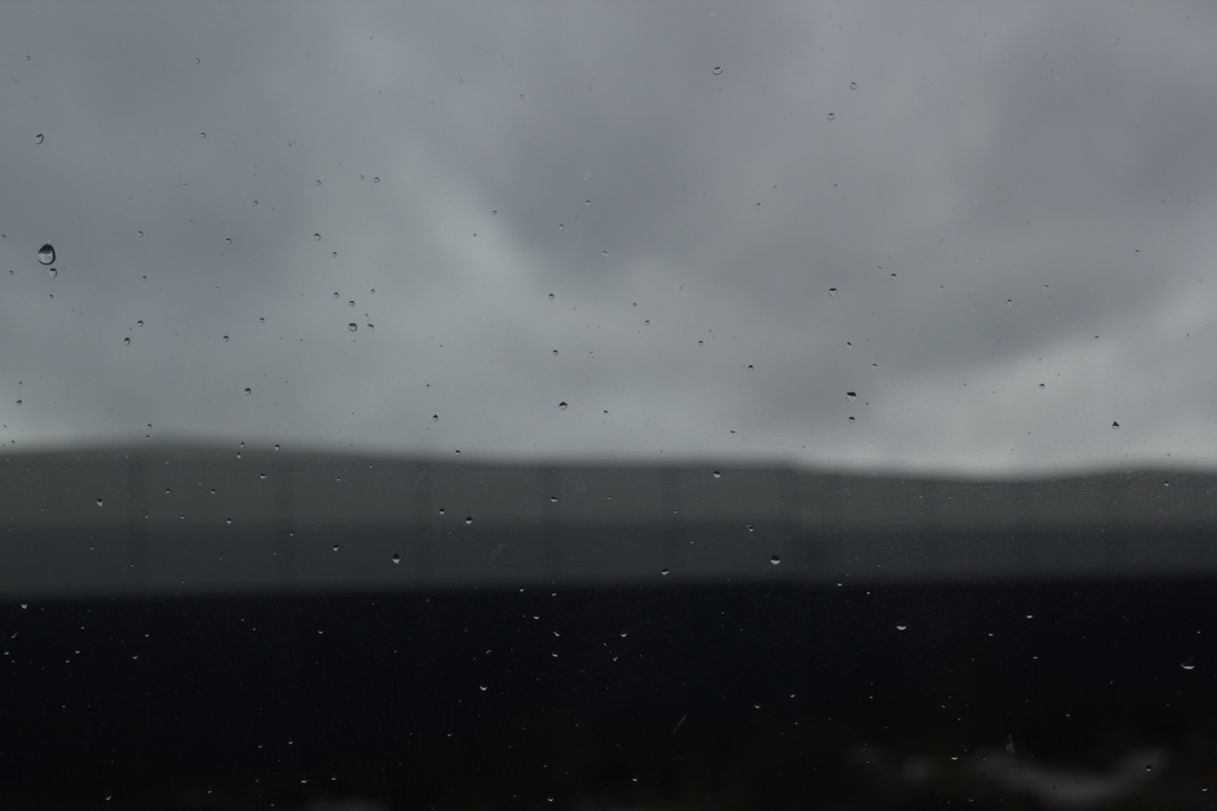
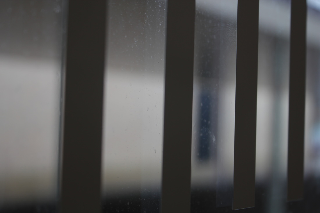
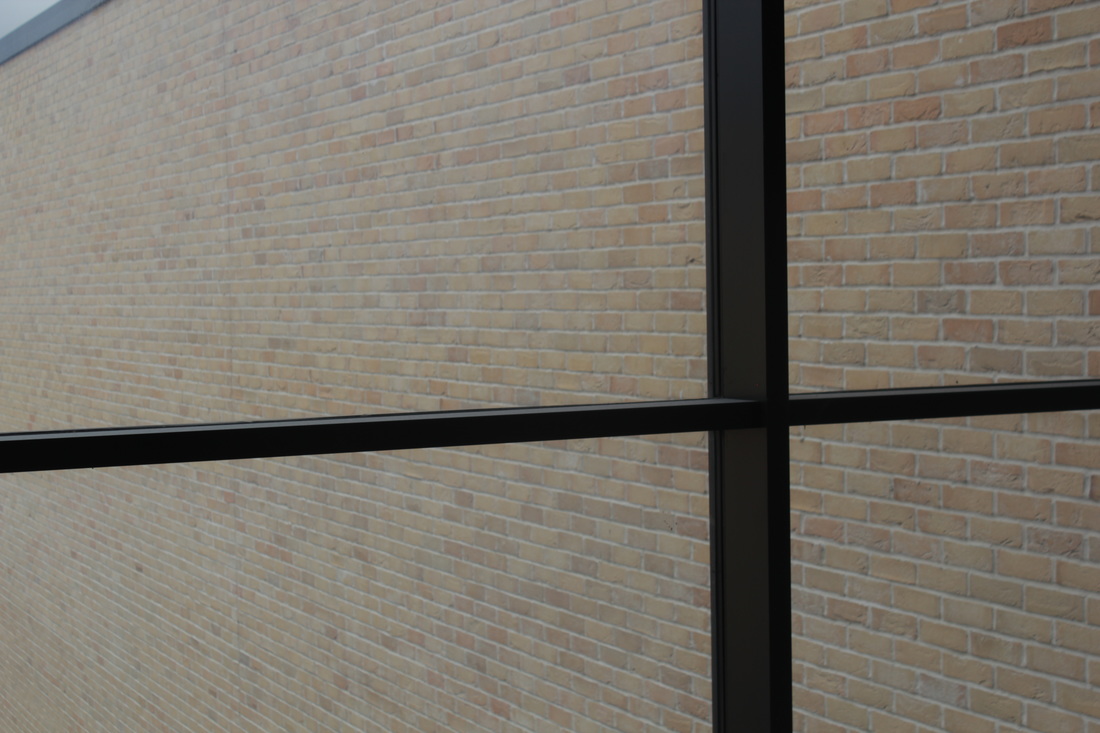
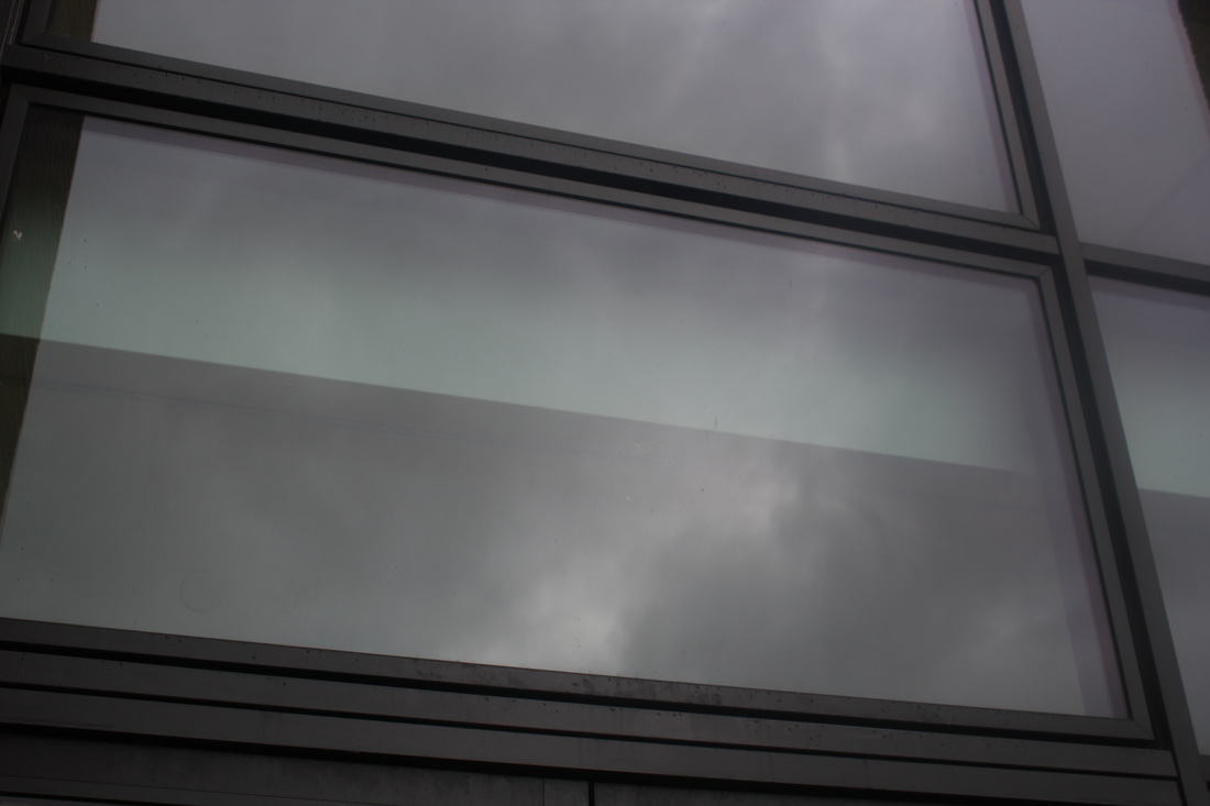
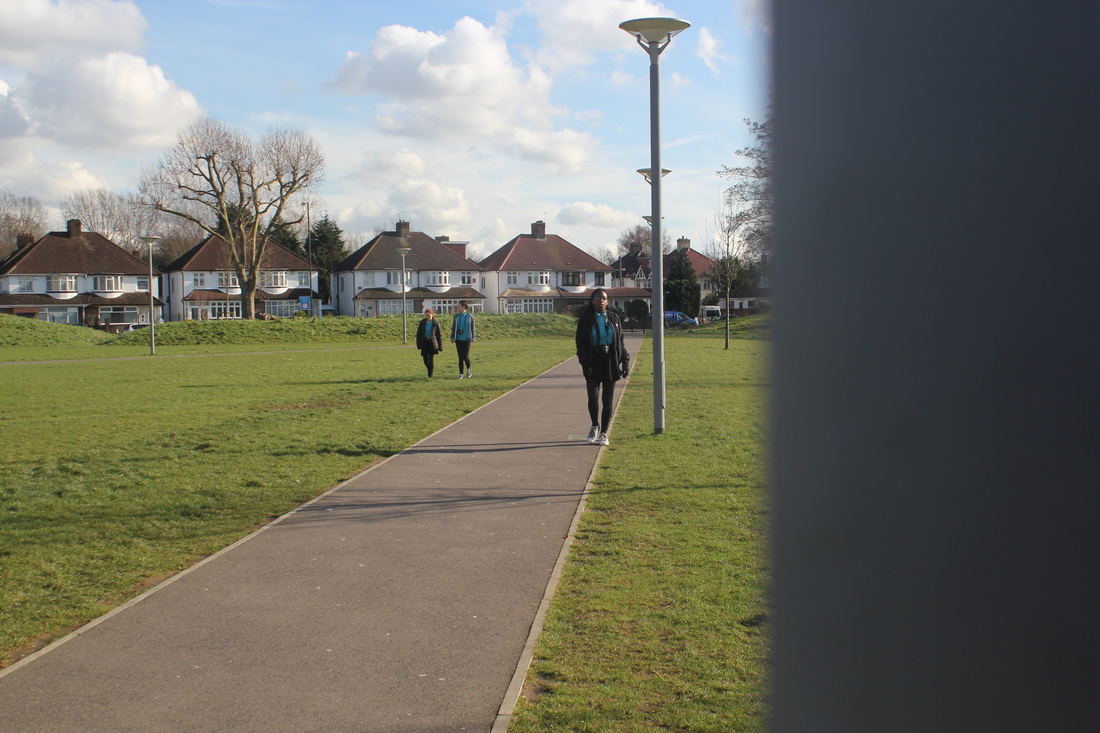
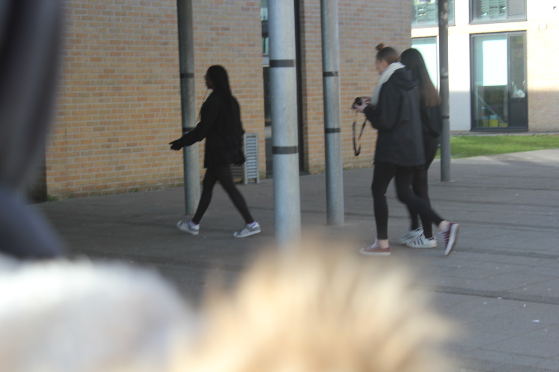
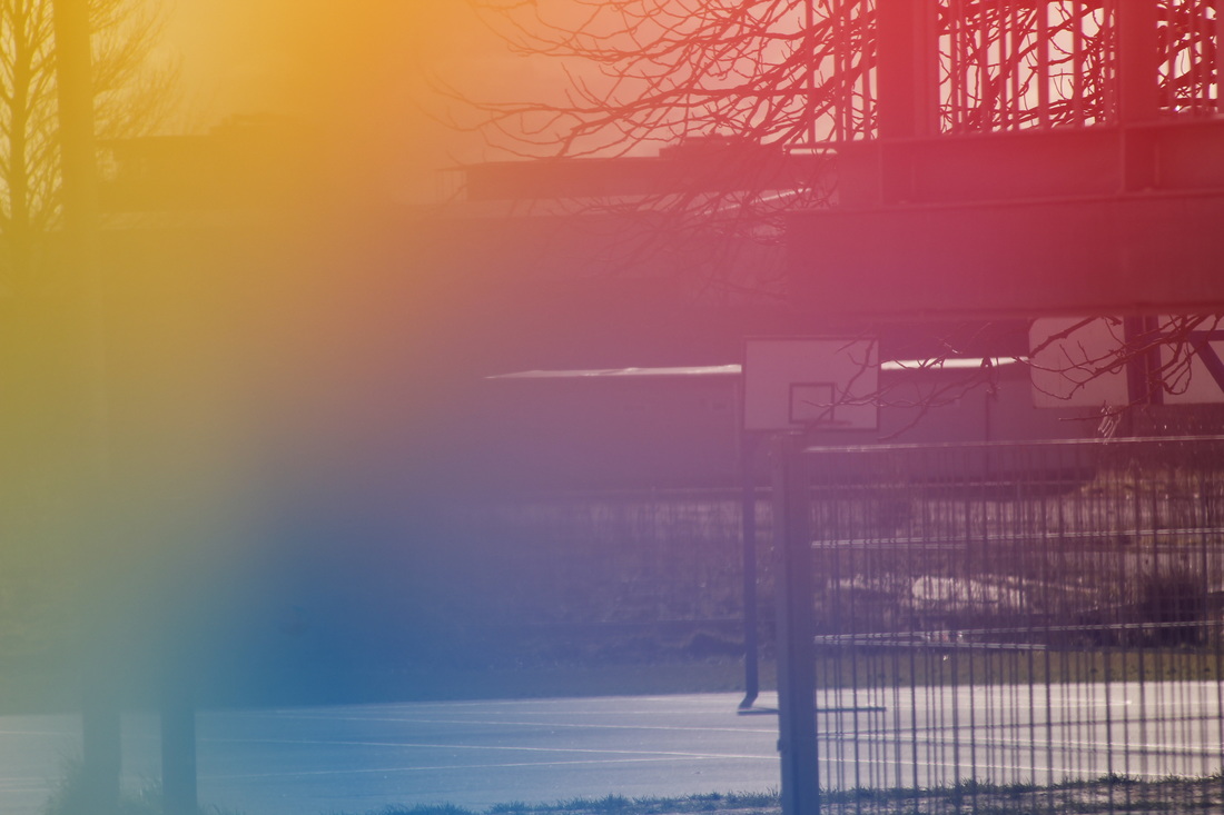
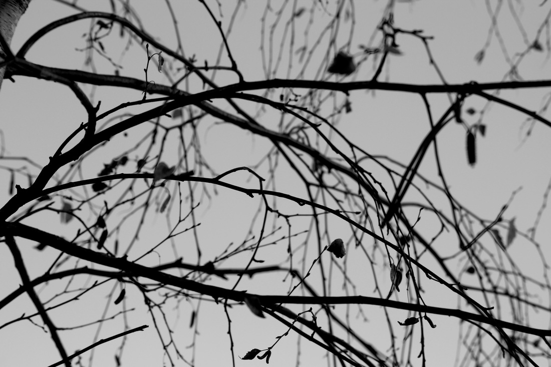
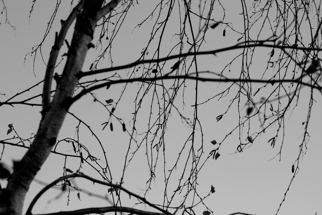
These photographs were taken at school, they are meant to be abstract. I focused on lines & shapes. I think my photographs are linked to abstraction because there are many shapes, like squares and rectangles. Most of my photos have a lot of lines from windows and walls. There is also value/tone, because in most of the photos there are shades and reflections from the sky and buildings. The space in the photographs have a range of close and far; some photos I took from quite close to show mostly lines and contrast instead of the whole main object. The ones that are from far away show a hint of the main object but it doesn't show it fully, which is linked to the focus that is an element of abstraction. In the future I would make images more different, but still very abstract. I could try using effects, or a different camera or a different particular place to take pictures. I also did a certain type of view and certain framing so the edges would stand out in the image and so you could only see some part of the building but not all of it. It also showed only some so you could see reflections. |
|
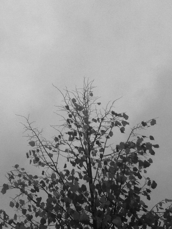
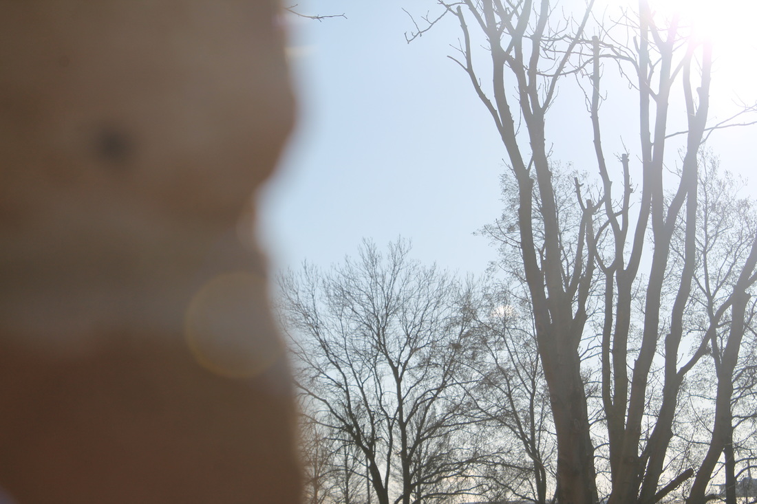
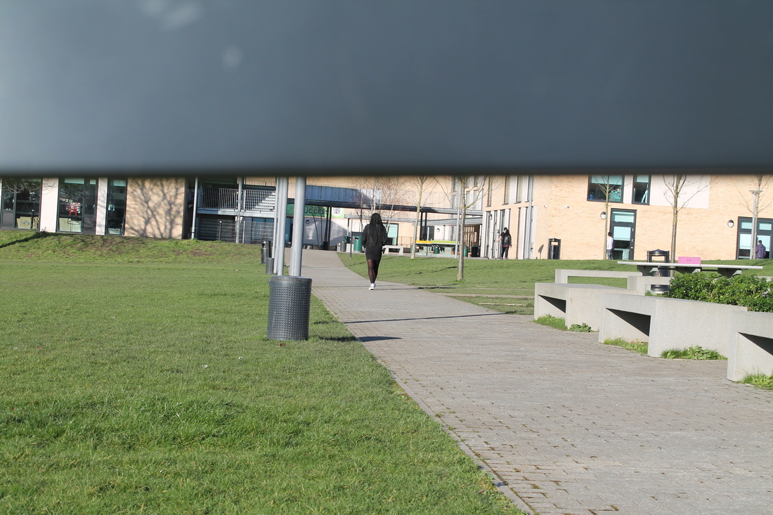
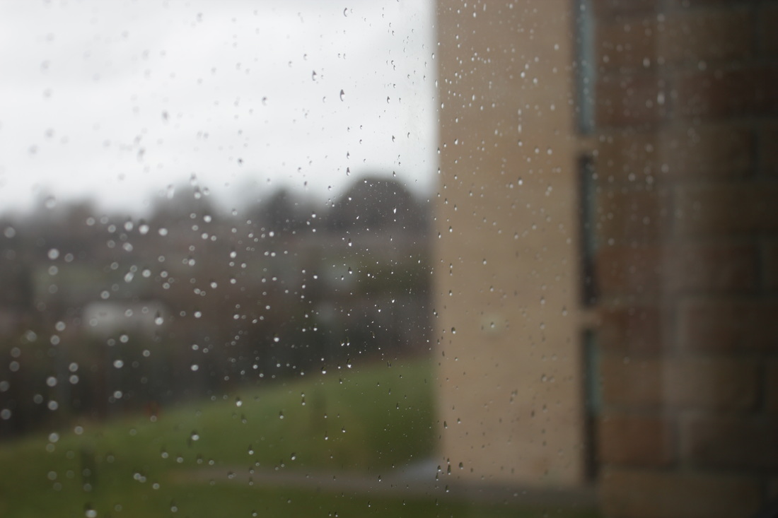
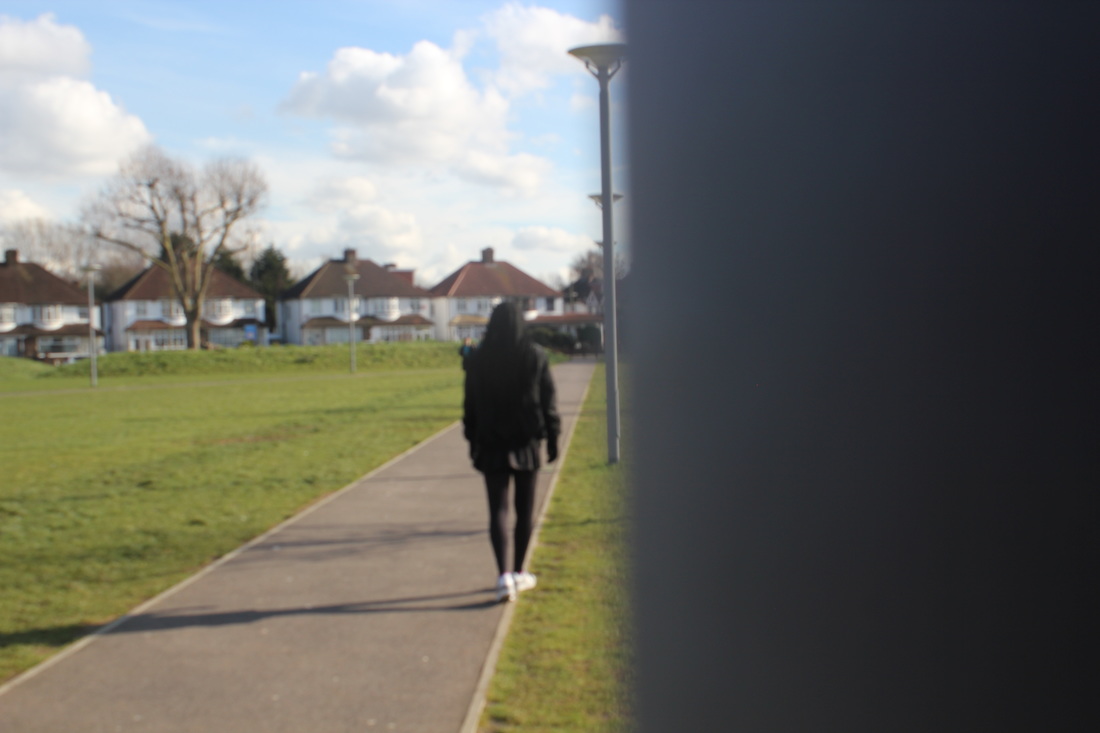
These photos I think are related to abstraction, I took them while on holiday and at home. Many of the photos are of buildings. The pictures show different lines and shapes. For example they have lines going throughout the buildings, and there are mainly shapes like squares and rectangles.
In one of the photos there is a road and tops of trees are in parallel with the road. There is mainly value/tone in this picture because there is a grey sky and the trees are making a black shade. |
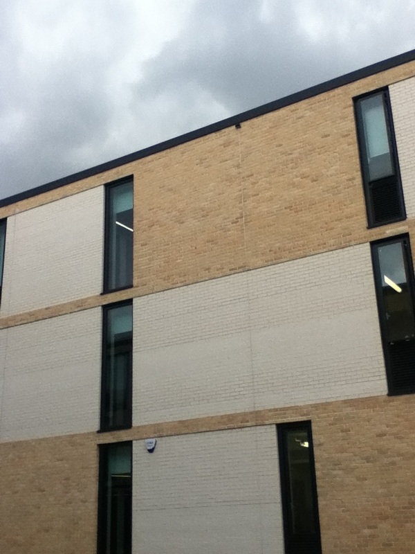
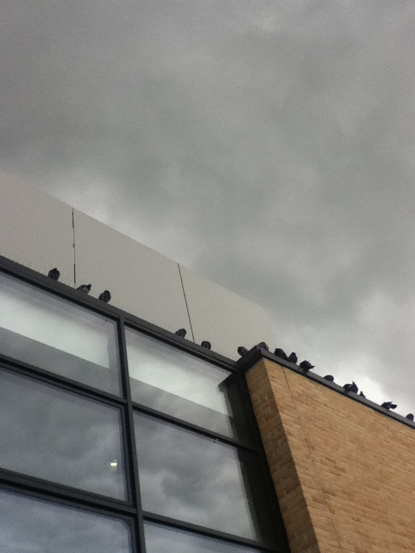
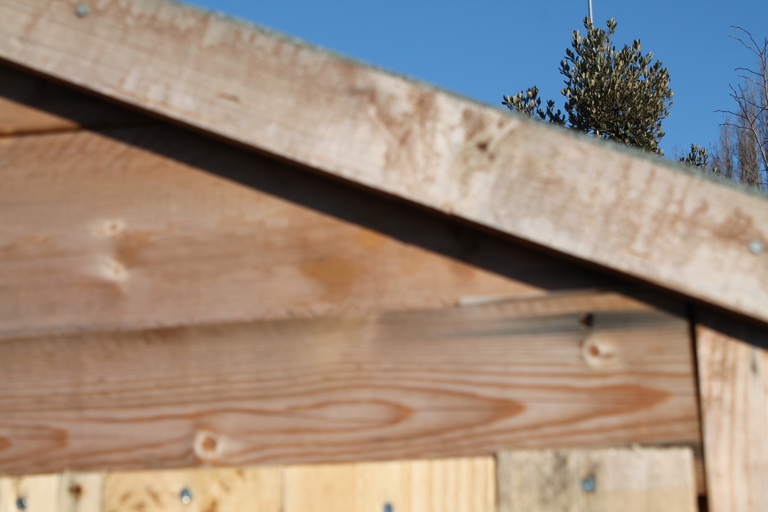
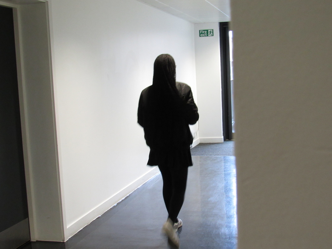
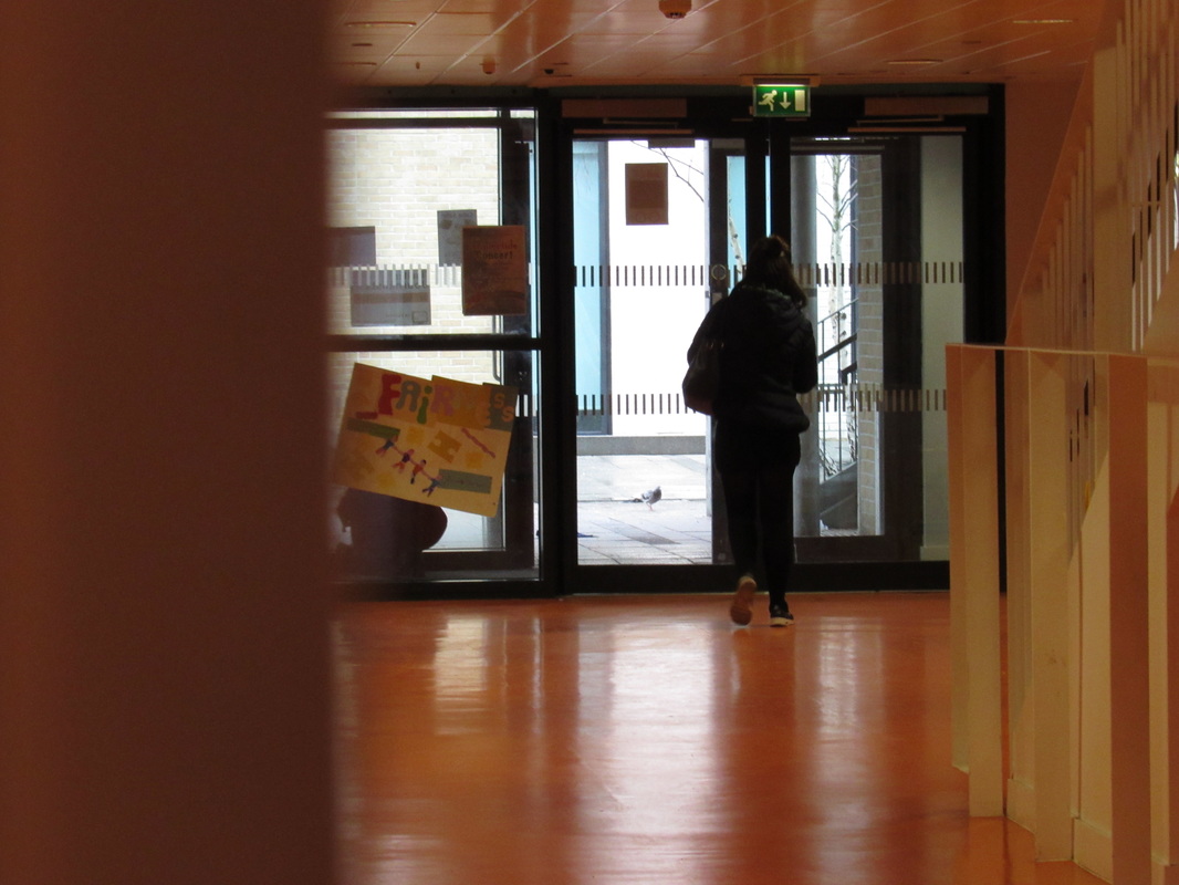
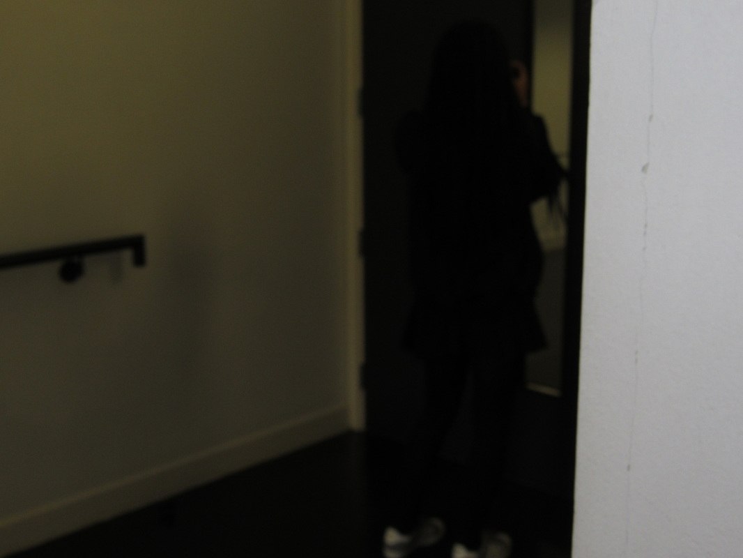
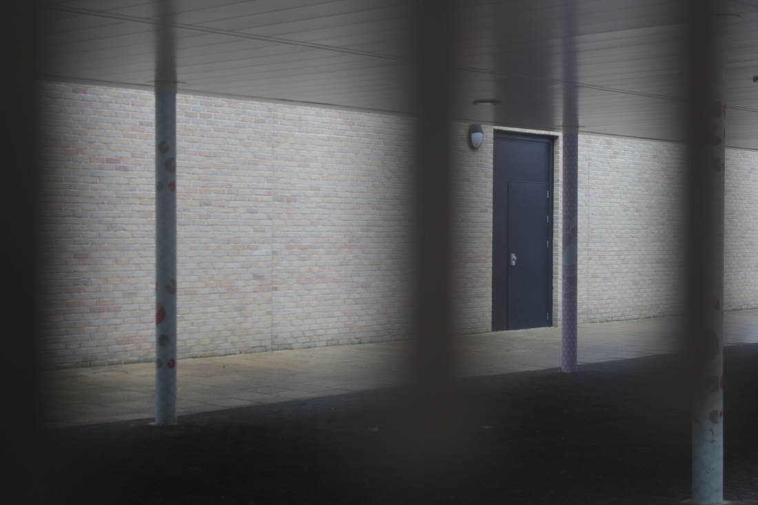
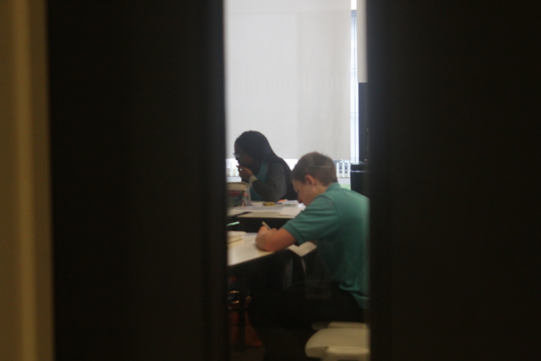
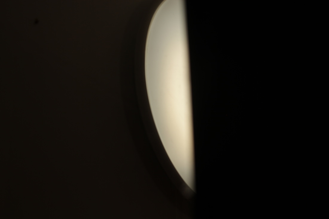
I took more photos at school, I used the element lines&shape and also light. I tried to make some photos not show the full main object so it could be some type of abstraction. Because sometimes abstract means complicated and I thought if I made the main object not so visible, it would look complicated to explain. Some photos need improving, but some I think can represent abstraction. It would be even better if I had more time to take my pictures.
|
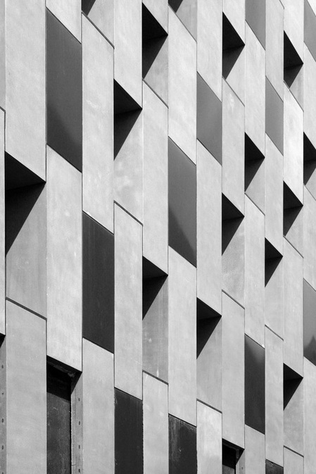
This photograph was taken by an unknown artist, it relates to abstraction because it contains some of the main abstract elements. Which are Line, Repetition, Shape and Space. The lines go across the object which is a building, and lines are also repeated across the building. There are rectangles and squares made by the lines, as well as triangles. The angle at which the photo was taken makes the building look very high and taking a lot of space. This picture looks like was taken at midday, and the camera was on the side of the building where the sun was.
|
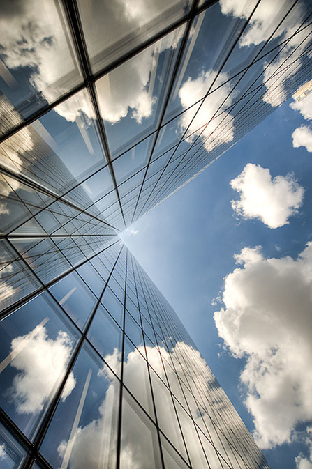
This photograph was also taken by an unknown photographer, as the first one, I found this on pinterest and thought it was related to abstraction. The elements this photograph has, are lines going across and along the object which also looks like a building, There is light and value/tone because there are shadows which make a grey shade scale. There is light shining on the side of the building we can see, but inside, where it looks like windows are, there are dark shadows. It looks like the photograph was taken during near midday when the sun was shining on the building. There is unusual shape element of the building because the dark looking windows are forming squares and rectangles.
|
Photograms
A photogram is a picture produced with photographic materials, such as light-sensitive paper, but without a camera. A famous example of a photogram is:

|
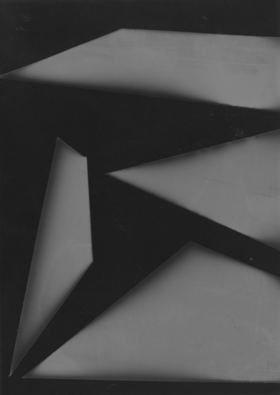
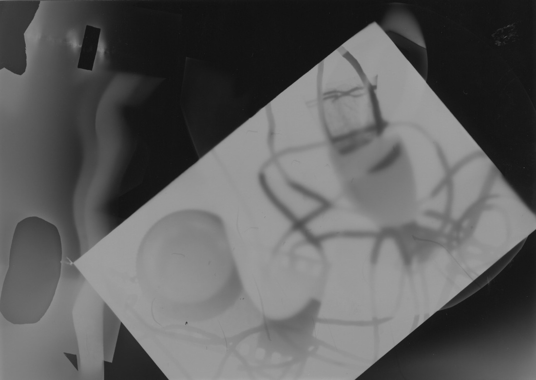
This photo, made by Edward Quigley in 1930. It's a photogram, it's made by using a photographic paper and reacting it with light for several seconds, the black shows where there was light and no objects, the white shows where there were objects, and grey shows a type of object being at the place for a short time or that was transparent for light to shine partially through it. I think this relates to Abstraction because you cannot tell what the main object is, and there are elements of abstraction, for example it has value/tone, because the objects overlap each other which makes it look lighter, darker and grey forming different shades. It also has shapes because there are different shapes shown in the photo, or the weird shapes were made by different sub-shapes. Also the lines in this photograph are made by objects overlapping and laying next to each other.
|
photograms and cut ups.
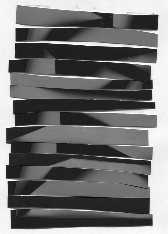
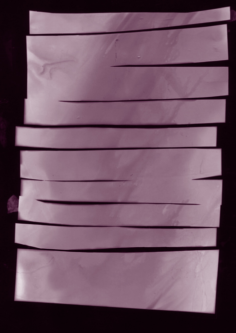
These are the photograms before they were cut up.
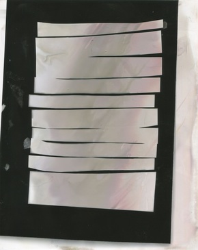
This is a photogram which was cut up to make it more abstract and also to make it less obvious of what it originally was. I made a weird shape out of it to make it look different to what the rest of the class made. I wanted to make it look different to its original standard. I just got a photogram and started cutting it up randomly from the corners and then put it together randomly.
|
This is the photogram of the cut up, the white parts turned black and the black ones turned white, so it is opposite. I think it is abstract because it has a weird shape and you can't tell what it is. I've made the shape more pleasing to what I had planned it to look like.
|
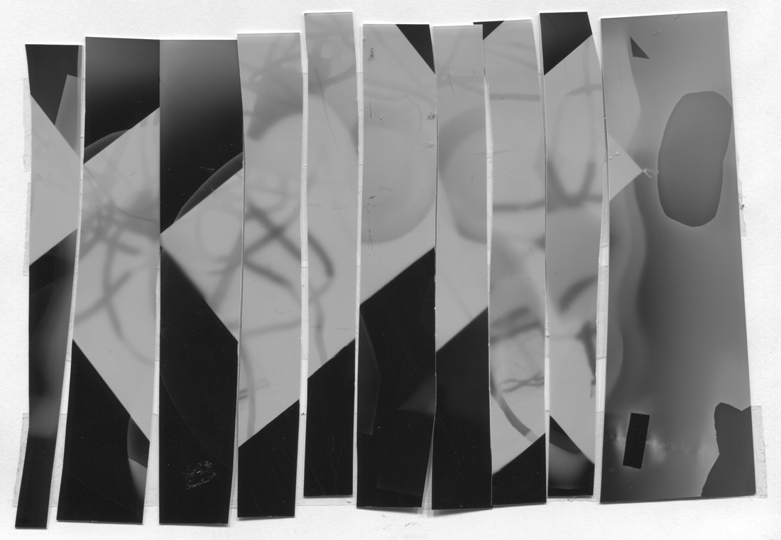
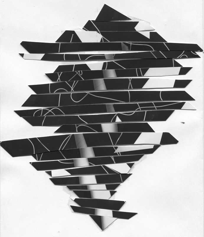
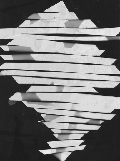
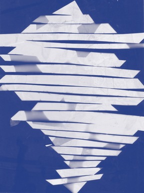
This is another photogram cut up, it has more of a square shape but you still cannot tell what it was originally or at least what the photogram represented. I cut it up in stripes and then put it together randomly so it doesn't look like the original. |
This is a photogram of a cut up, it looks abstract but you cannot see negatives or opposites going through. If I did it again I would've made sure that it could look more different. I would also check the chemicals that were put on it because it looks pink and brown and slightly mixed with other colours.
|
This is the last cut up I made from a photogram, it is still abstract as you cannot tell what it is, it sticks out and has gaps between so when I made the cyanotype afterwards it would make a different shape.
|
This is the photogram of the cut up in which nothing turned negative but I liked how bold the shape is, if I could do it again I would've made the original photogram have more white bits so it could show on the second photogram.
|
duotone
I used a black and purple duotone on this photogram.
|

In this photogram I used white and light blue.
|
I used dark blue and white in this photogram.
|
|
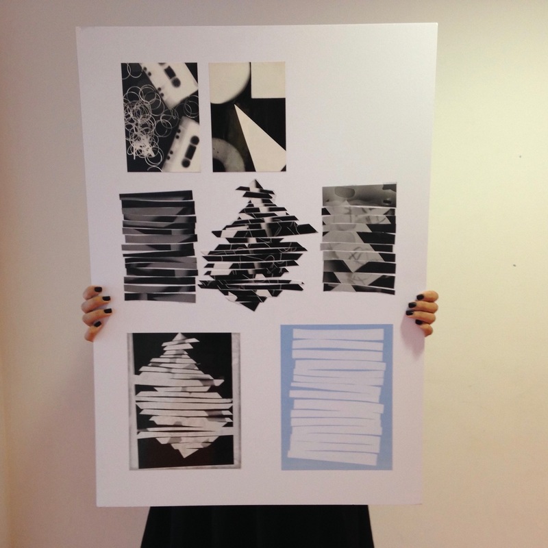
This was my final outcome. I removed some of the duotones and photograms that didn't fit together, also those that didn't correlate, for the final work to look nice when individual pieces fit. I put the photos in order of what I did. The first is the photogram we took at first. Then there is the cut-ups we made of the photograms. And after there is a print of the cut-up. Then the final one is a duotone of a cut-up I made with photoshop. I think these photographs relate to abstract because a photogram is abstract depending on what is on it and if you can see what the main object(s) is/are. It would be even better if I made it more colourful because it currently looks a little dull as I only used photograms and one duotone.
|
Harry Callahan
I started researching Callahan after my final project for photograms in Abstraction because I wanted to look at different ways to make photographs relating to abstraction, I wanted to find someone who did it straight with a camera instead of taking a photogram.
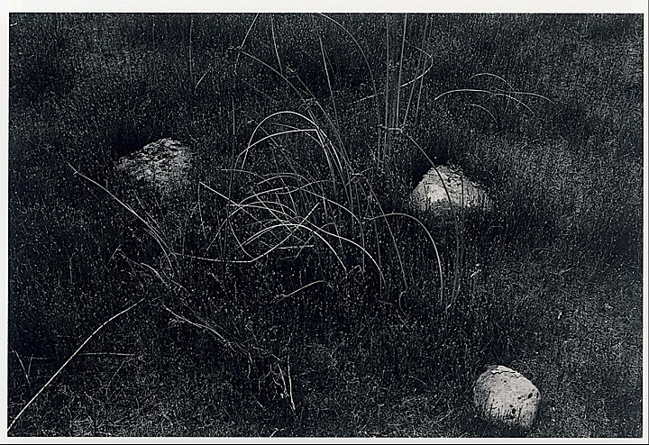
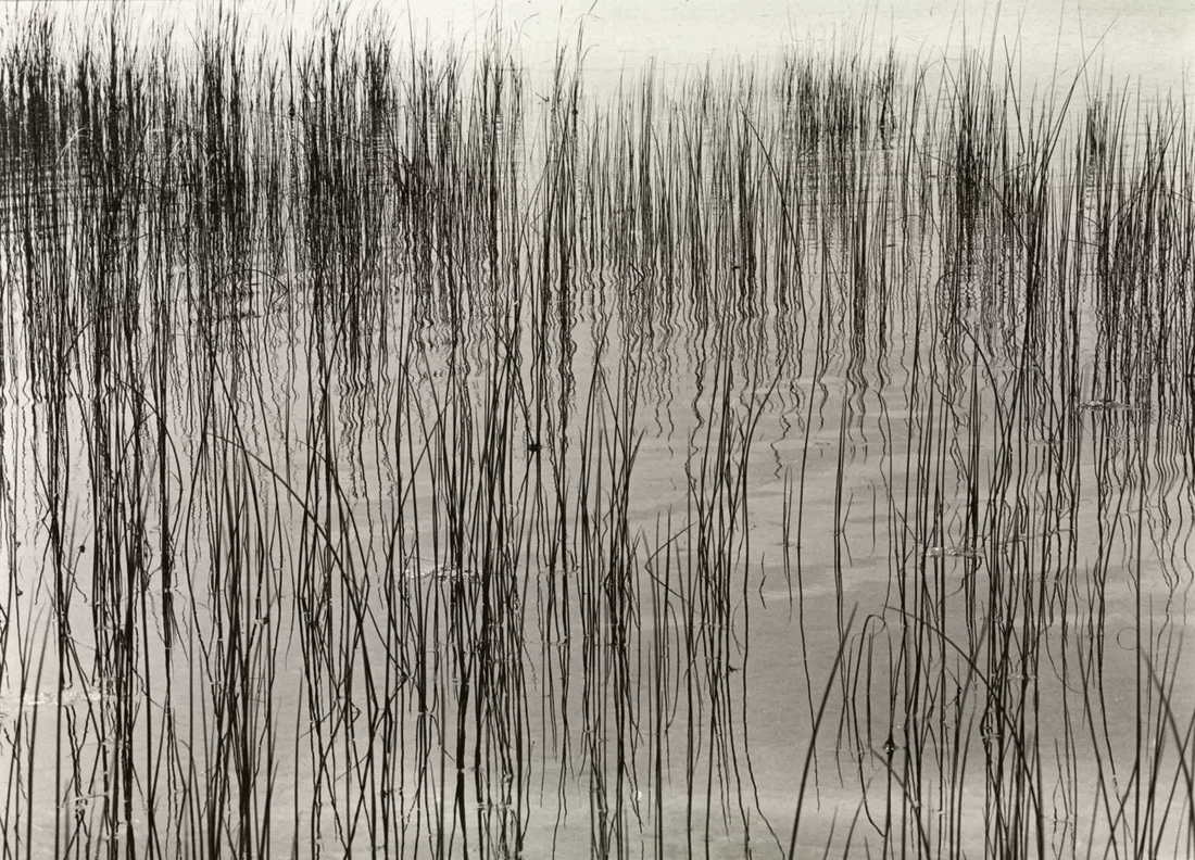
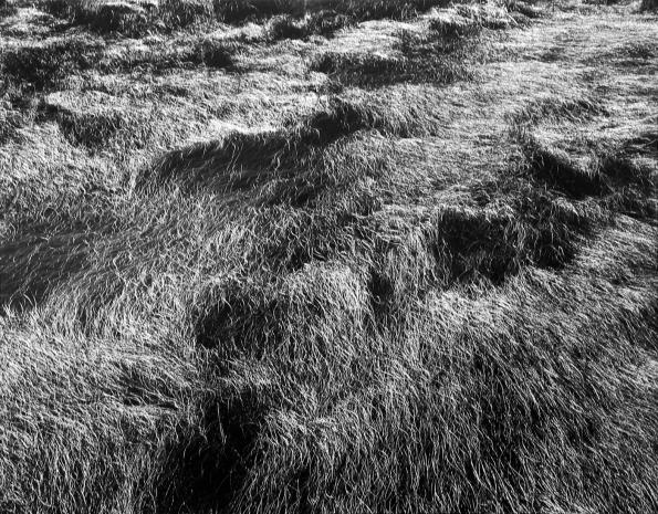
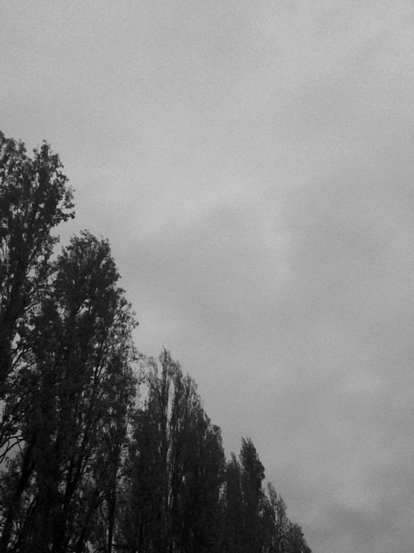
These are some photos by Harry Callahan, he's an abstract photographer, he takes pictures of plants and water etc. and makes it relate to abstraction. He uses some elements like light, because some of his photos are dark which makes the light objects stand out and then some photos have a very light background which makes dark objects stand out. His photos are vary natural. What I find interesting about his work is that his photos work well with different tones and contrasts even thought they're just images of nature, I find this photo interesting because these photos are a mixture of naturalistic and abstraction.

|
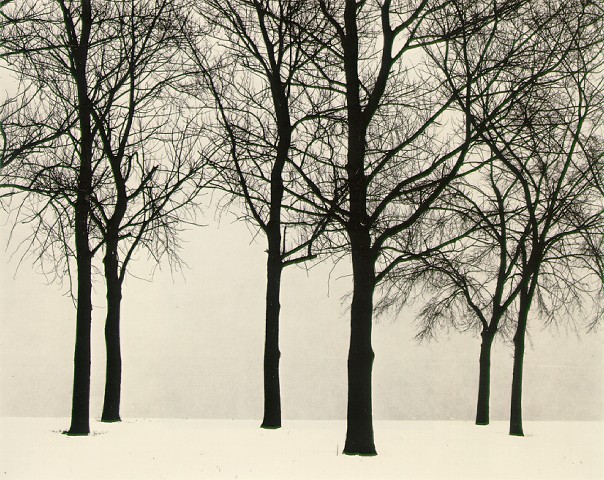
I like this photograph because the light in this photo is different. I like how dark the trees are when compared to the light background. You cannot tell what time of day it was taken because you cannot see any sun and you can only see a white background. This photo is very natural and very rural.
|
How to take a photograph like harry callahan
First, you need to think about the formal elements he uses in his photographs, for example he uses contrast and light to make the objects stand out. Also other elements like space, or texture.
Secondly, you should choose a camera with a good focus so it makes the photos more detailed and easier to capture what you want in the photograph. Also a contrasted camera or one that works well with light.
Thirdly, make the photograph in black and white and highly contrasted.
Then, take a picture of something natural like plants for example trees and grass.
After, make sure that what you want in the picture is in and nothing interrupts, also check if your subject is the main thing to look at, so make sure it fills the picture.
Think about how it relates to his work and then think of the correlation and edges in the photograph.
Focus on a large fragment of the subject, or if its a single object like a tree or twig then focus on a tiny fragment of the main subject.
Make sure the photo is contrasted well enough to make the subject stand out.
Harry doesn't usually have a confusing or unusual effect on viewers, so don't worry about making the photo recognizable or nameable.
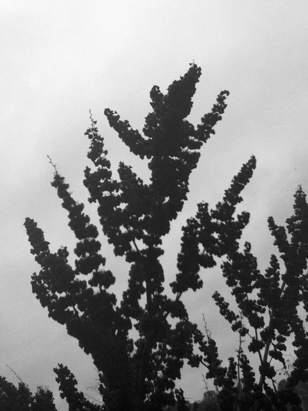
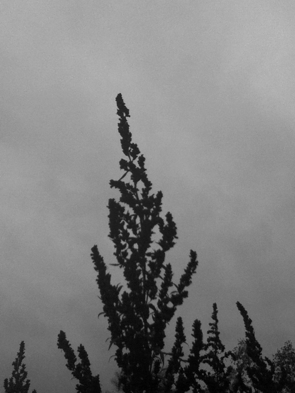
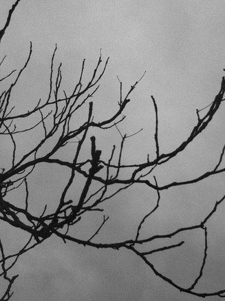
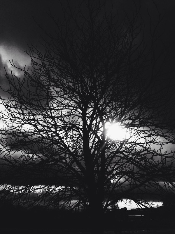
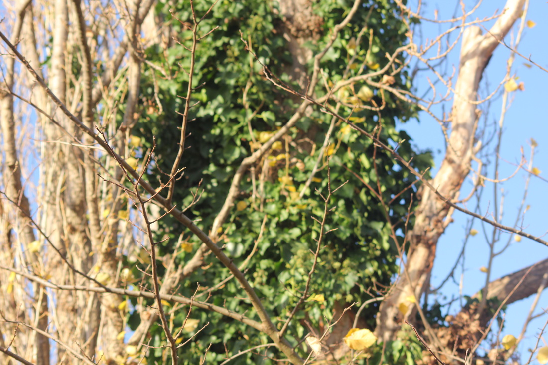
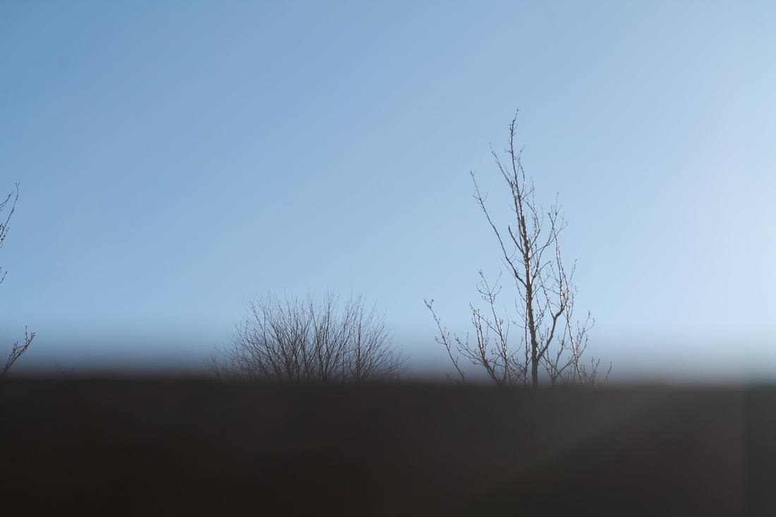
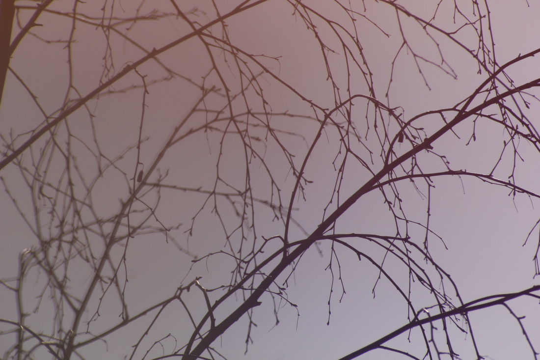
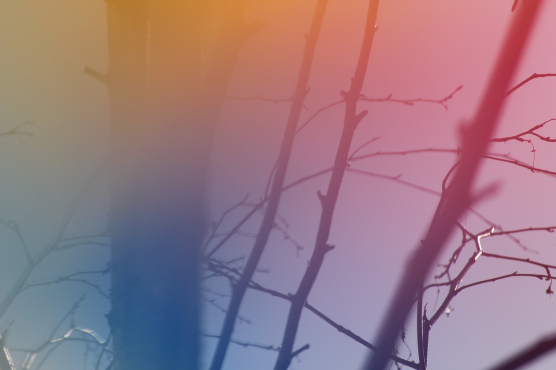
These are photos I took at school while trying to relate to Harry Callahan's photos. I tried to use some of the elements he used, like shade, light, colour, because I made it black and white and took it in areas which were quite dark. I think they are abstract and relate to Harry's work because they have similar elements. I took them in black and white because Callahan takes his photos in black and white. Even though some of his photos have a hint of brown. I tried focusing on the main object and tried to make the rest seem less important, like Callahan does with his photos.
|
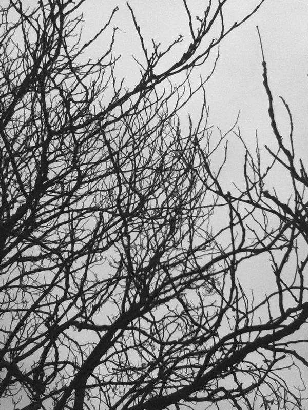
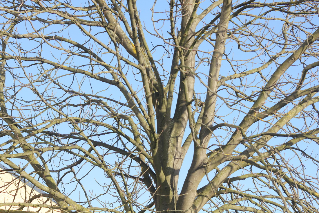
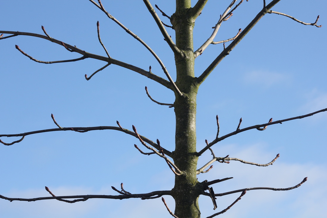
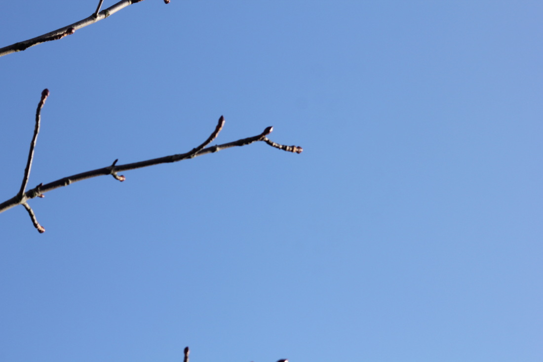
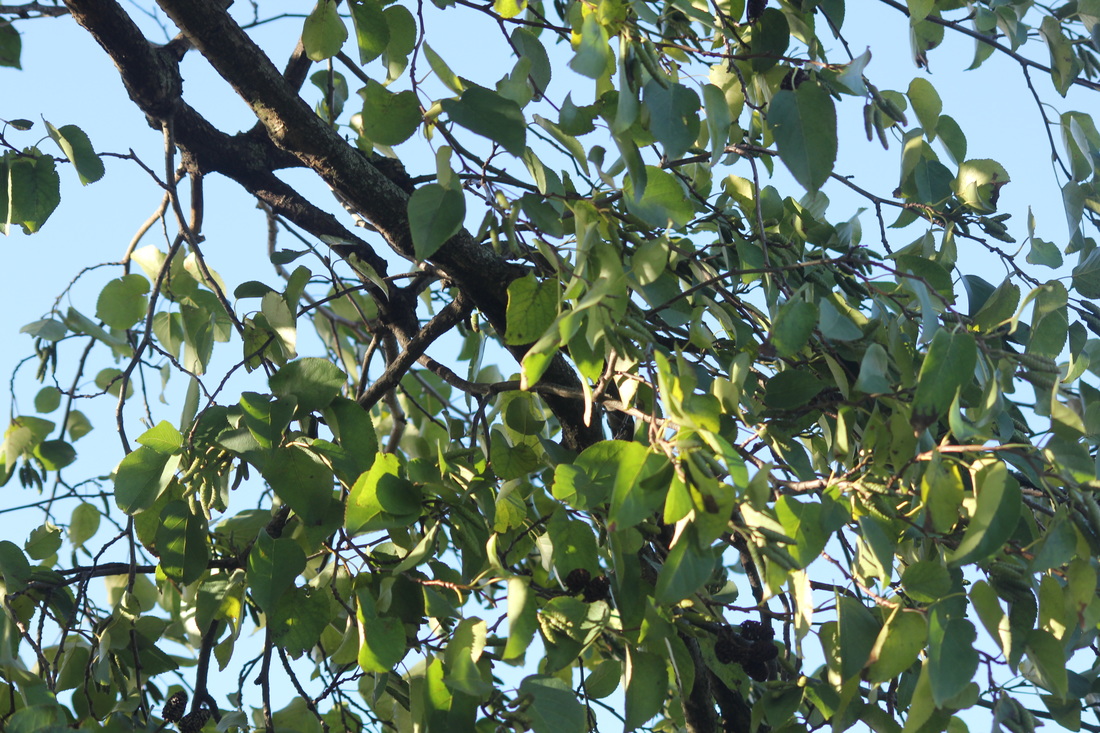
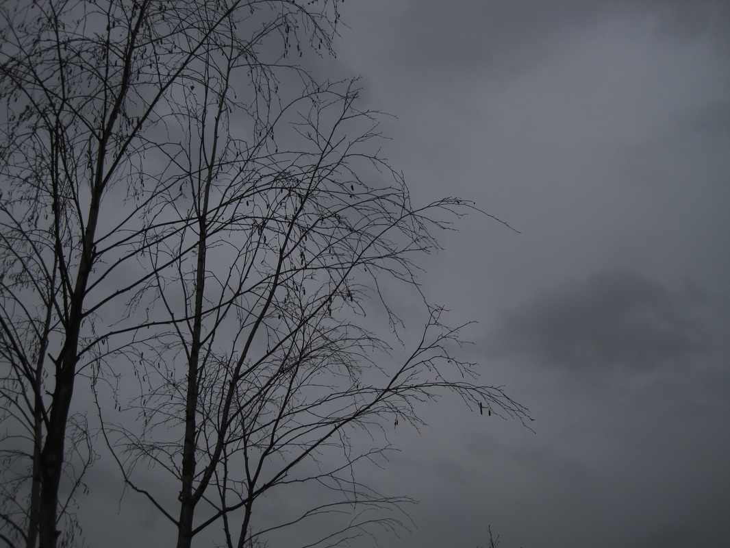
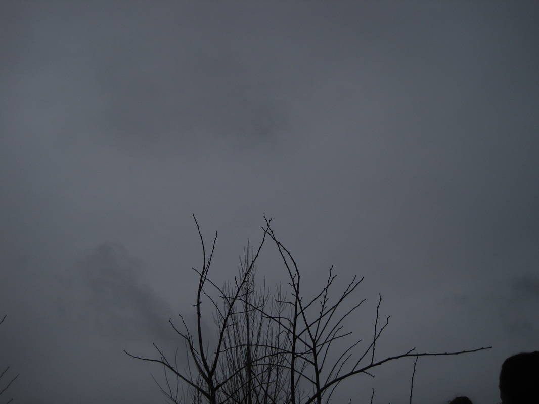
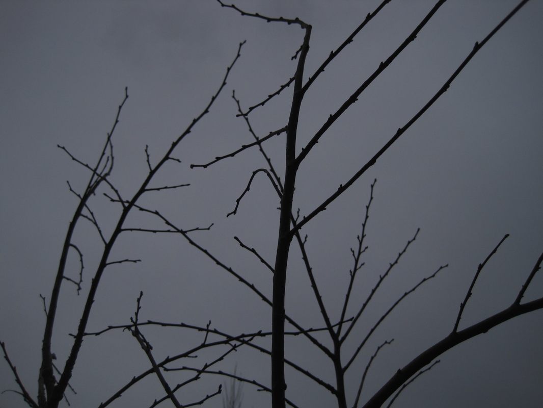
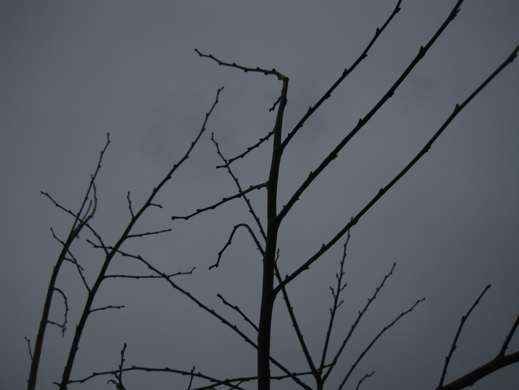
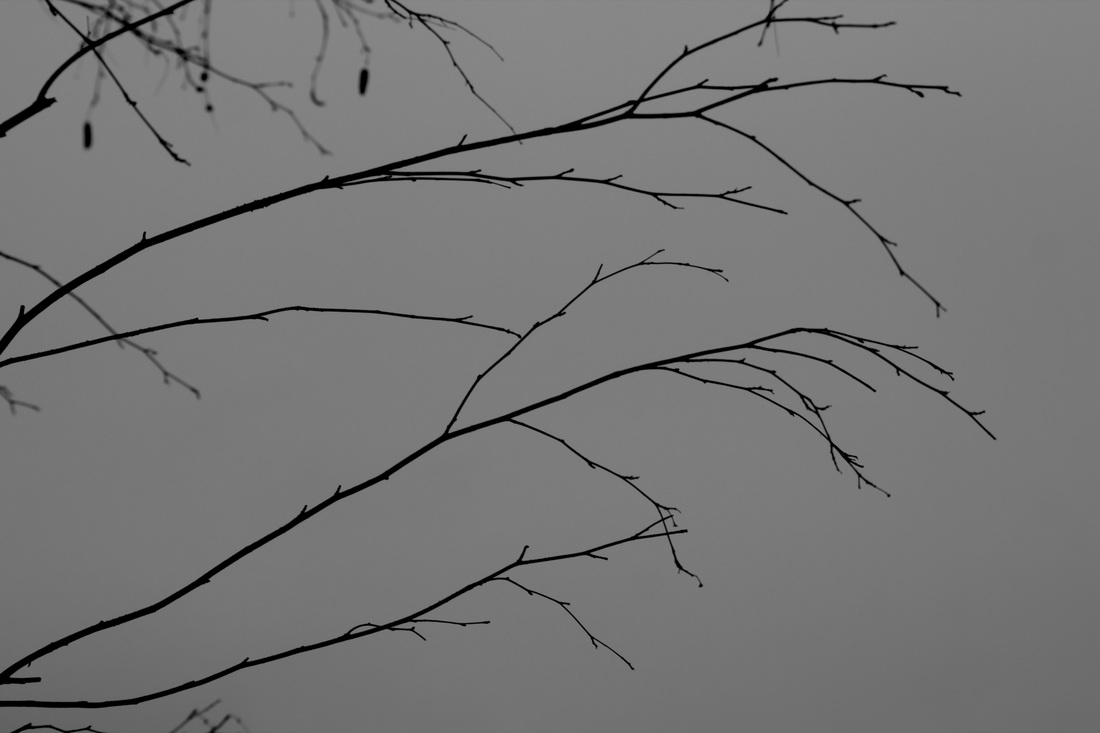
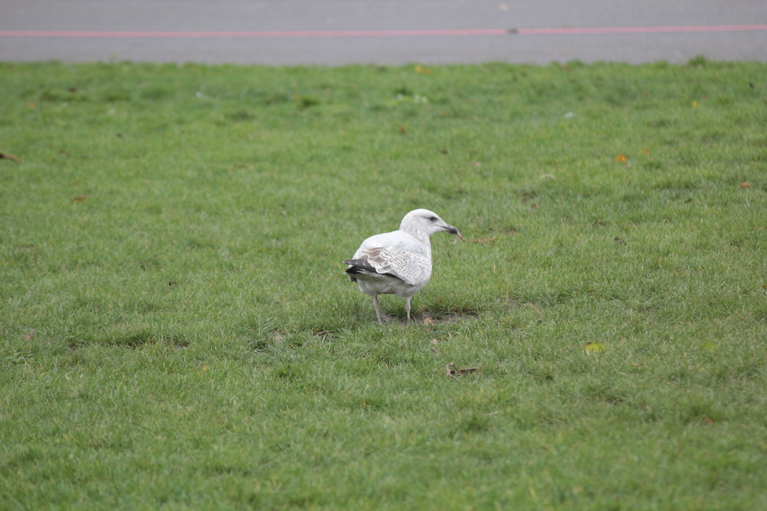
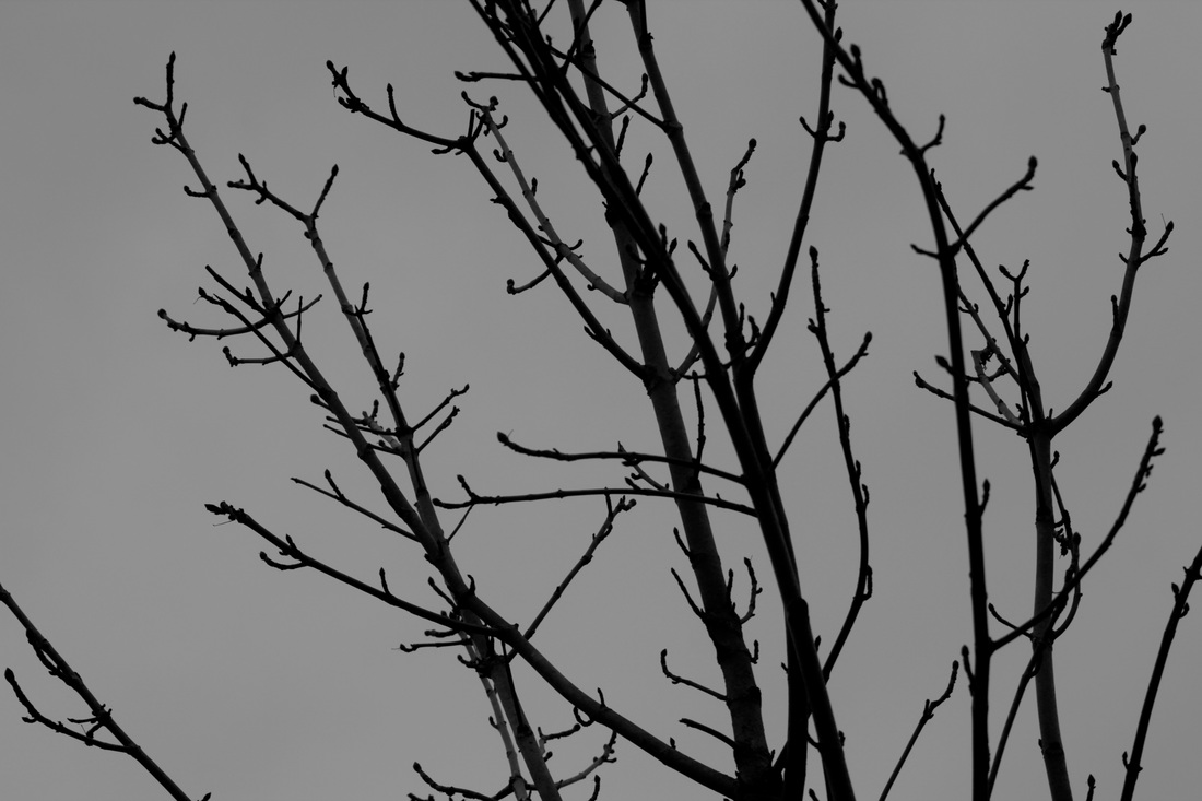
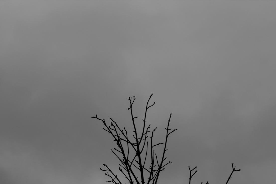
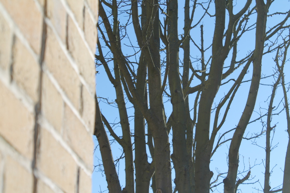
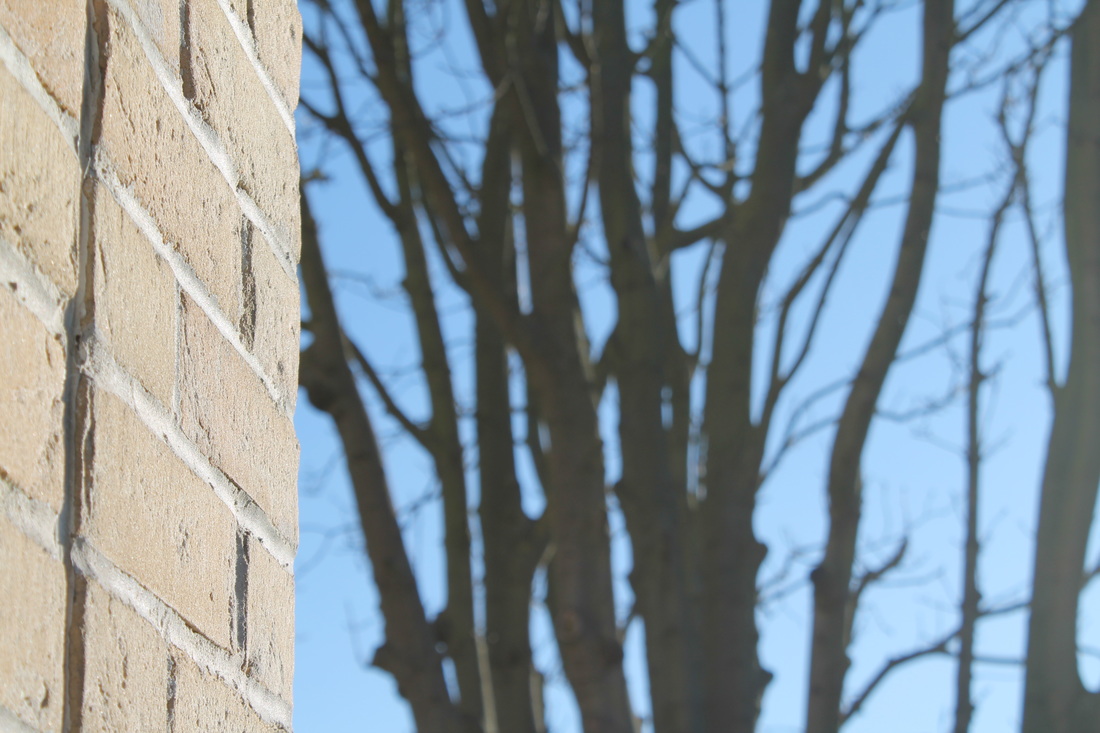
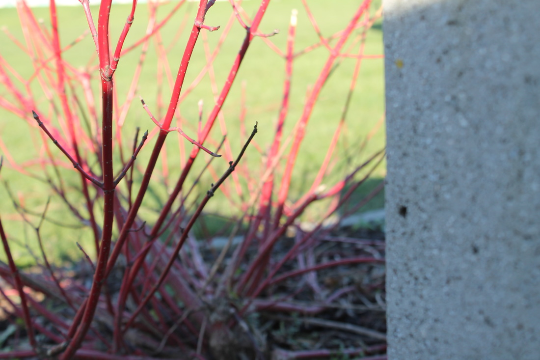
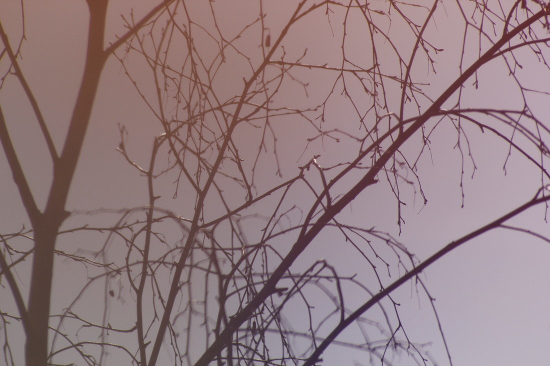
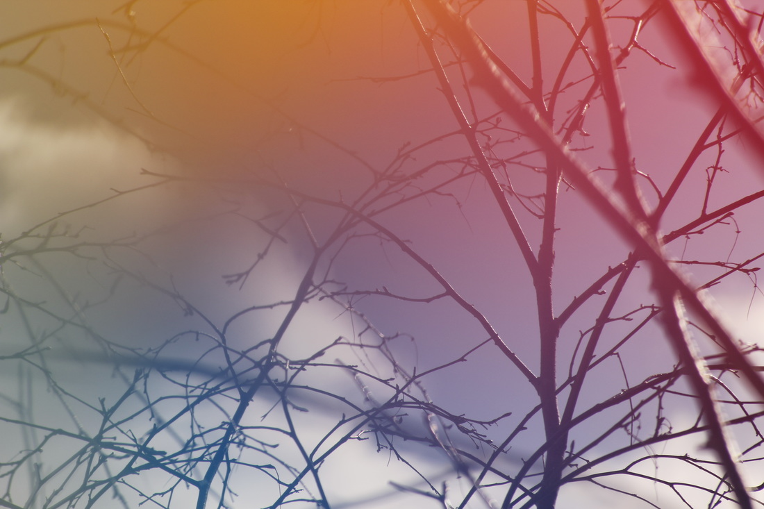
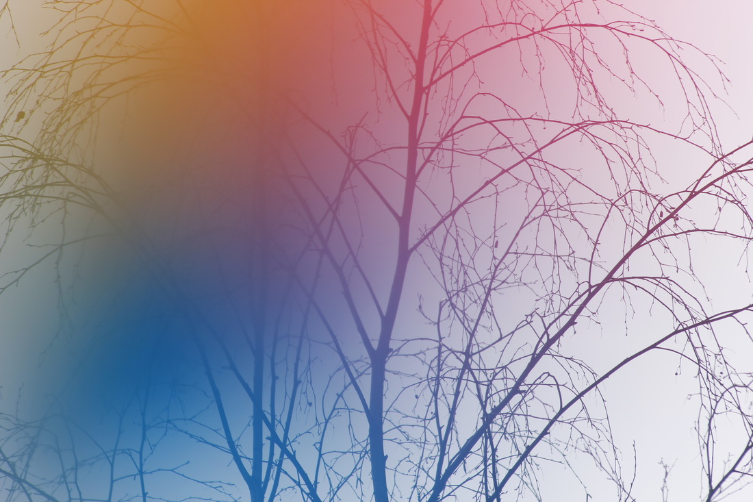
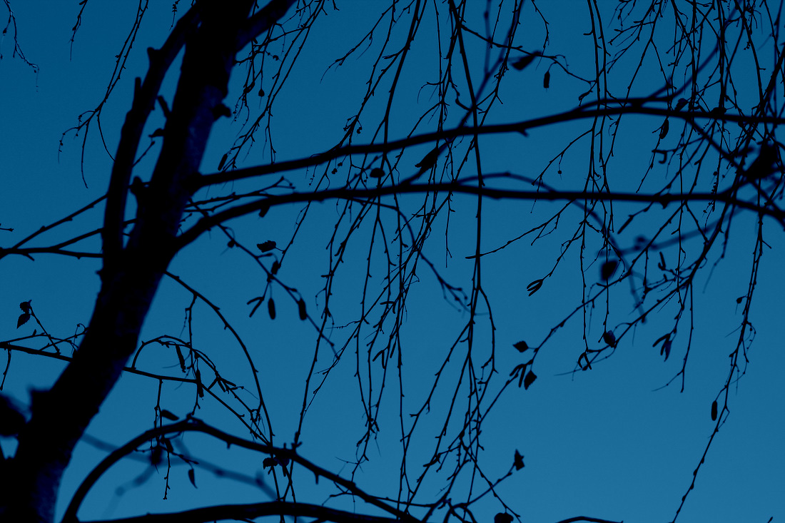
I think this photo related to Harry Callahan's work because he focuses on one object and in this photo you can only see tree twigs. I also tried to compare the contrast and light of the photos. Harry's photos look dark and contrasted. I made these photos on a rainy/cloudy day so there could be natural contrast. Also Harry mostly takes photos of plants and natural things so I took a picture of a tree.
|
Ralph Eugene Meatyard
|
|
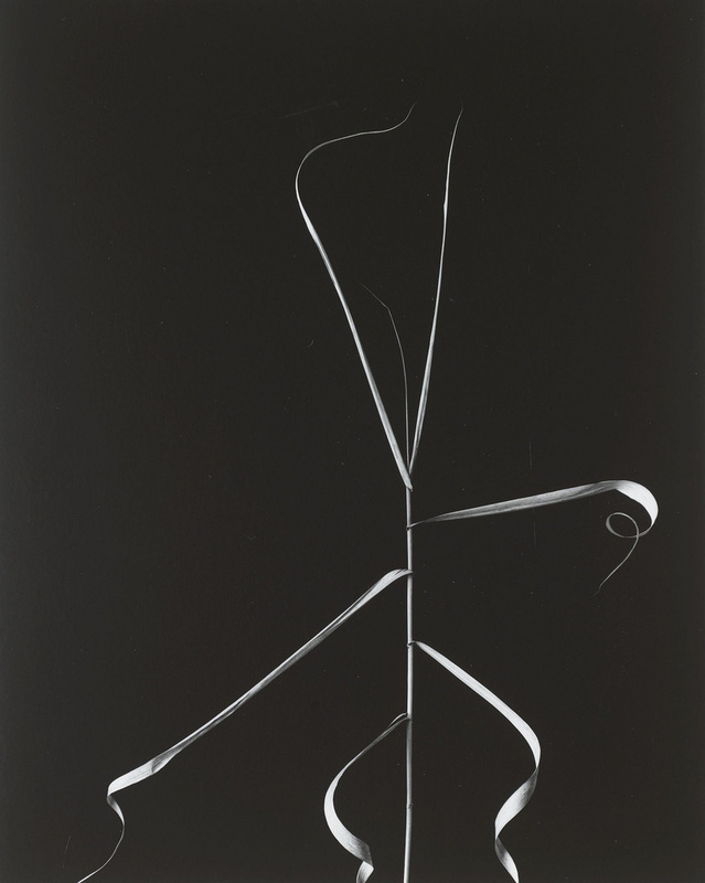
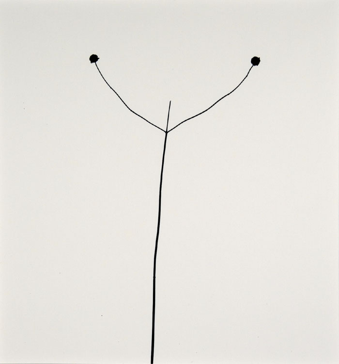
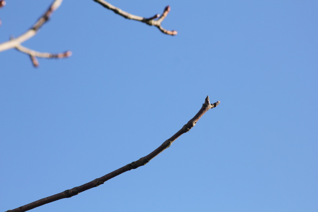
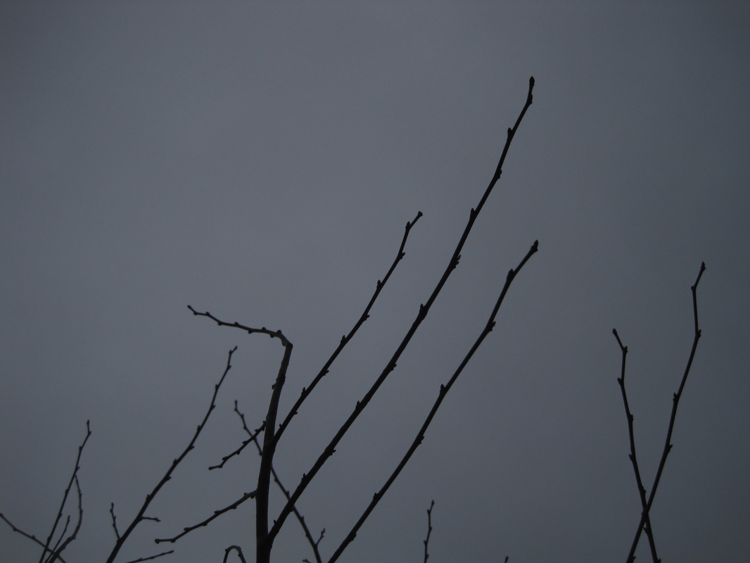
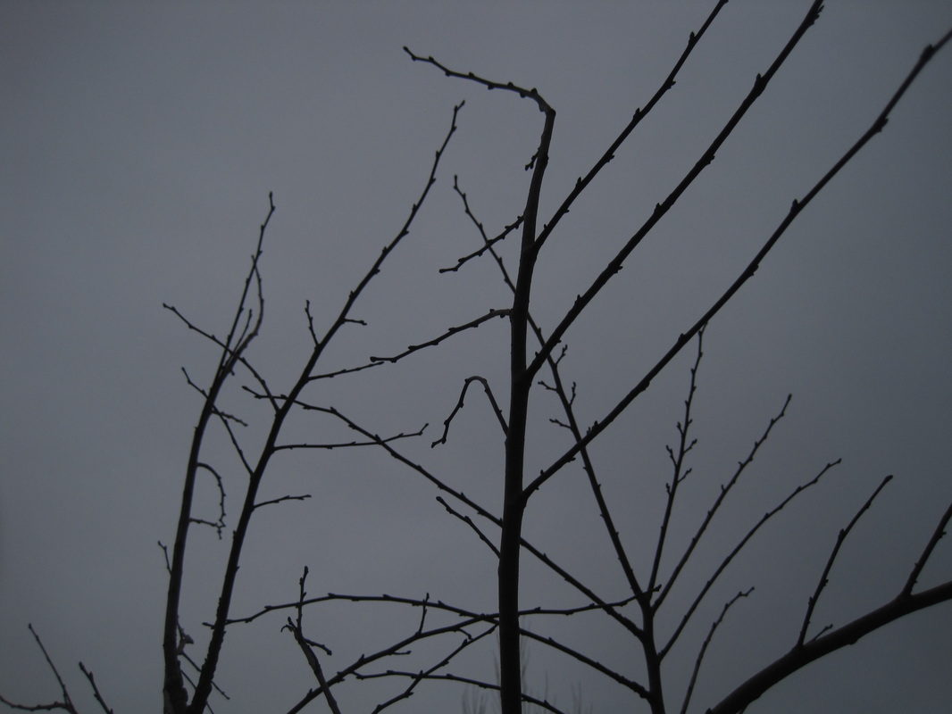
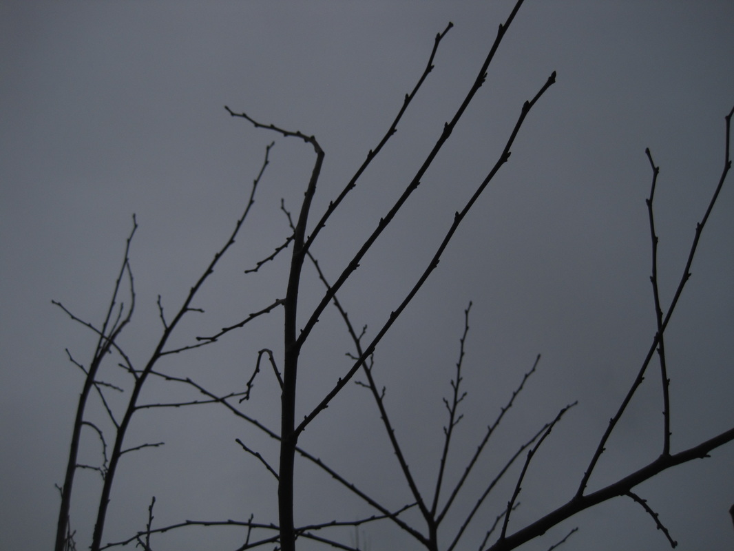
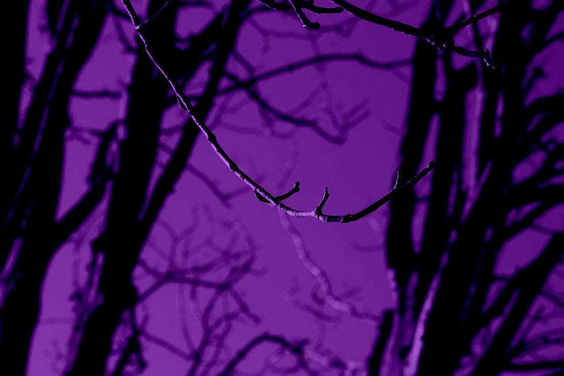
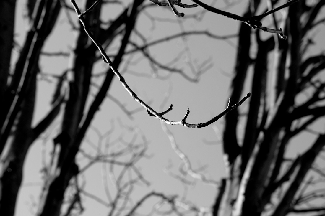
Ralph lived in a rural part of the United States. Meatyard was born in Normal, Illinois. After his marriage to Madelyn McKinney, he moved to Lexington, Kentucky. The series below is called 'Zen Twigs'. He takes photos of twigs from trees. His photos have contrast and focus. I like his photographs because of the focus and darkness in his photos. It makes the twigs stand out from the background. What I found interesting about his photos is that he can make a single twig giving atmosphere and emotion.
|
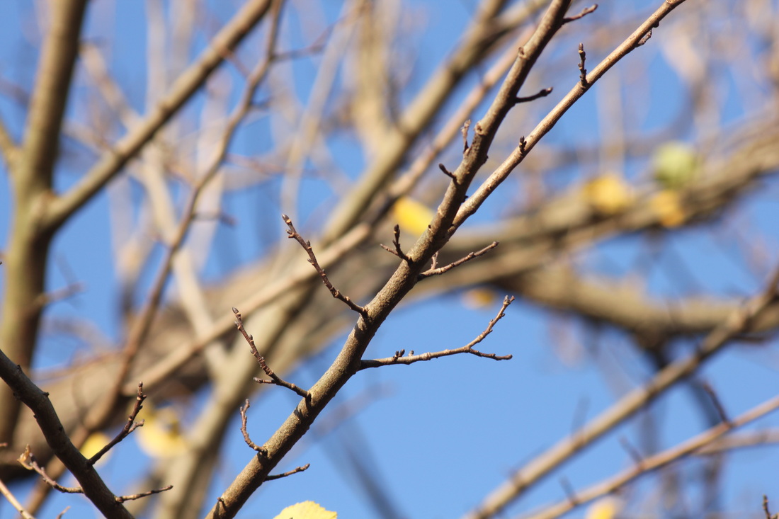
In this photograph I see a range of different lights, shades and contrasts. I see a twig and a blurred out background of leaves and branches. I would describe it as dark, blurry and atmospheric. Because the contrast and darkness put together with a black and white filter makes it look sad or emotional. To a person who couldn't see it, I would describe it as dark and shady. Also blurry with only a single twig not blurred. This photo is an abstract image. It was taken as naturalistic picture because you can tell what's in the photo but then the artist changed it to look more abstract by using effects, so it's not very clear, but after you take a close look you can recognize the twig standing out and the rest, where a tree and the sun was, is blurred.
The equipment used was a telephoto lens and a wide apparatus so that only a small part of the subject is in focus. He used techniques and processes like only taking pictures of twigs. It reminds me of a dark forest, or how forests are normally set in horror films and descriptions of novels and poems.
The only lines in this photograph are the twigs and the lines of branches in the background. The shapes are made by the blurred objects in the background. There are no colours in this photograph, but there are different tones of light from the light shining through the tree. The focus makes the twig look hard and the background look softer. The photographer took the photo looking directly at the sun but then blurred it out. In real life it looks more lighter and coloured. I like it because it creates a calm mood while I look at it. The space in this photograph looks compressed. The background strikes me the most because you cannot tell what is in the background.
My questions for the photographer are: how did you know that you wanted to take a picture of this particular twig and why this twig?
I would name this photograph 'contrasted or shaded tree'. In this photo it doesn't look like anything is going on there because it's a picture of a tree. I think it's about life and nature. To be in the photograph would feel like being in a dark, cold place but still full of life.
I think the photographer made this photo to express his inner feelings into an image, or it shows his personality by showing how he takes his picture and what he makes it of. I think this shows what would be like living in a very rural place.
I think the contrast is effective in this photograph, as it sets the mood of the photo and it makes the photo more abstract. I learnt how to use contrast, shades and focus to make a photo more atmospheric and abstract.
I tried to take similar pictures to Meatyard's picture. The similarities were that they were very contrasted and were pictures of trees, but didn't have the same focus and zoom. They're on my weebly page. What I learnt is that you cannot make a photo look exactly the same as somebody else, or have the same elements of abstraction. I also learnt that normal things like twigs can still give a mood.
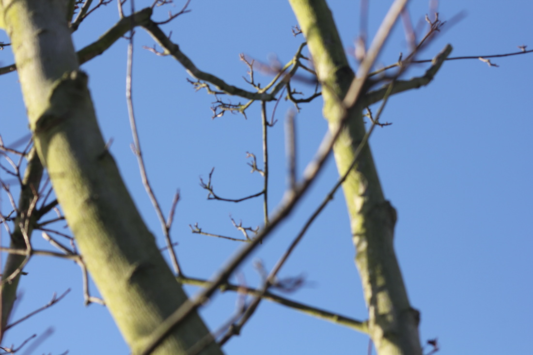
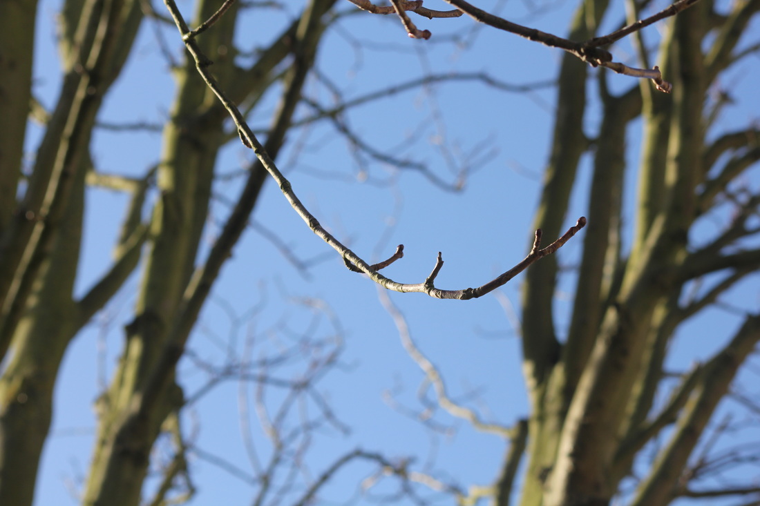
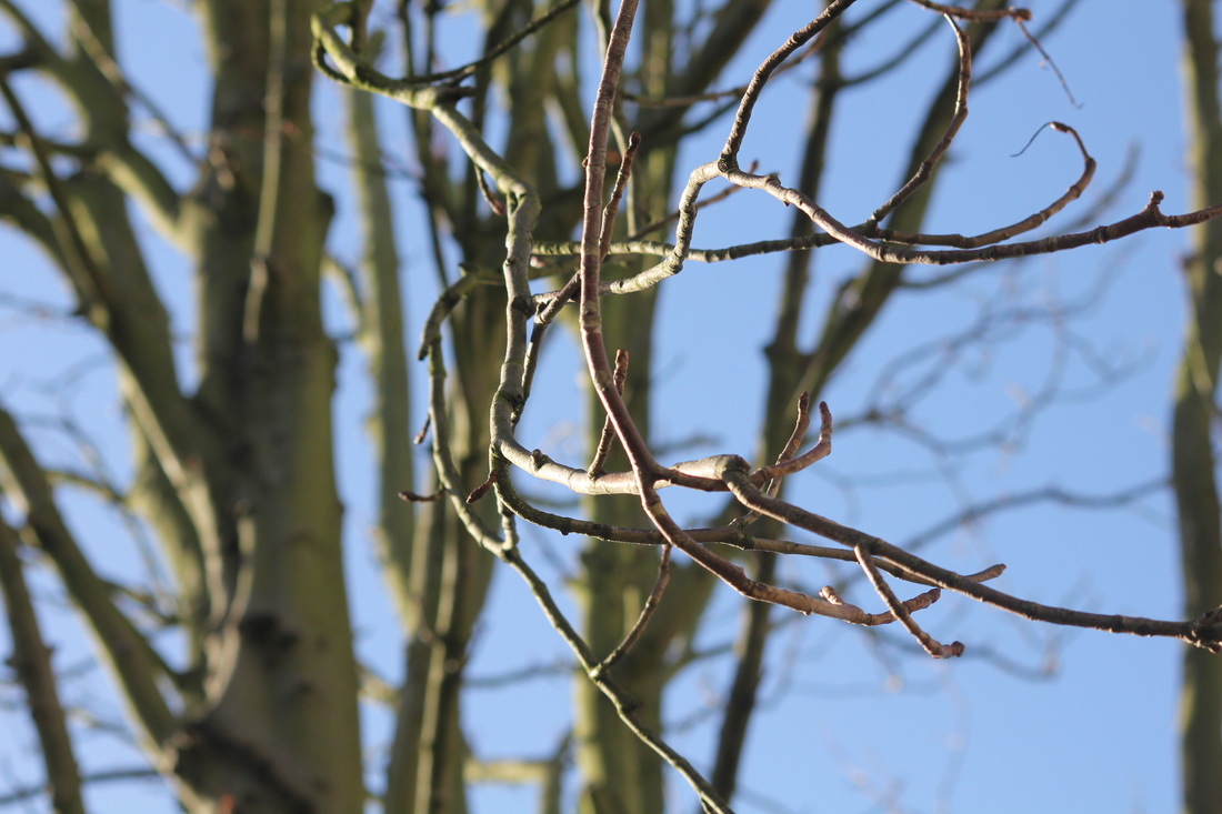
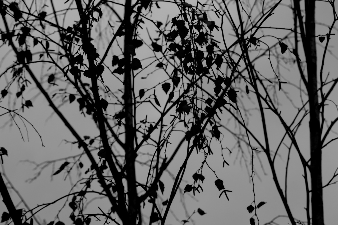
These were my attempts of Meatyard's work. I tried taking pictures of trees and darkness, I contrasted my photos down. I used my phone to take these photos and then I edited them with an app called VSCO and used the B5 filter to make the photos black and white and look dark but make the light stand out. I think they relate to him because I have related elements to his work. Next time I could try to take pictures of only branches or twigs of a tree, just like Meatyard did.
This was my second attempt but this time I used a camera with a telephoto lens like Meatyard did and experimenting with focus.
Below are the photos edited with higher contrast and with a B&W effect.
|
|
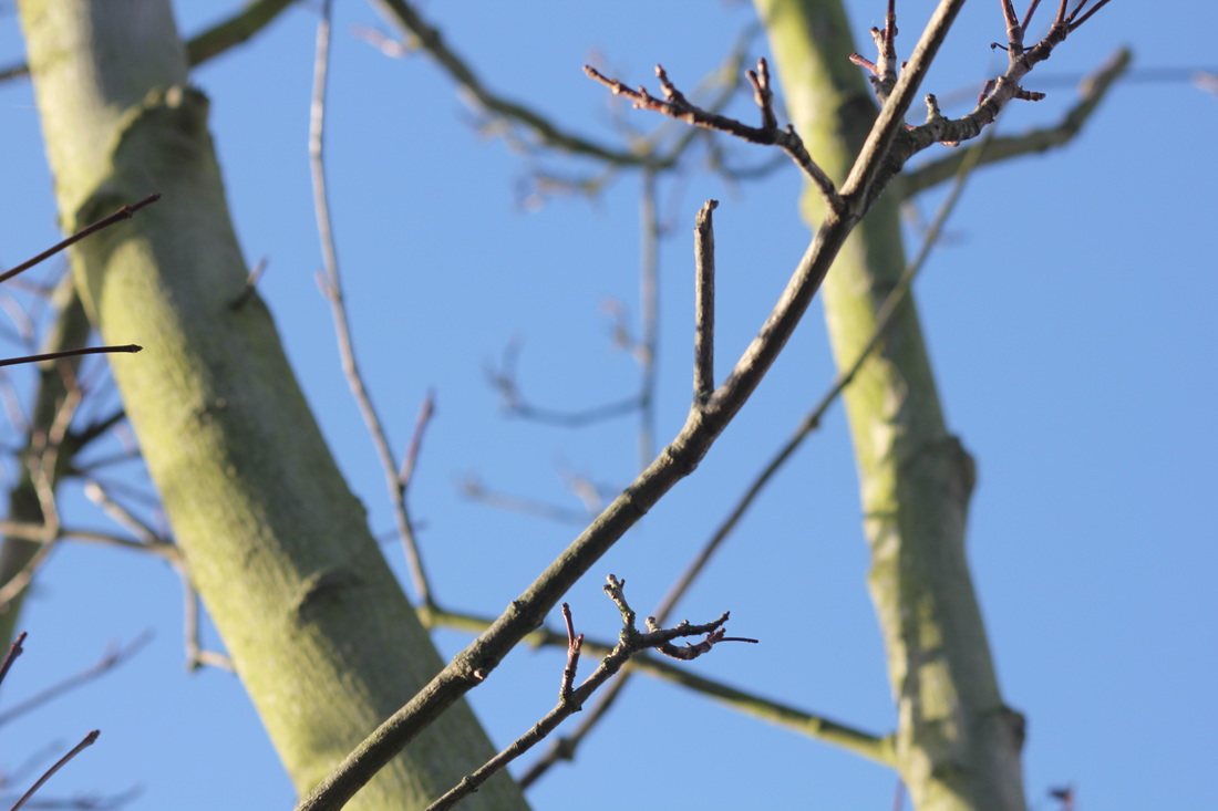
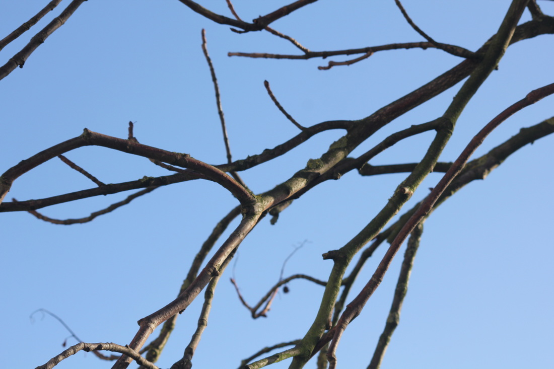
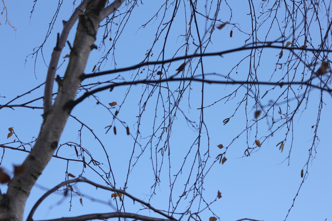
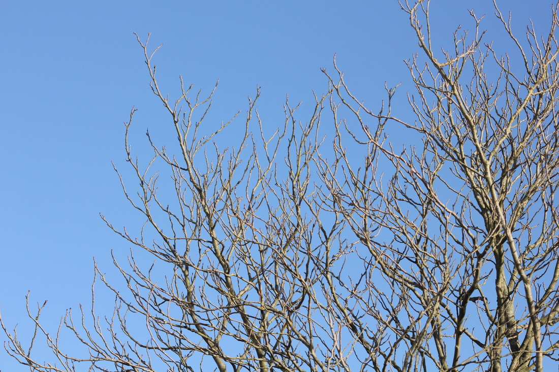
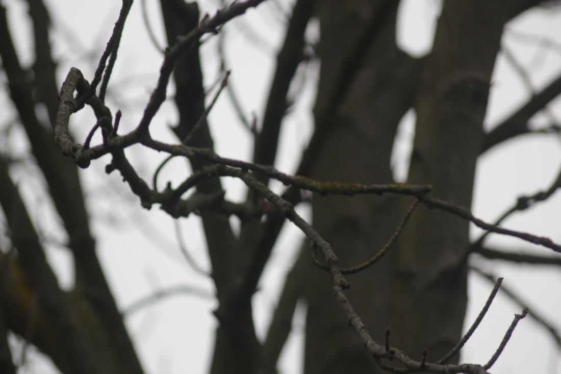
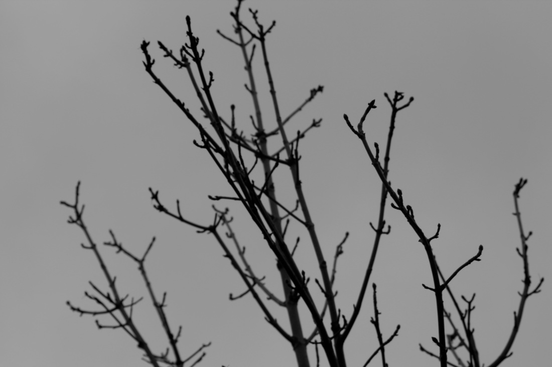
I tried to take more photos linking to Meatyard's work. I tried making them dark and contrasted. I used a digital Ixus 95IS to take these pictures, they're not very good at zooming in, but it worked well with light. I think it links to his work because he took pictures of twigs and he took dark pictures. |
|
|
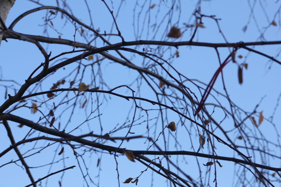
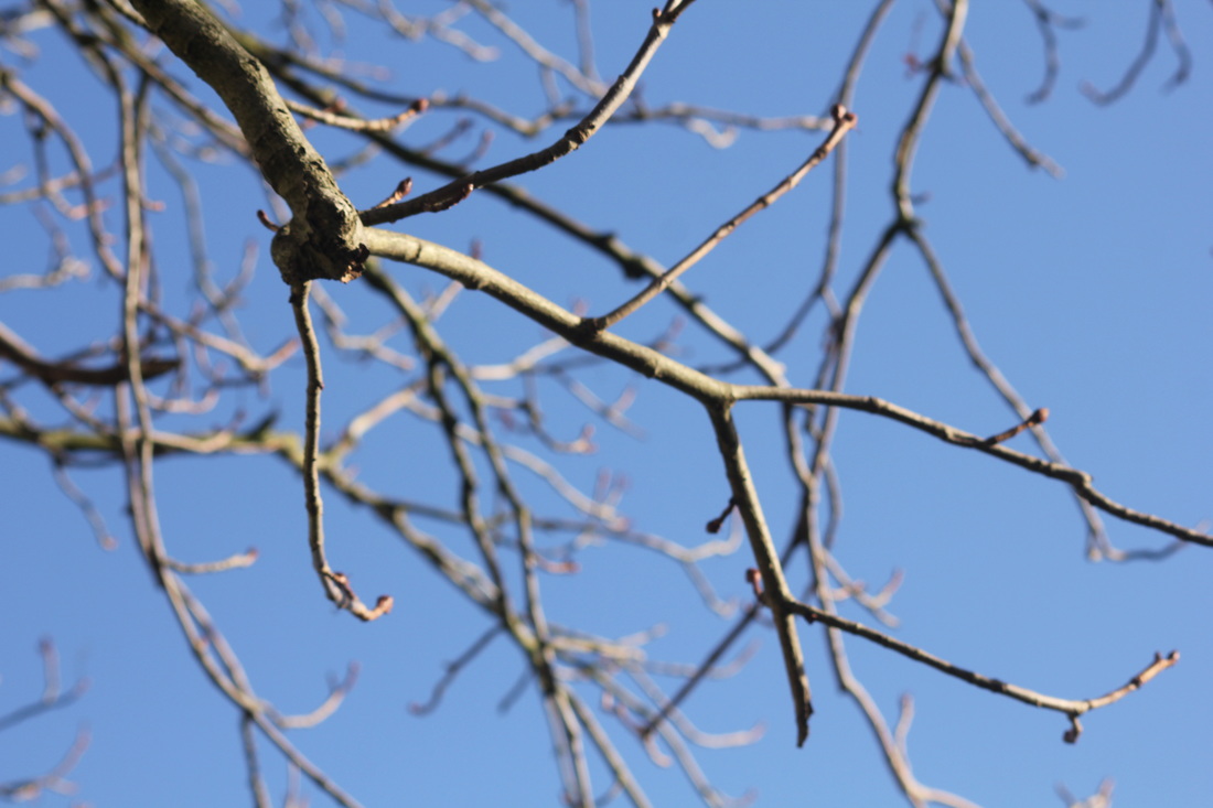
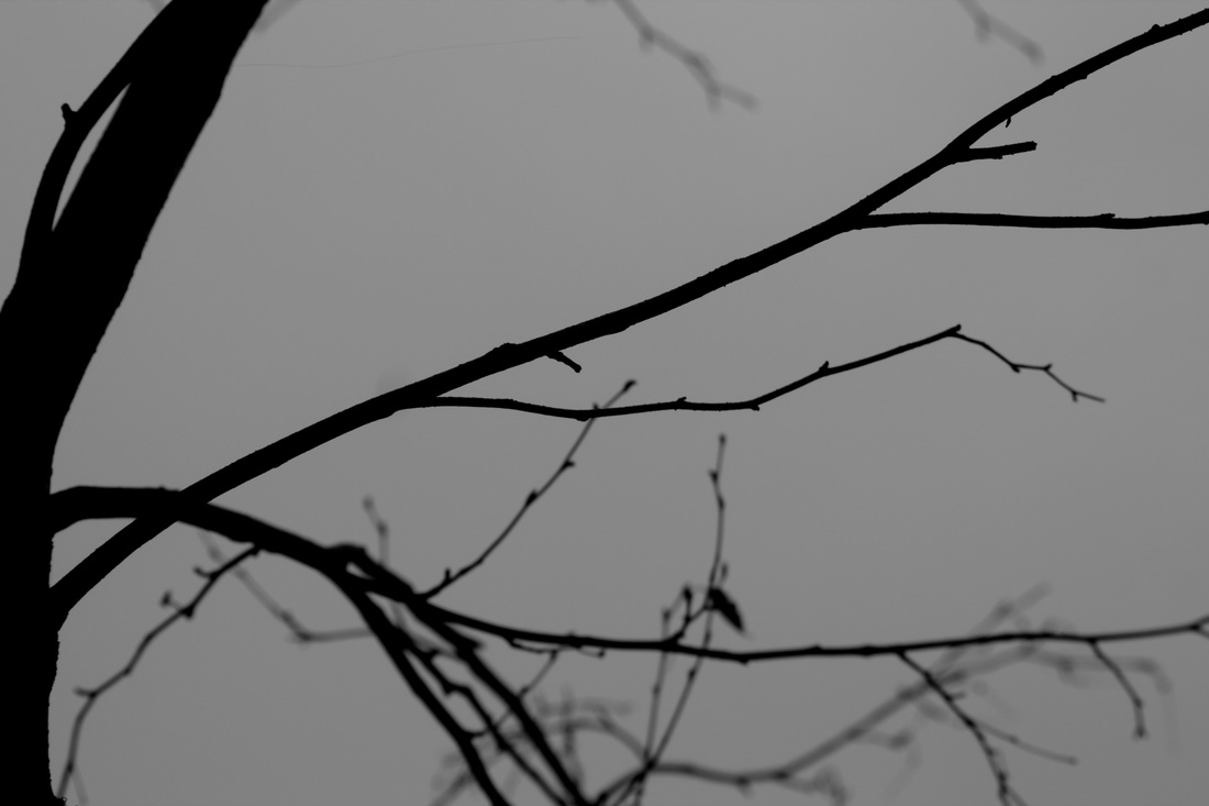
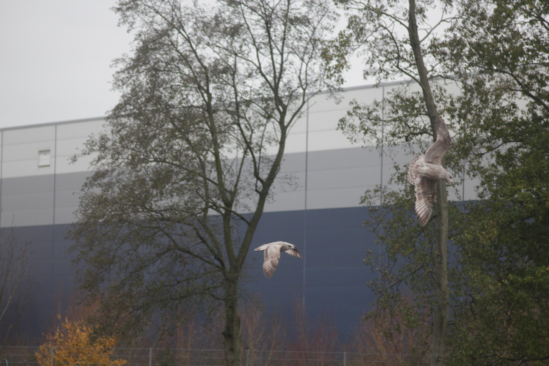
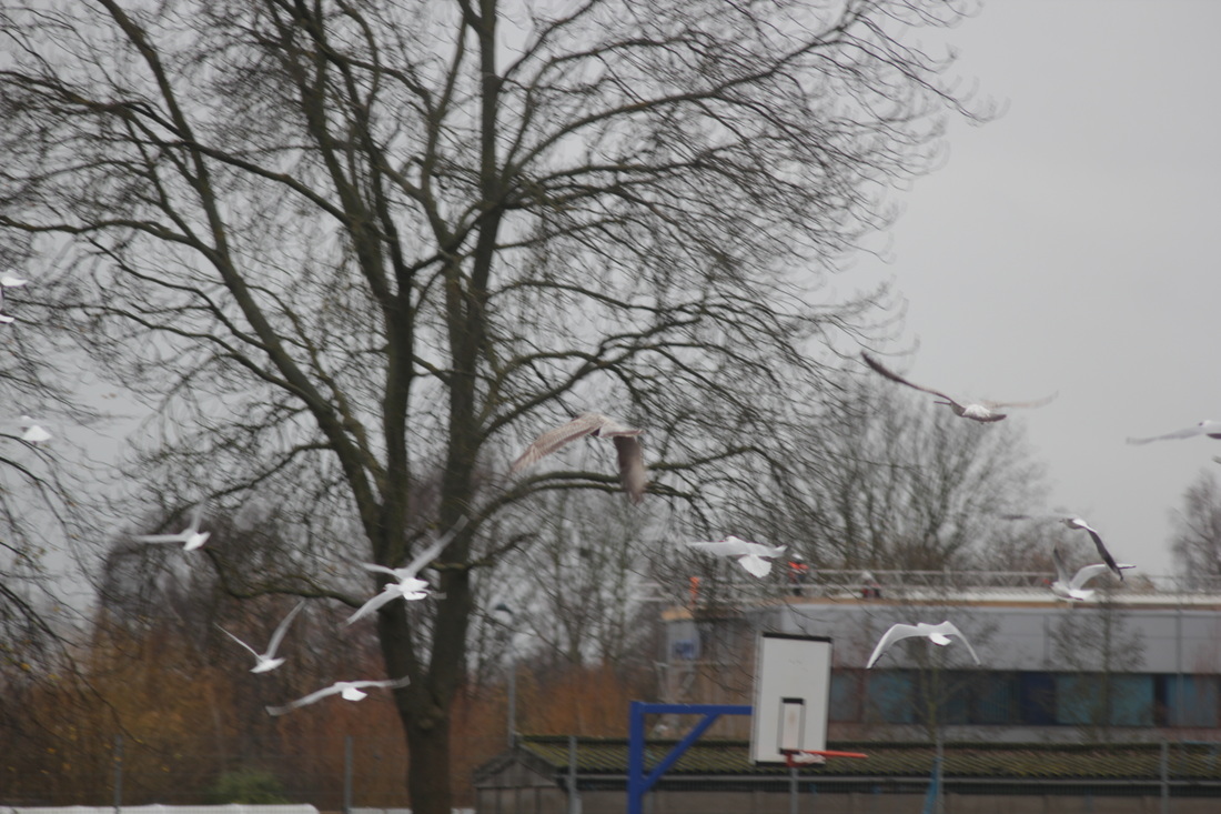
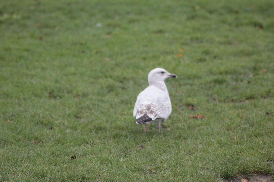
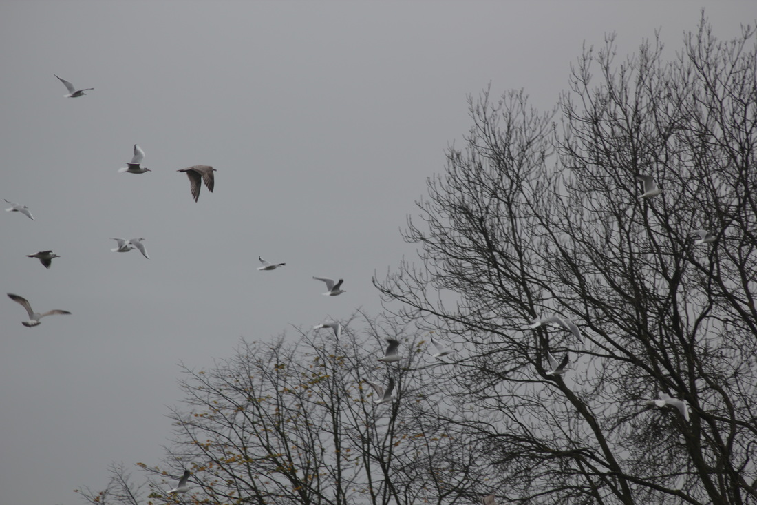
This was another attempt of getting close to Meatyard's work, I added more to test. This time I took pictures with more focus. There was less contrast and light. Instead of only taking images of twigs like Meatyard, I tried to expand and experimented with other natural things like birds. They would've been better if I added a black and white effect. |

Alfred Stieglitz
|
|
An American photographer and modern art promoter who was instrumental over his fifty-year career in making photography and accepted art form.
Alfred takes photos of clouds mostly, his photos show texture and contrast. I like these photographs because there are no other objects apart from the clouds and there is not a lot of colour to it, which adds temperate and mood. What I find interesting is that he only takes images of clouds, but they still all look different like they were taken at different times of the day and different seasons and places. |
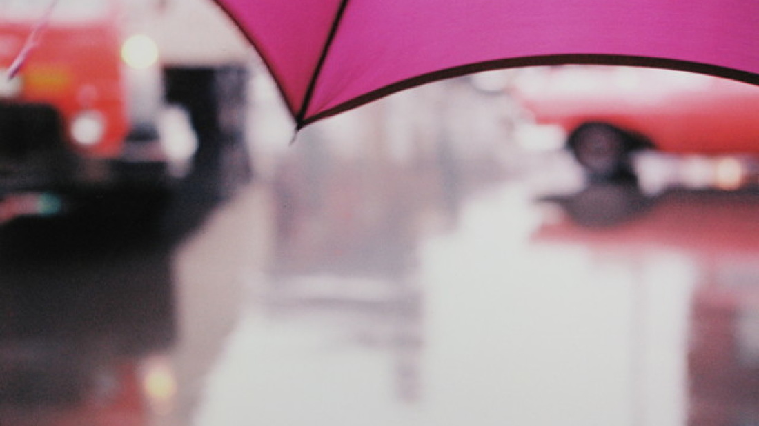
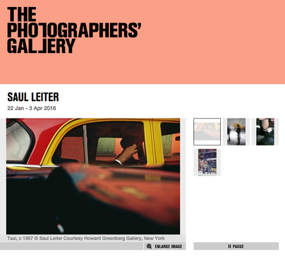
In focus: Saul Leiter
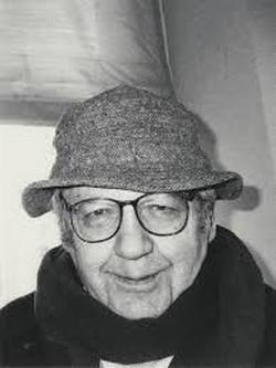
Saul Leiter was an American photographer and painter whose early work is set in the 1940s and 1950s. Leiter uses a lot of the formal elements in his work, his work is also very abstract. He lived throughout December 3, 1923 – November 26, 2013. He was born in Pittsburgh, Pennsylvania and died in New York City. The picture on the left it him.
Here is some of his work:
|
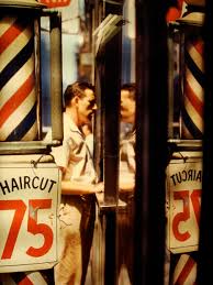
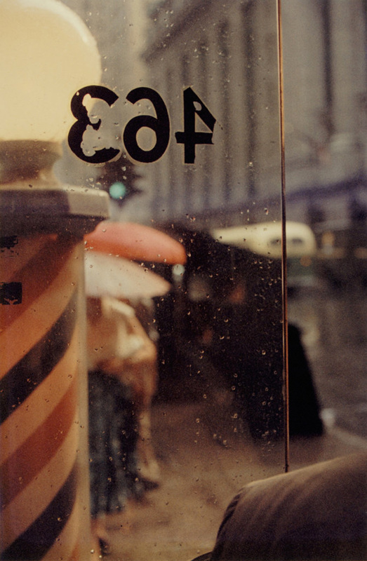
His photos show some differences of light. Some of his work is dark and some is light, the light in the photographs shows during what time of the day the photograph was made, but also there are many shadows. The light looks very natural but in one photograph he shows light from the street which would be artificial light. There's also value/tone in his photographs. You can see where the lightest parts of the photographs are. Some photographs have a lot of shapes. For example in the photograph with the red/yellow car, you can see the lines and the shapes the car windows made, also the light that reflects onto the car shows a shape. Most of his photographs are good in focus, with sharp and good quality; but some of his photographs have bad focus and you can only barely see the subject. There are also lines which stand out in some of the photos. The lines are easily seen in certain photos. I think the most important element would be the shape. His work is abstract because some of his images are unclear of what the main subject is. Also his work uses a lot of the formal elements.
|
|
|
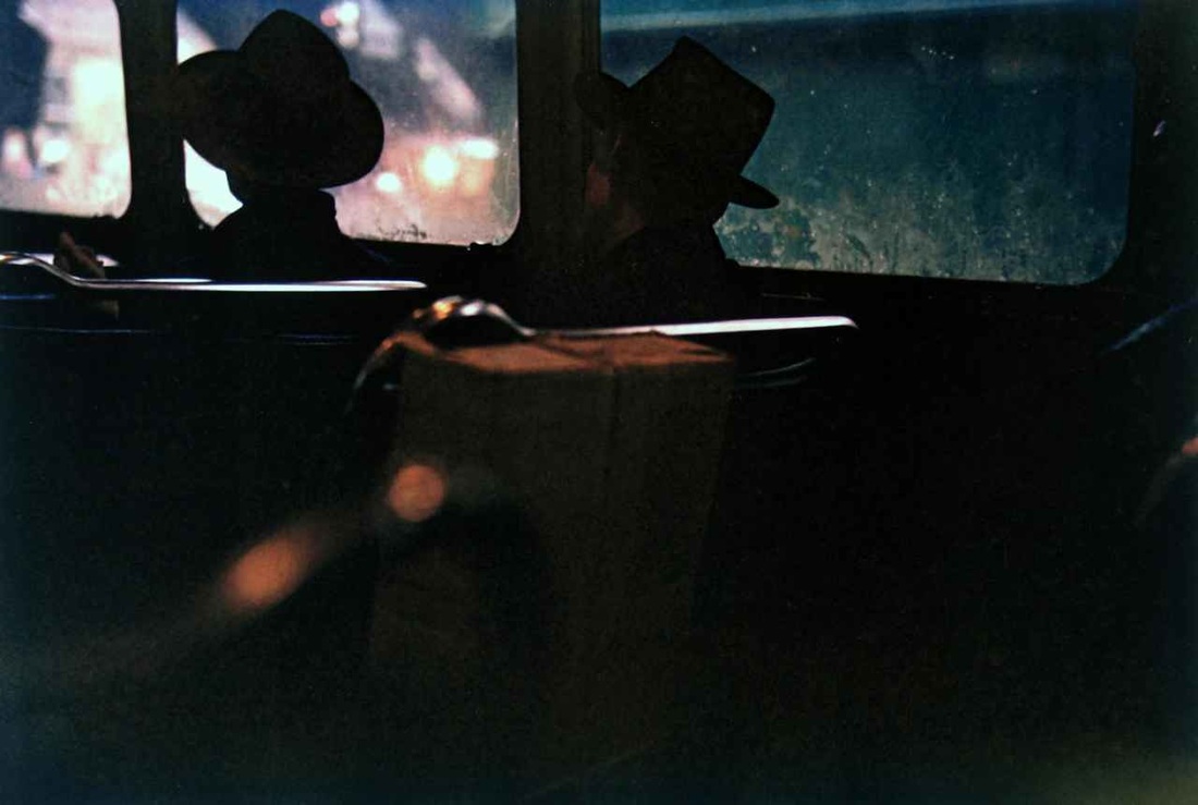
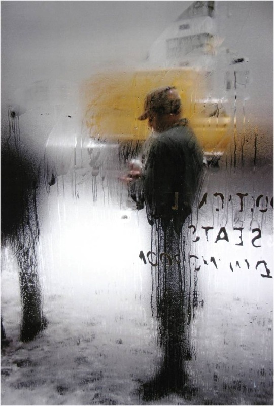
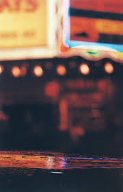
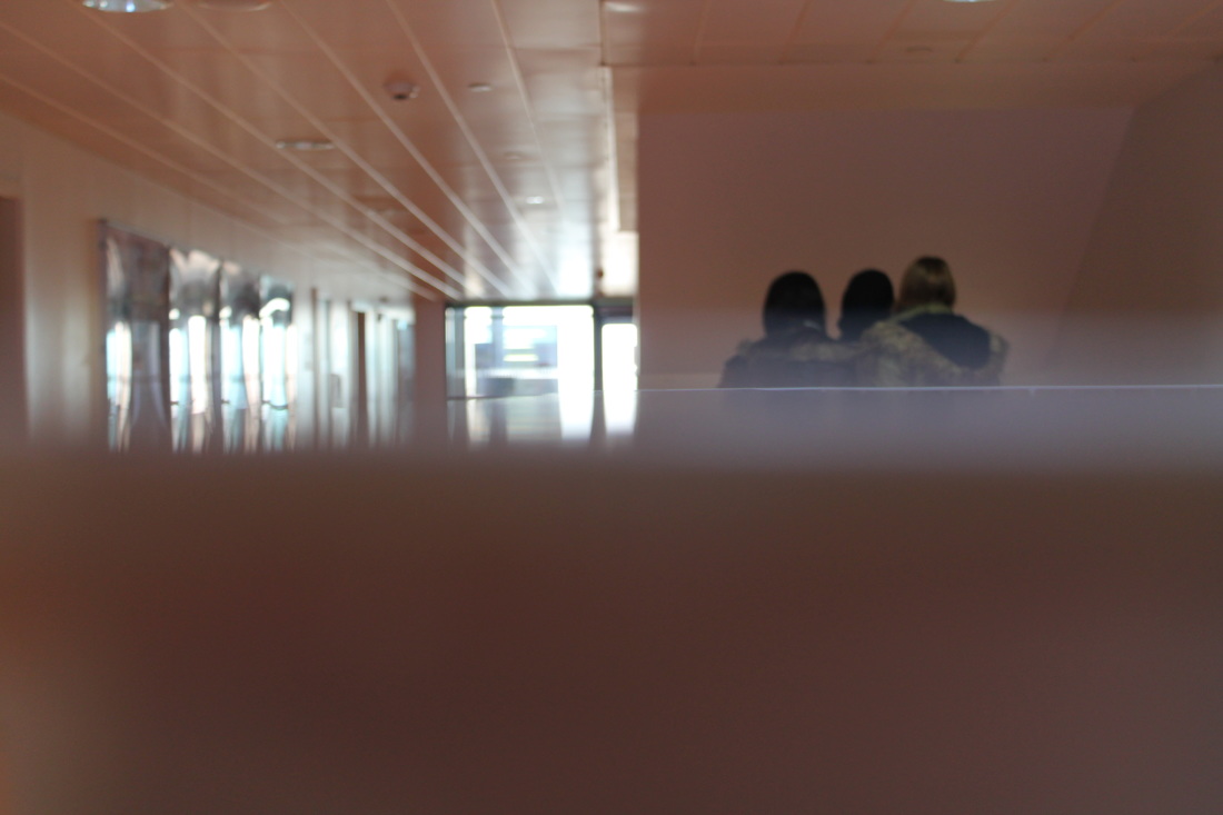
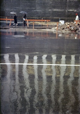
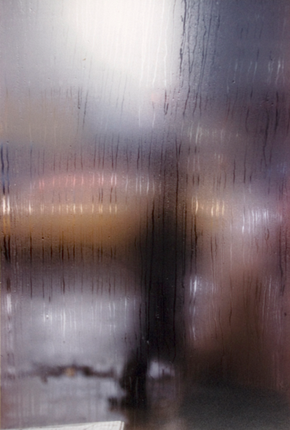
I chose this image because I like the light and tones in it and the different shadows and lines. An unusual thing is that you can't really see much, and you can't tell what's going on outside of the vehicle, but you can see the picture as being interesting. This photo has a strong element of light, you can see there is artificial light coming from outside of the windows, the brightest lights come from the street lights and the reflection from it. There are shadows, for example the two people are basically in a shadow because it is so dark there. Everything is dark apart from the reflections and lights. You can guess that this photo was made at night. There are both reflected light and direct light, but some of the reflected light was made by light that isn't in the photo. The photo looks like it has also soft light. I think this photo is important because it represents some of formal elements. Saul Leiter's photographs are abstract because in some of his photos you can't tell what the subject is or what is going on, also his photos contain a lot of the formal elements.
|
- "I don’t plan things. As a rule I prefer to see what happens."
I chose this quote because it shows that he lets the photos "make itself". It helps me understand his work and it shows how he takes his photos and that his photos are more unexpected than planned. Sometimes the best photos are taken when we are unprepared for them.
|
|
What I learn about the photographer from this video is that he is very patient, and he doesn't plan his photos. His vision is unique, and he likes catching certain moments. He can photograph the same neighbourhood for 55 years with the same light and style. He's a unique person who doesn't just join the crowd and doesn't do what everyone is doing.
|
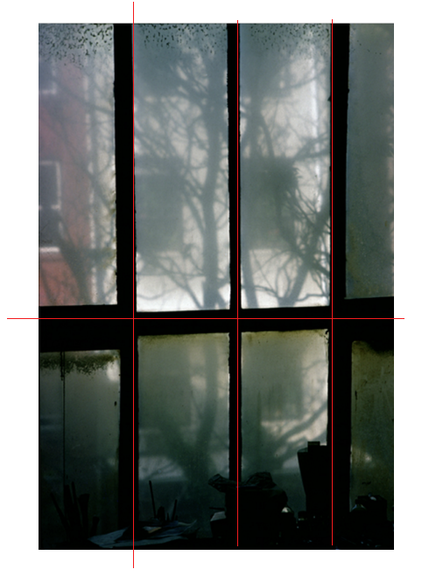
I used pages to draw lines onto the photo to show the composition. His images line up with a type of correlation. For example, in the image below his correlation is where the horizontal and vertical lines are. He seems to have an eye for correlation.
This was my first attempt of taking photos like Saul Leiter. The first attempts were okay but needed improvements. These photos had more of a lack of focus. They also had a lack of colour and light. If I was to do it again I would've chosen a camera that had more focus so the main object was more clear, even though in abstract it's not meant to, but without it, it looks like nothing is really catching the eye of the viewer.
In my second attempt the outcomes started to look better and more looking as relating to Leiter's work. It had more formal elements. These set of photographs had more colour and light in them, they also had more shape. I think it relates to his work because the formal elements are in comparison alike. It would be even better if I had more main objects instead of a plain field so the image would look more interesting.
Saul Leiter Paintings

|
I picked these 2 images because they both have a straight line cutting through the middle of the image. They also have more focus at the top of the image as there are more things to look at. Both images are in a portrait form and they both have similar composition.
The differences are that there are different lights, shades and lines; also there is different focus because in the first one there is also focus at the bottom of the image. They have different patterns as well, for example at the bottom of the left painting there are more scribbles and random stains, but in the right image there are lines. The photographs are also made of different colours. |
|
|
|
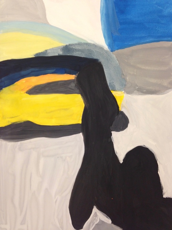
I tried painting one of Leiter's images, I added the colours but I didn't add the steam or rain into the image as in the painting colours just mixed up together and it didn't look the same but messy. So I made the image more bold and added the main colours. I chose this image because I thought it looked interesting. I liked how it wasn't very visible so you couldn't tell what it was at first.
I didn't want to make an image that looked exactly like the photograph. I just tried to connect the colours and the composition, and to make a similar image of how everything fit in the picture.
I didn't want to make an image that looked exactly like the photograph. I just tried to connect the colours and the composition, and to make a similar image of how everything fit in the picture.
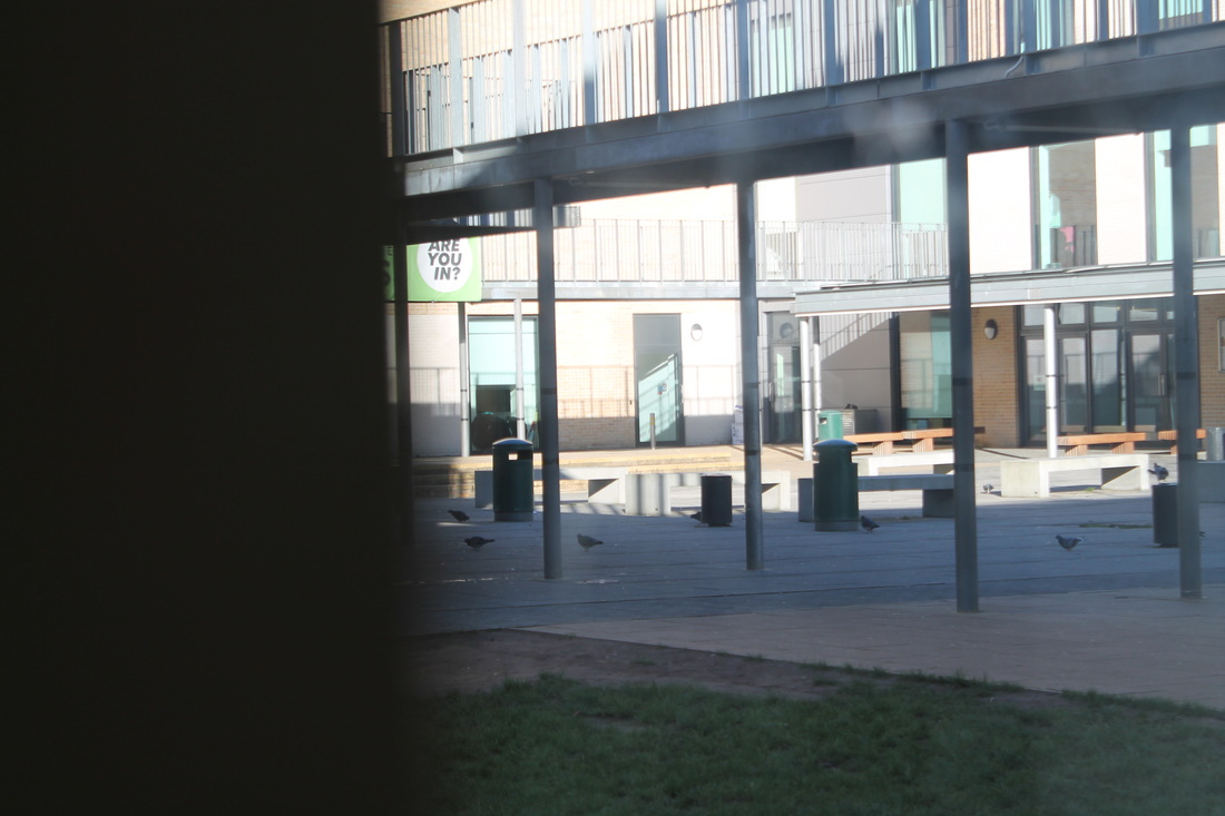
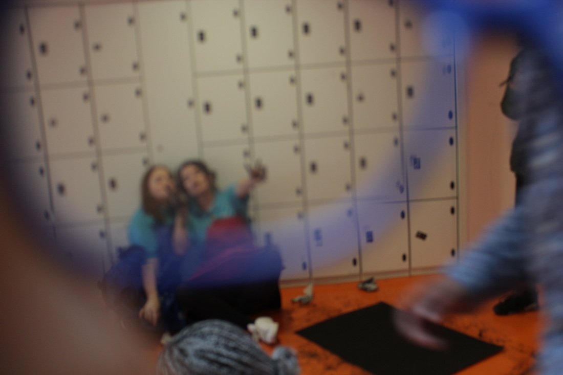
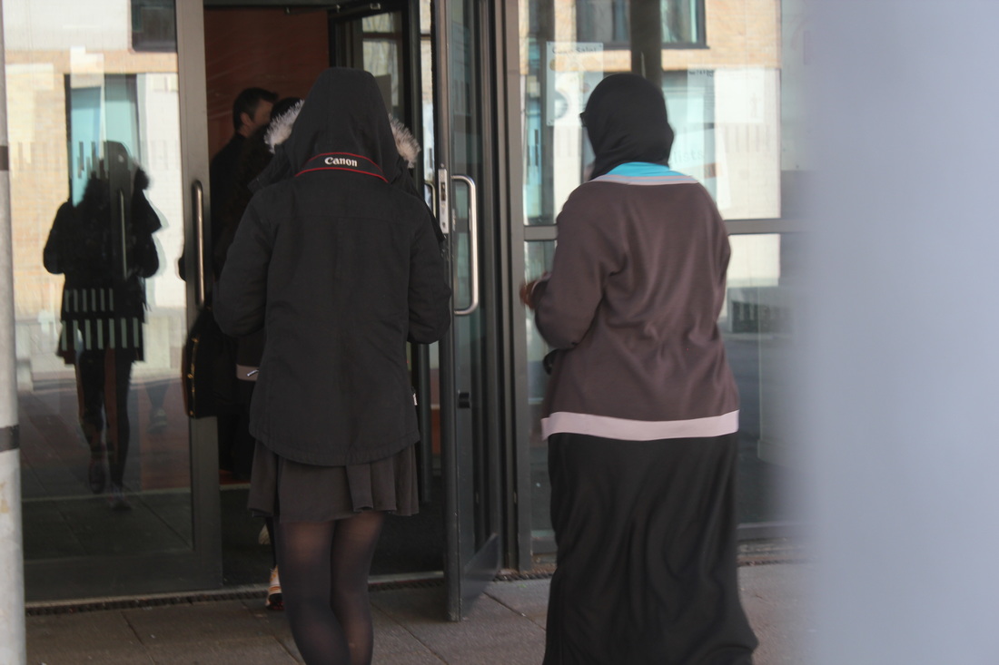
These are photos that I took at school while trying to make a link with abstraction and Saul Leiter's trick with covering up half of the image to make more focus onto the subjects. To improve I should've made more coverage and focus, and maybe used more colours to make subjects stand out. These photos had less light and more shade/tone, shape and lines. For example the pictures were very dark, but there were more shades with the lighter and darker parts of the image. There was shape as the images were the main subject and the rest was blocked out. The lines were all over the images for example the stairs is a good example.
'views through glass'
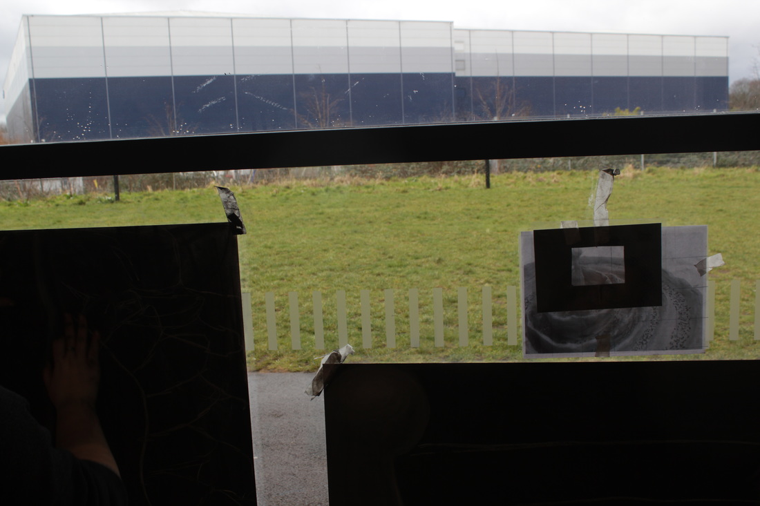
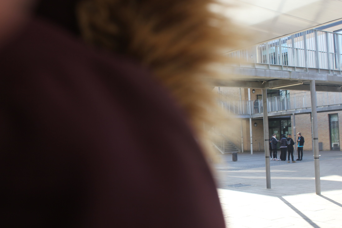
I took these images trying to take pictures while looking through a glass. Like Saul Leiter takes images through glass with different compositions. These photos had less colour and more shade/tone and lines. There was a variation of the amount of main subjects in the image. It would be even better if I had more main subjects and added more colour to it, so it could lead the eyes of the viewer to the place I want them to be.
I took these pictures in school, trying to relate to Leiter's work of covering half of the image. In this set of images I had more main objects and lines. There was colour but not a whole variation of it. To improve it I would've added more colours and shades/tones or maybe more shapes into the images to make it more interesting to look at. I could've also added more techniques for example, I could've taken some more of the images over the shoulder of someone looking at a subject. Or I could've experimented with more images looking through a window.
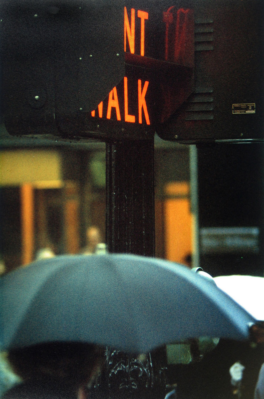
obstructed views


In these series of photographs I used coloured tape and stuck it to the camera, I used red blue and yellow and then mixed them up to create a rainbow colour, on the last picture instead of sticking the tape onto camera lens i stuck sticky notes. onto a glass plane and the took a picture zooming into it. I think these pictures are abstract because you cannot see what is behind the coloured tape and the sticky notes.
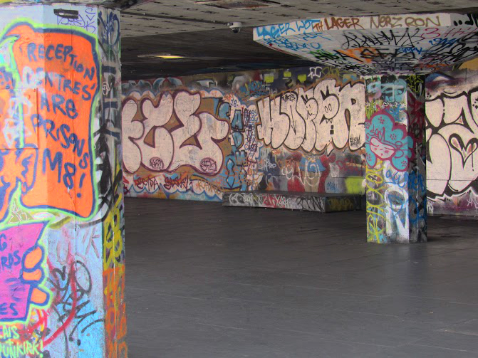
A trip to the photographers' gallery:
|
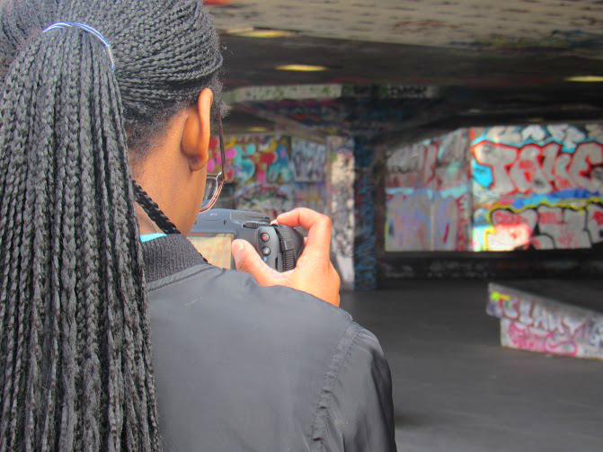
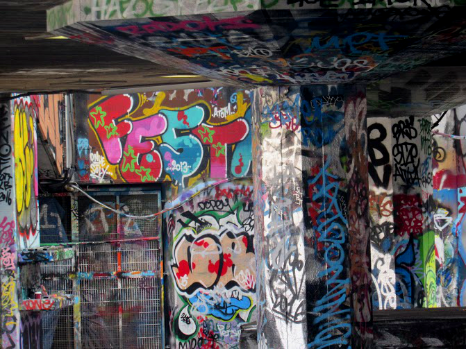
experienceThe trip taught me a lot about Saul Leiter and about abstract and photography. Going up London and taking pictures let me test my photography skills on a whole other level, because we didn't take pictures of the same things at school and I didn't take pictures of my area which I see all the time, I took pictures of something new which adapted my eye to take photographs. I also understood how to collaborate abstraction with my photography. The trip overall benefitted my photography.
|
|
|
| ||
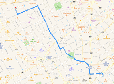
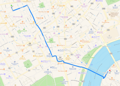
The file shows the worksheet we had to use while we were on the trip, the pictures show how we got there and where we took pictures.
Before
|
After
|
I took this photo on a photography trip with my class in Soho and Southbank. I edited this picture because I think it looks better and relates to Saul Leiter's pictures, as Leiter uses colours, light and contrast in his photos. I used Adobe Photoshop to edit the contrast and made it higher. It made the colour and light stand out. It also makes the details of the picture stand out so it's easier and nicer to look at. I think it's abstract because it has the elements of abstraction in it.
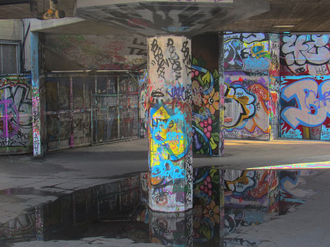
These are some of the pictures I took up London on a photography trip Soho and Southbank. I edited these photos at home with adobe photoshop, on every photography i decreased the brightness and decreased the contrast so that the colours stood out more in the image. I used adobe photoshop to edit them. I picked these images because I thought they linked the formal elements. I picked these images to be my final pieces, I was thinking of adding splitting the images up on 3 different boards and split them up. I haven't decided how i will yet, I think it will be better if I print the images first to see which ones fit together the best.

This is going to be one of my final pieces on the top is where i used adobe photoshop to change the colour of it, I used a linear colour change, it made the photos look darker. I will use the ones above are the ones i will use as my final project. I edited them like this because then they are more abstract, they also have a lot of the formal elements for example, contrast, light, space and value/tone.
final outcome
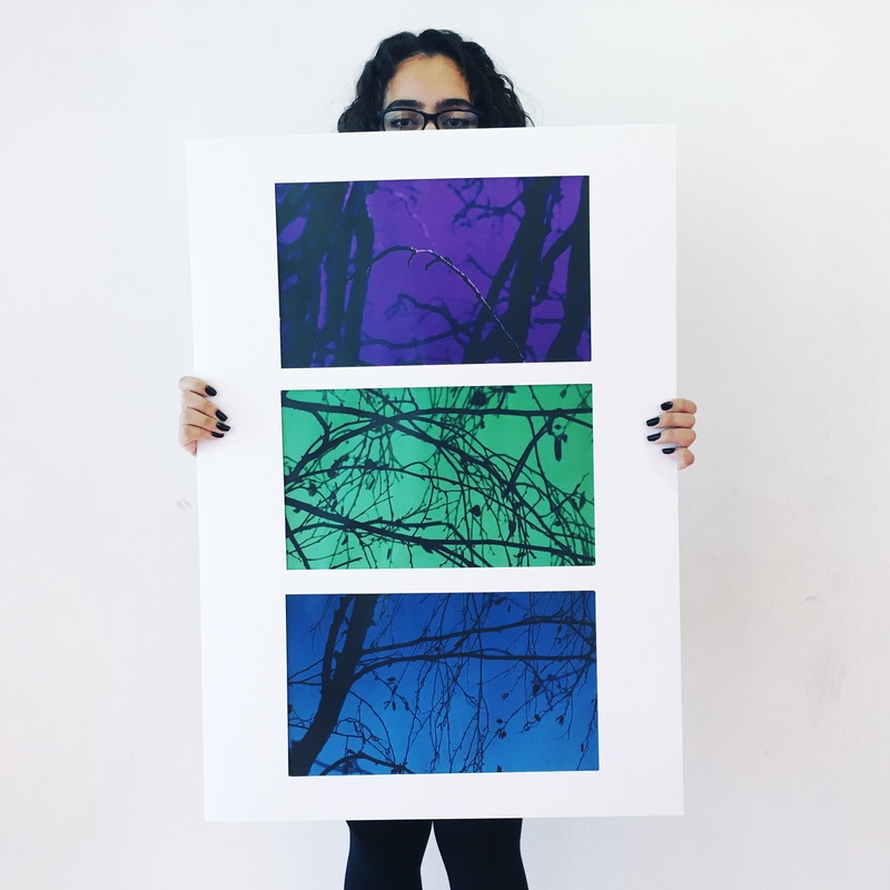
This is my final outcome for Abstraction, I decided not to use the images from the photography trip because I couldn't correlate images together and when I could they didn't look very abstract. So then I decided to pick photos that I took before.
